Introduction
Welcome to my Vintage Travel Poster Illustrator Tutorial. I wanted to make this to teach and inspire others how I make my Vintage Travel Posters, which you can check out here. Art should be shared and celebrated, not hoarded and kept a secret. If you asked me, I wouldn’t say that I’m an expert at Illustrator and this tutorial should work for someone with a decent understanding of the program. I developed my skills and abilities over many years and slowly created this process. If you want to learn more about my “why,” click here. Basically, what I do is trace real images in Illustrator in order to create my posters.
Alright, that’s enough about my story. Let’s dive right in. In order to help you follow along and get started, I’ve included the original image and an SVG File Template that you can download. I like to have the original image open at all times so I can reference it. If you don’t feel comfortable, then you can create your own illustrator template and try to match it to my specifications.
If you don’t feel comfortable, then you can create your own illustrator template and try to match it to my specifications. Keep in mind that you’ll have to try and match the photo up with mine for the rest of the tutorial to work.
- Artboard Width: 1296px
- Artboard Height: 1728px
- Border Width: 1152px
- Border Height: 1476px
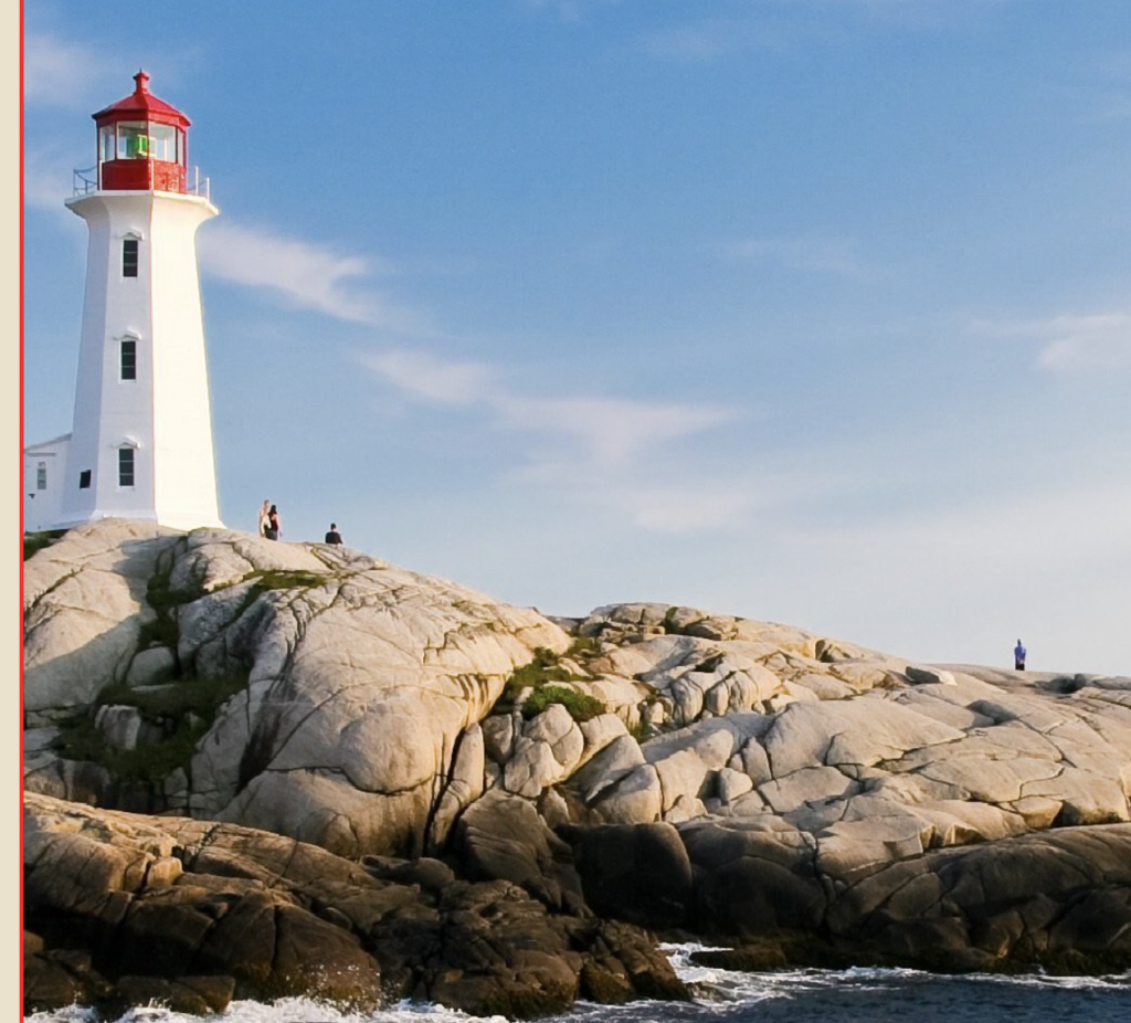
If you open the Poster Background Layer, you’ll see that I’ve already included the image I used as my model. You can find the original image here. I like to use images I’ve taken myself, whenever I can; however, there are so many places in the world and traveling can be difficult and expensive, so I rely on images I find on the internet. Pixabay is a great website for finding free images and vectors.

Warning, this is a pretty long tutorial and it actually takes a few hours to actually accomplish the entire thing. So, if you’ve had to take a break and you need to jump to a different section, you can do so here: Section 1, Section 2, Section 3, Lighthouse Method 1, Lighthouse Method 2, Sky and Water, Finishing Touches and Text.
Section 1
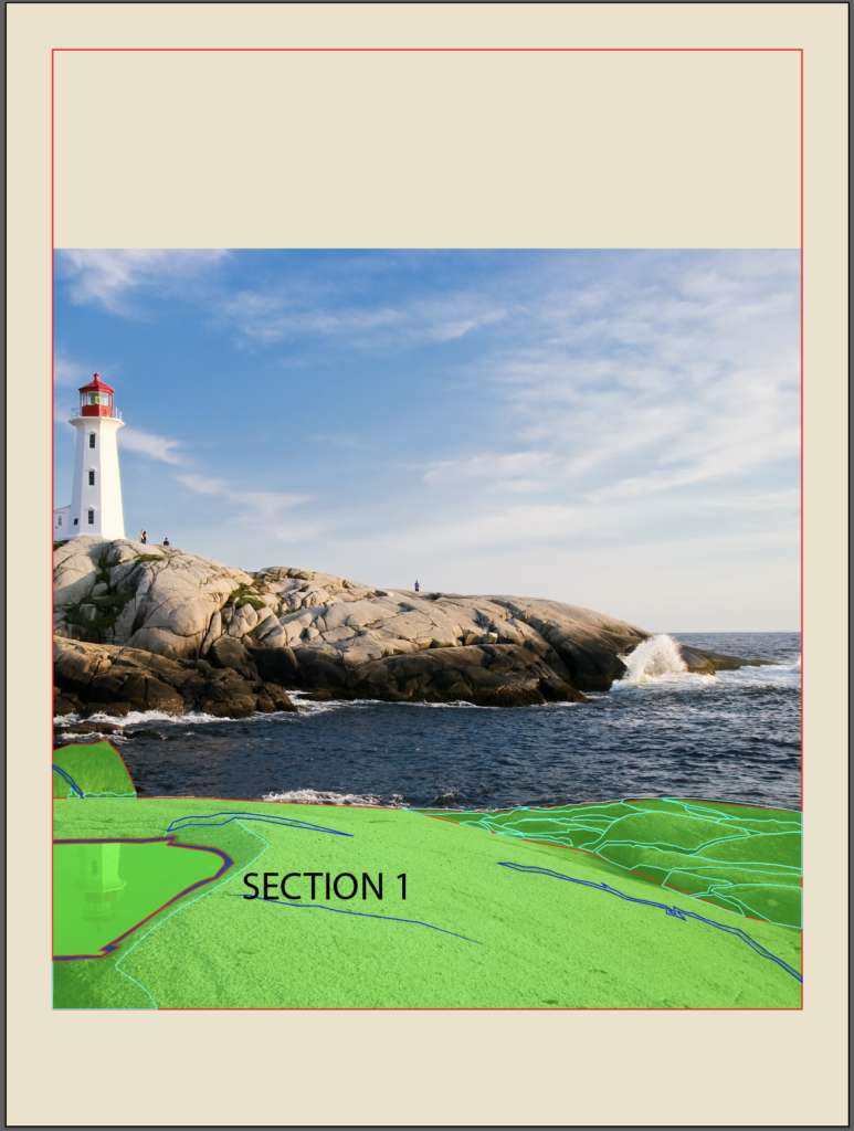
The way I start my posters is by breaking it down into smaller sections. It is much easier to tackle a smaller section. Typically, I also start at the front and work my way back. So, in this image, the best place to start is with the rocks directly in front of us.
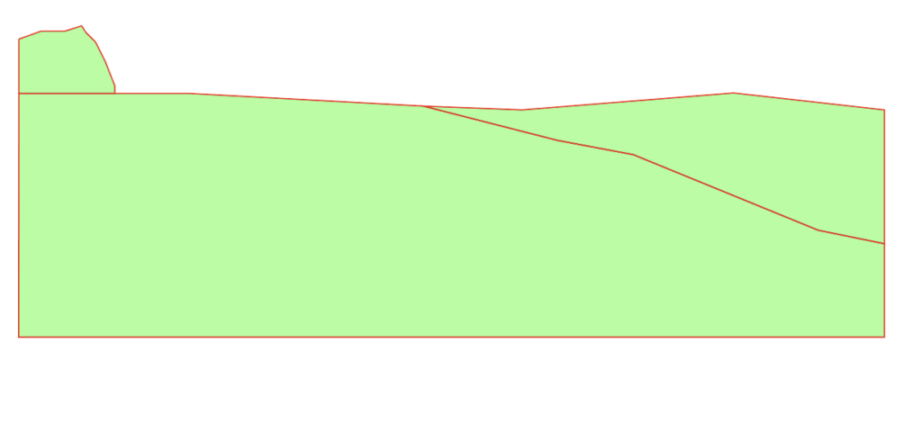
I’ve broken this up into 3 smaller sections as well. The area on the right, the large section in the middle and the small rocks on the left. Start with making an outline of the area using the Pen tool. Then connect anchor points all around to make the shapes. From there, just add some detail.
Subsection 1
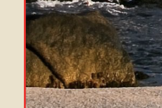
So as we can see on the left rock, there is a crack and some dark spots near the bottom.
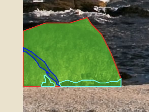
So, using the pen tool again, begin drawing the detail. For the purpose of this tutorial, I used different outlines to designate the different elements. The teal outline is the dark spots and the blue outline is the crack in the rock. Keep everything in outlines until you’re absolutely finished drawing or editing. Next, let’s move onto the main section in the middle.
Subsection 2

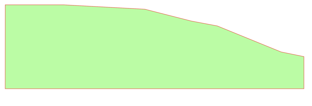
Again, just connect the anchor points and follow along with the general shape of it. There’s no right or wrong way to do this. Just connect points until you’re happy with the shape. Then start adding some details. Notice that this area has a puddle and some small cracks in the rock.

Starting with the cracks, start making a bunch of anchor points and kind of following with the actual crack. It is okay to freestyle a bit, because that’s what makes it unique. These posters don’t have to be perfect replicas of the scene. They just need to capture the essence.

As you can see, my cracks are larger than the real ones. The bottom crack was pretty small though, so I just drew a simple path and adjusted my stroke size to match the real one.
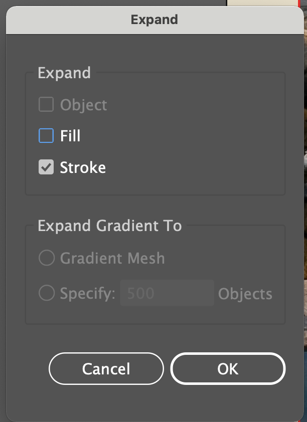
The problem with this is that you can’t get the pointy ends that many of these cracks have, so you’ll want to go to Object, Expand, expand the “Stroke,” then add some anchor points on each end and drag them outwards to make it pointy.
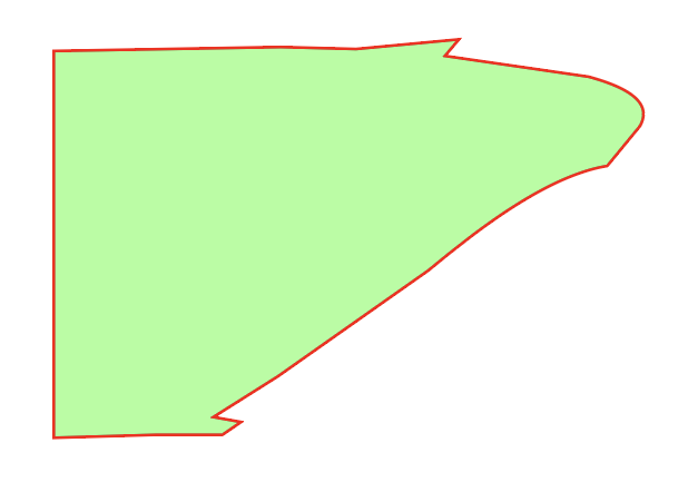
Next, is the puddle. This is made up of 2 parts, the dark ring and the water itself. Starting with the water, use the border of the poster as your edge and connect anchor points around the water to create a similar shape.
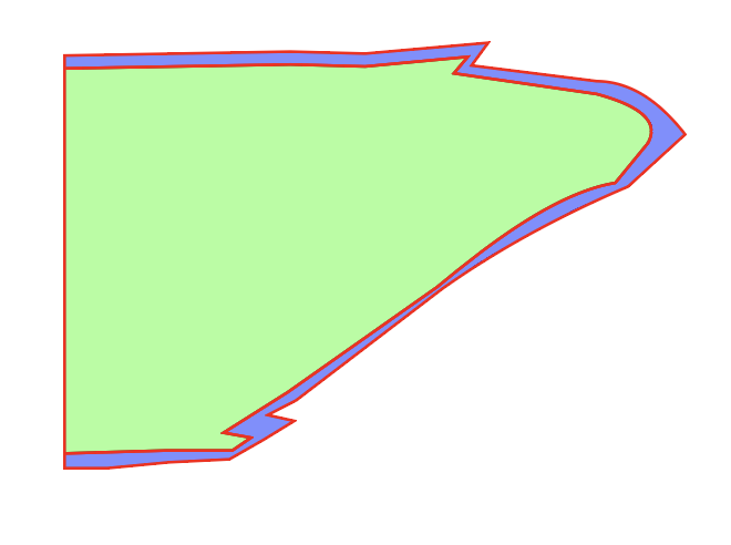
Next, to add the dark ring, trace the edge of the puddle and take your cursor slightly outwards and go back around and follow along. This ensures you don’t have any space showing underneath.
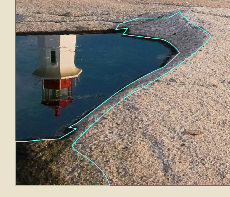
The final thing is to trace the shadow of where the indention in the rock begins. Again, retrace the lines you already made for the dark part of the puddle, move your cursor outwards and then follow the image.
Subsection 3
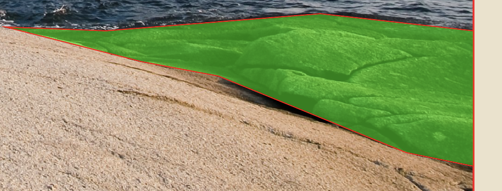
The last subsection is very similar. Draw by drawing the outline of the rocky area.
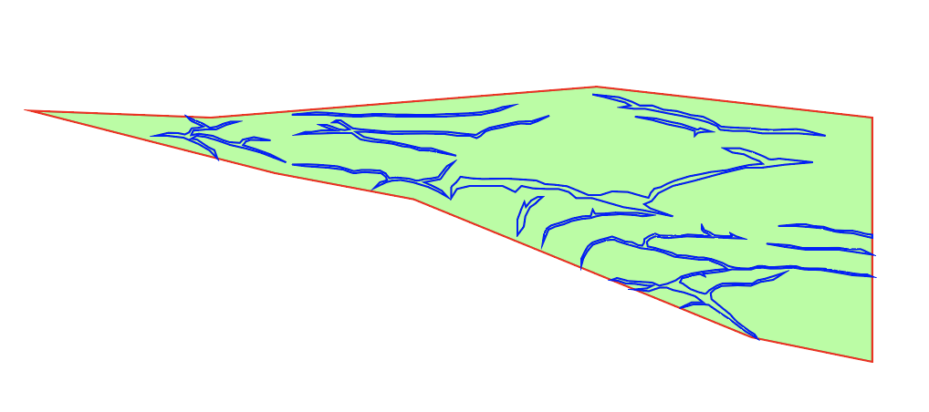
Then draw the detail, which in this case is really only the cracks. It simplifies the detail, but it still looks great when you’re done. If you wanted to go into more detail, you could try to draw each rock individually and line them up and create the cracks that way. I chose to take the simpler route, because I wanted to keep it looking more uniform for the rest of the poster.
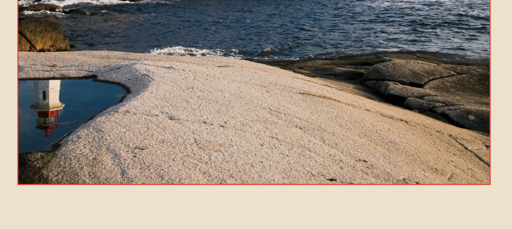
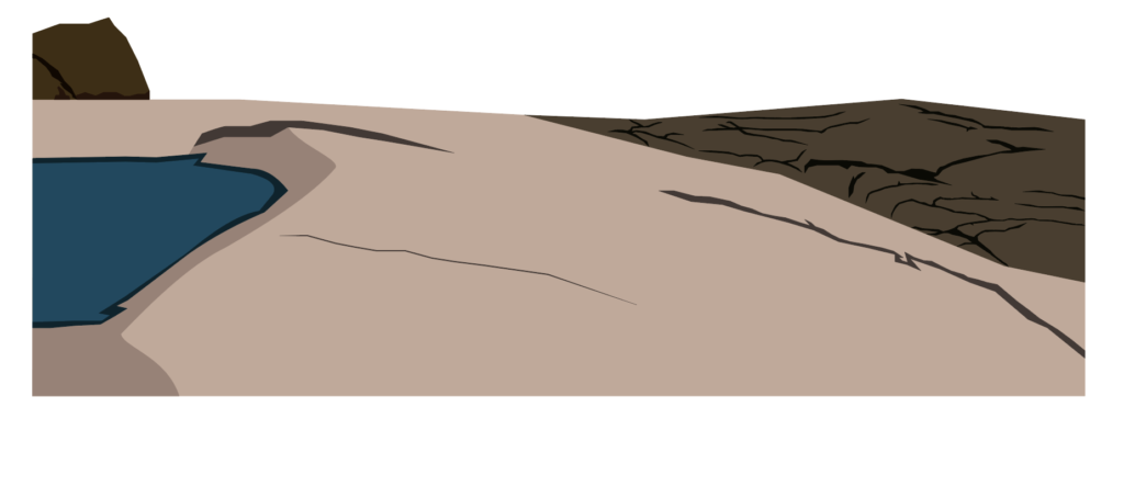
So, when you decide you’re ready, you can begin adding color from the rocks. An easy way to do this is to select the object or path you want and use the eyedropper tool to match the color from the image. Here’s how mine turned out.
Section 2
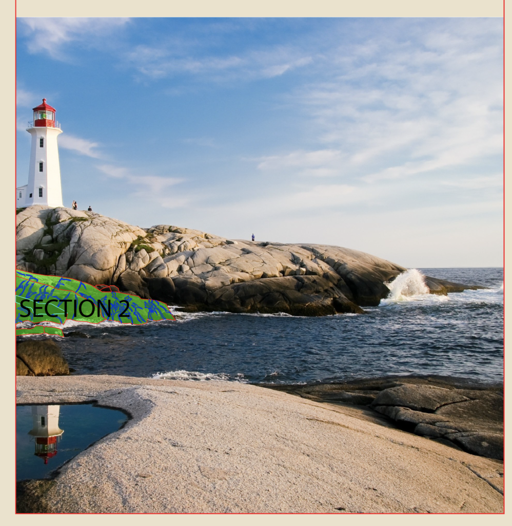
I’m going to quickly go over these next two sections, since the process is basically the same as the first one. So the second section is what I marked in the image above. I broke it down into four smaller ones.
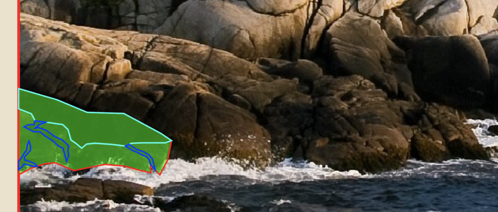
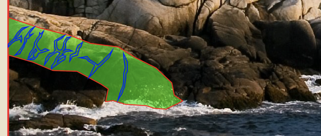
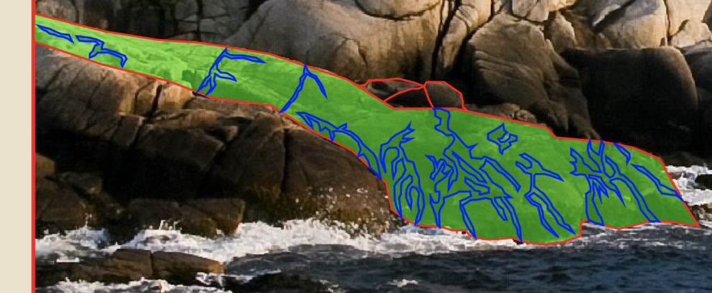
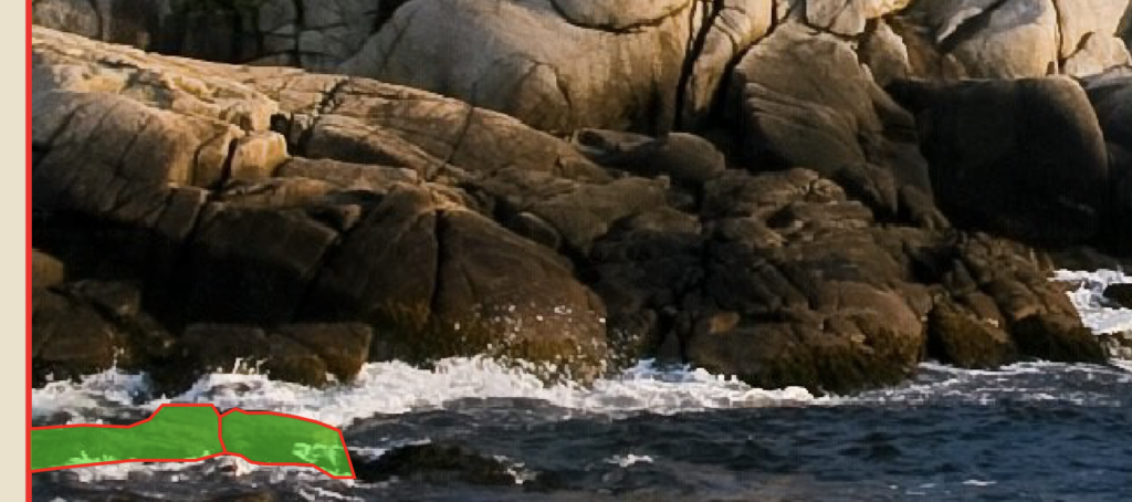
Divide the rocks into smaller groups, outline them and then add the color to the rocks and the cracks. The closer rocks are slightly darker and the further rocks are slightly lighter in color. Here’s how mine turned out.
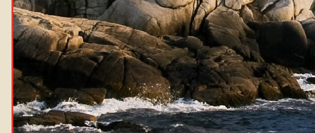
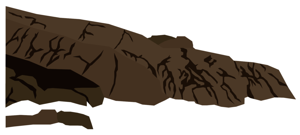
Section 3
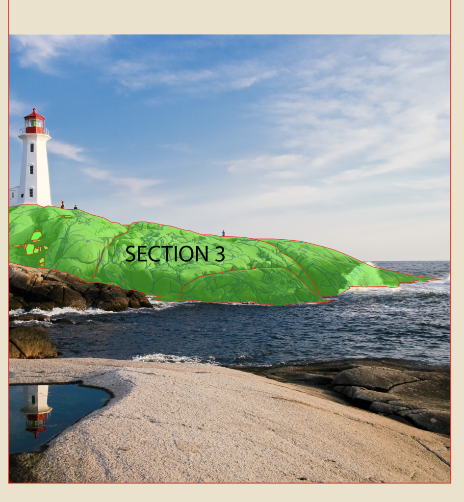
Again, this section is pretty much identical to the previous two.


Divide this large rock structure into smaller groups and then trace the shapes and add detail. This one does have a twist though. Instead of only having cracks, there is some moss and grass on part of the rock. There’s no wrong way to go about this. Just do your best and use the same technique you used to make the cracks.
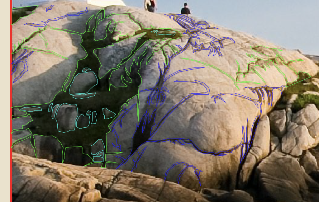
If we zoom in on the image, you can see that there were some rather large areas of detail in the picture. Blue lines mean it is a crack, green means grass and the teal means it is a rock I had to draw back in. I ended up doing this for all sub-sections, but I just wanted to highlight it here.


Either way, here is how mine turned out after I finished outlining and adding color to the rocks.

Optional Step: I initially chose a darker color for all the cracks, but wanted to soften it up a bit, so I messed with the blending mode. You can find all sorts of options in the Transparency menu. For mine, I chose “Soft Light” and I applied it to all the cracks I drew in the picture.
Lighthouse Method 1
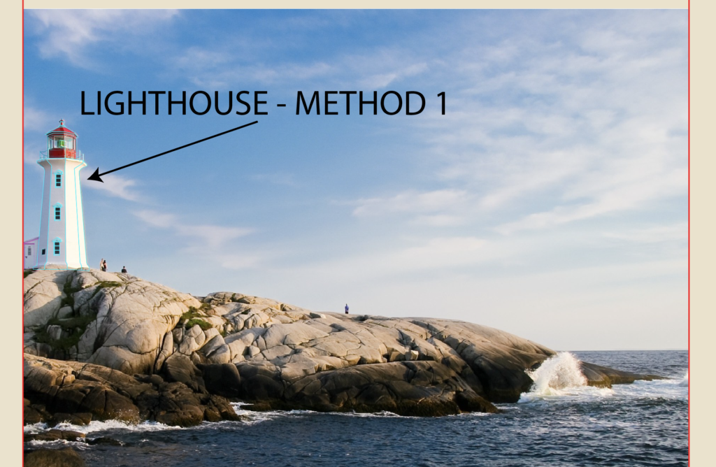
Now, the part we’ve all been waiting for, the lighthouse. I will outline two methods you can use. I ended up going with the second method, but I wanted to demonstrate both so that you could choose how you want to handle situations like this in the future. The reason I have two methods is because the details can be pretty fuzzy when examining the original image in Illustrator, especially when you zoom in really close to trace the lighthouse. While this first method is more true to the picture, it is also more difficult to get to look right in my opinion. If you want to simplify things, then I would recommend that you click here to skip ahead to Method two, otherwise just keep going.
Side Entrance
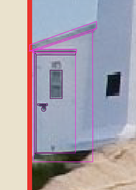
This first way is to simply trace the lighthouse as is and try to get the perspectives right. Start with the side entrance, draw the roof, the roof perspective (dark area), then the body of the structure, then the door and the doorknob and door perspectives to give it some semblance of depth. Now, I tend to maybe overdo it on the details of my buildings. The truth is that you could probably do without the perspectives and your structure would look perfectly fine.
Main Body
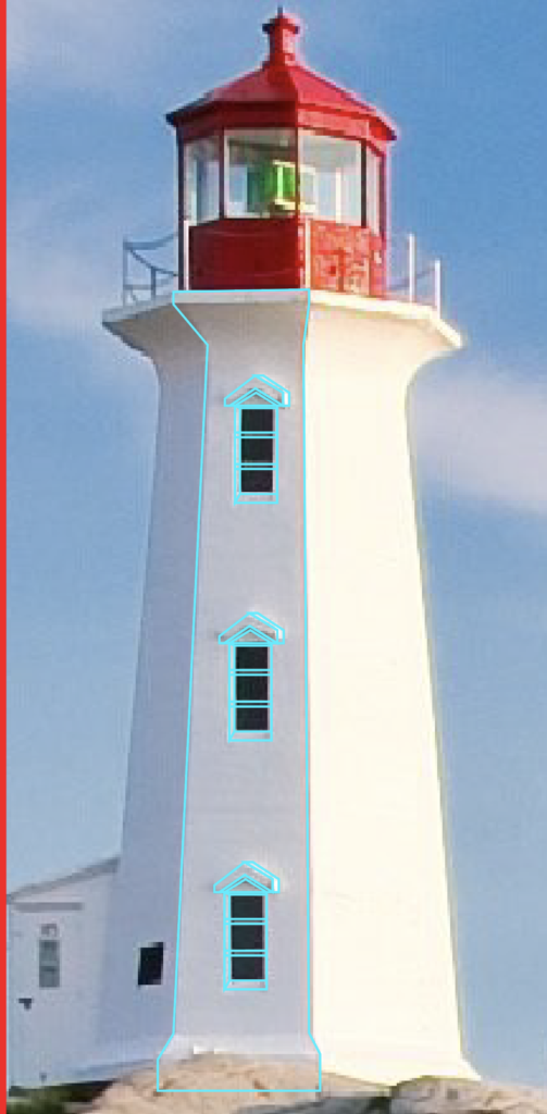
Let’s move onto the center of the lighthouse. Trace the body and the curves.
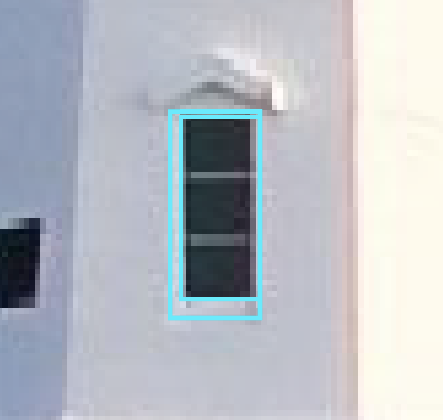
Then make the first of the three windows. Outline the glass and where the perspective around the window are. Because it is slightly at an angle, you’ll have to skew the larger rectangle.
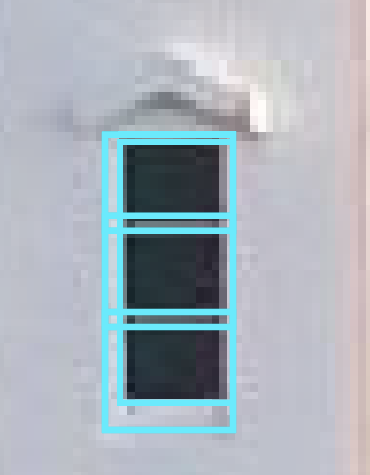
Then, add the cross sections across the window.
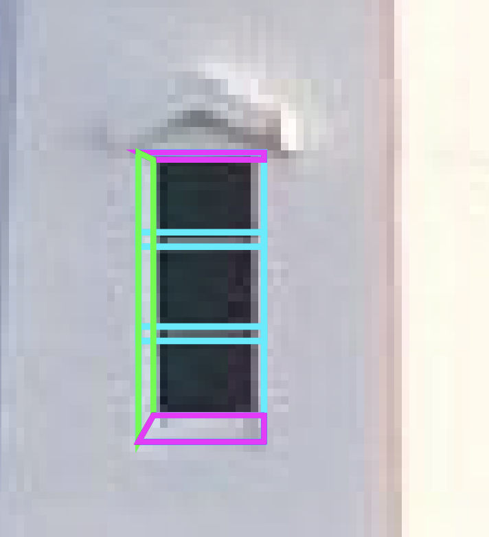
Next, fill in the gap between the window and the larger rectangle by connecting anchor points to make three shapes. A top and bottom part (which I like to make the same color when finalizing the shape’s color) and a side part (which will be slightly different colored than the top and bottoms).
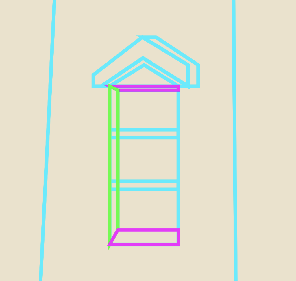
Lastly, make the triangle roof detail that sits above the window. Because it is at an angle, there needs to be a side perspective and a bottom one as well. Start with the main part, then add the side perspective and finally the bottom one. If you really wanted to get technical, you could follow this process two more times and tweak the perspectives slightly to match the angles of the windows perfectly, but I promise it doesn’t really matter that much.

Next, select all the window shapes together and group with CTRL/CMD + G, then hit CTRL/CMD + C, then CTRL/CMD + F to paste a copy of the first window in place and use the mouse to drag it upwards. Do it one more time for the last window.
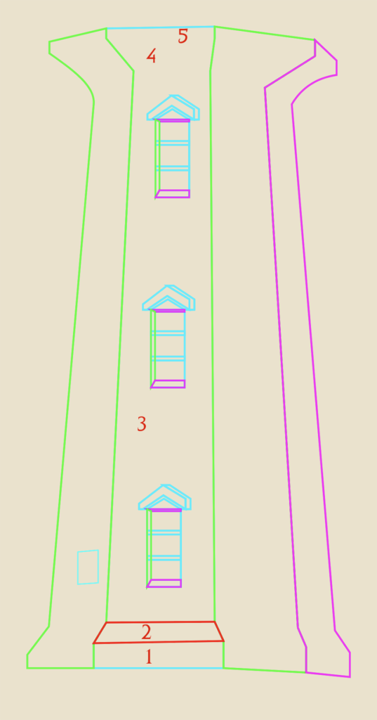
Next, use the pen tool to trace the left side of the lighthouse, then the right side. If you look closely, you’ll see that there are actually two areas to the right of the section with windows (in green and purple). Each section basically has five parts (numbered 1-5 in red), designated by where you placed anchor points. From bottom to top, there’s a bottom lip, an angled part, the large body, another angled part and a final lip. So the way I handled this was to start with my outline like above, then use the pen tool to make each of the five parts by tracing over them and closing them off (like the red shape on number two). I did that for all five parts on all four sides of the lighthouse. Don’t forget the little window on the left section.
Top Section
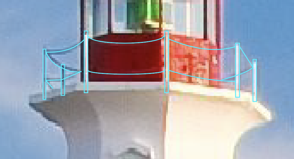
Moving upwards, mark the six spots where there are posts and add the chains. Make sure the chains stop at the bounds of the red structure, otherwise it will look like your chains don’t go around.
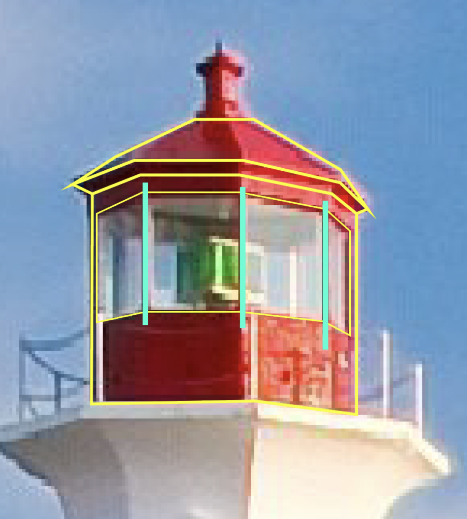
Similar to the body of the tall area below, you’re going to want to outline the entire red structure. Make sure you mark the roof perspective and outline the roof and the window frame. Then, just like before, section off each of the parts using each anchor point as a boundary, since they each represent a different angle of the red structure. Remember to keep some space in between the windows since they have individual frames. Those places are designated by a teal line.
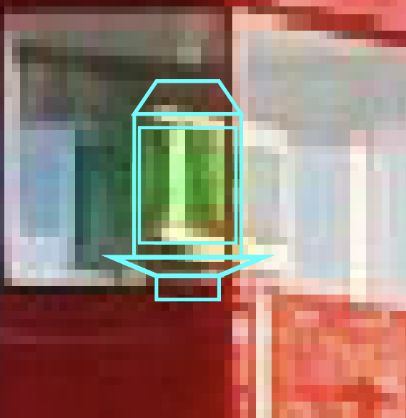
Next, we have to draw the actual light fixture. Don’t worry about lining it up exactly with the frame of the structure. This will sit behind the window outline and the actual red structure pieces. Again, this image’s quality is pretty heavily reduced when you zoom in, so I looked for another picture of this lighthouse on Google and modeled it after that. There’s a main body, the light itself, a top area and a base structure on which it sits.
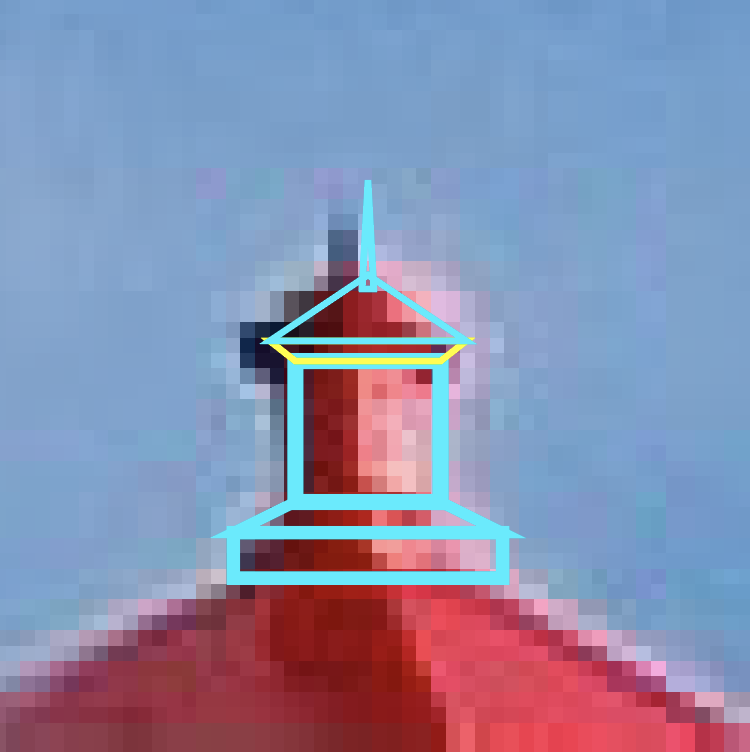
Don’t forget the top section on the roof. this one is basically a small version of the main red section, I went ahead and made it “flat,” meaning I didn’t include the perspectives and alternative angles. It was hard to match the picture because the quality is so reduced. So I would start by making bottom section, the middle, the “roof” and the perspective (in yellow) where it attaches to the middle part and the top pointy thing in that order.
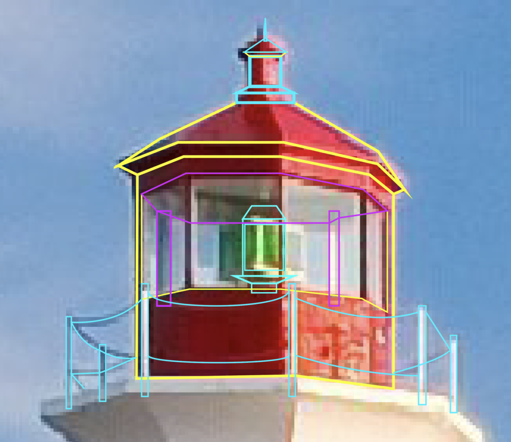
The final thing to remember is the perspective on the ceiling and the back of the structure that is visible through the glass. This is outlined in purple.
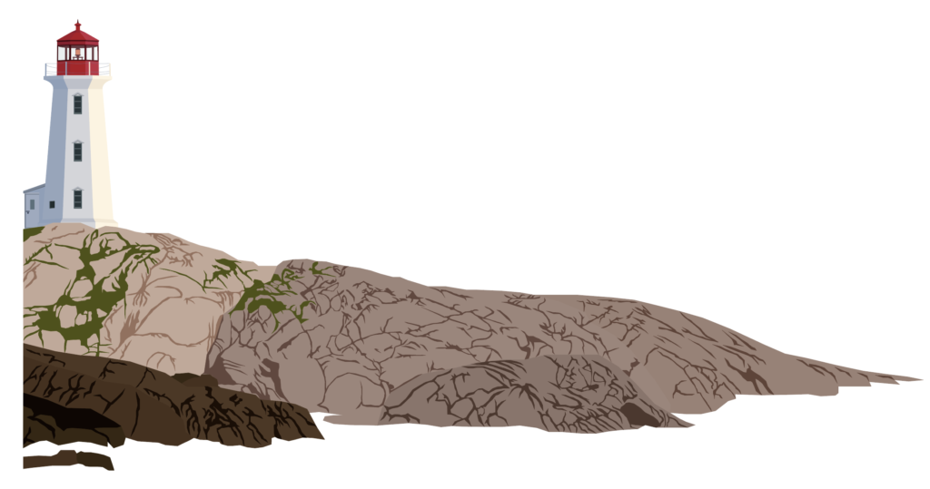
Then, just start adding your color to the shapes you made. I like to use the eye dropper tool and pull from the actual image. So, once you put it all together it might look something like mine.
Lighthouse Method 2
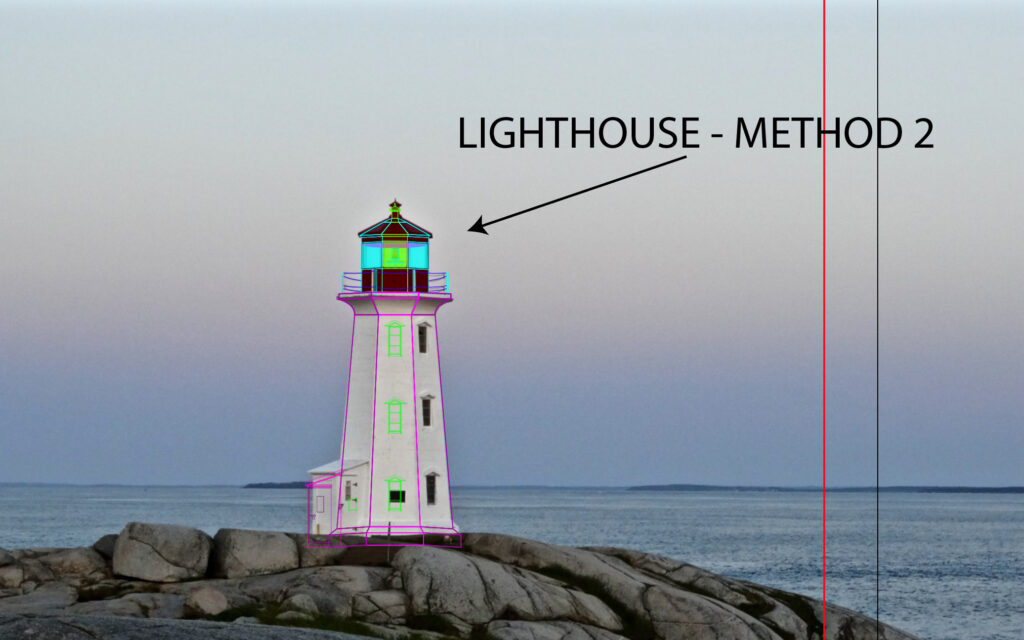
Out of the two methods I’m covering, this is the one that I used. I felt like it was easier and that the accuracy of the exact positioning of the lighthouse didn’t matter that much. At first this might seem just as complex, but what you’ll find with Method one is that getting the perspective to look right can be difficult and frustrating.
For this method, I found a different, closer up picture of the lighthouse; which can be found here. Basically, I got a higher resolution photo of the lighthouse so that I could see more detail and trace it more easily. Another difference is that this picture is taken from such an angle that you only see 3 sides and it is more symmetrical than the original picture, which again simplifies the process greatly. However, keep in mind that we want to keep the side facing us from the other picture, so we are going to trace this angle, but keep the features from the other one.
Main Body
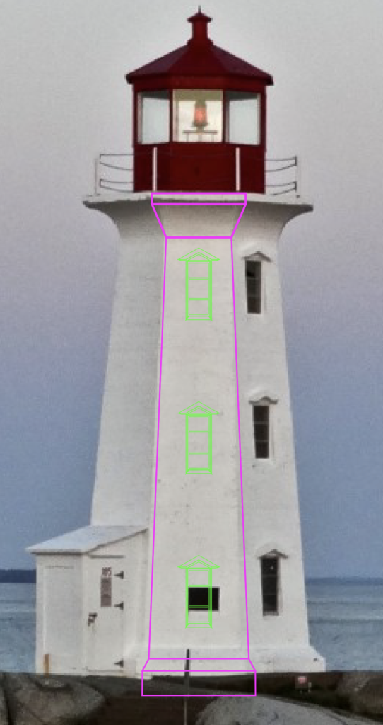
What I mean by that is begin by tracing the middle body section of the lighthouse, but then add the three windows to this section, like the other photo of the lighthouse has. So although this version of the photo is from a different angle, you’re going to use it to match the generic structure while keeping the details from the original photo. Start off by dividing this middle section into five parts: the base, the angle, the main body, the upper angle and the top lip.
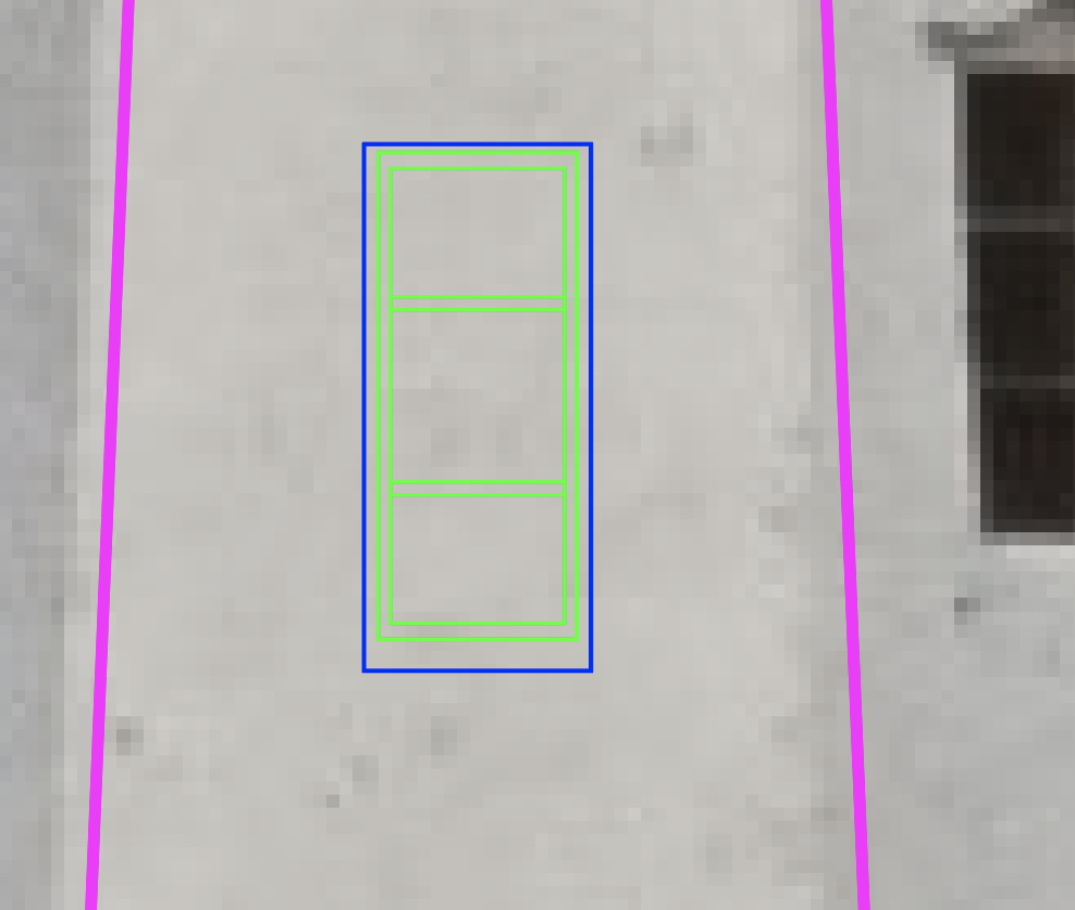
Next, move onto creating the window. Because this angle is straight on, it is easier to get the glass and window perspectives right. Build a rectangle for the glass and then duplicated it and make it larger to create the window’s frame. Repeat this process another time to line up where the window’s frame perspective lines up (blue outline), since the window is technically inset in the building.
Lastly, add the horizontal cross sections on the window. Do this by making a small rectangle across the inner-most rectangle, put it in the center of the object and duplicated it. Then move each one upwards and downwards the same distance. An easy way to move shapes and objects is to use Shift + Arrows. This moves it greater distances than just the arrows. It also makes it easier to keep track of how far you move objects by counting how any Arrow presses you do.
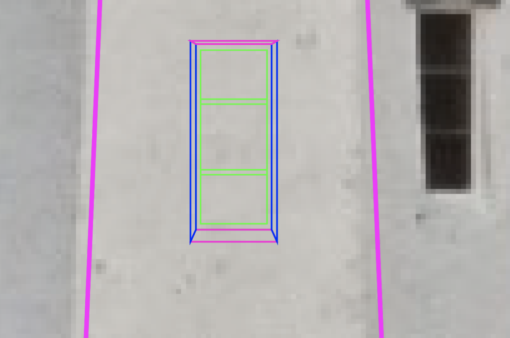
The next step is to use the pen tool and fill in the gaps between the second and third rectangles on the window. As seen in blue and magenta outlines, create a left and right perspective followed by a top and bottom one. These are to help give the window the illusion of being inset in the building.
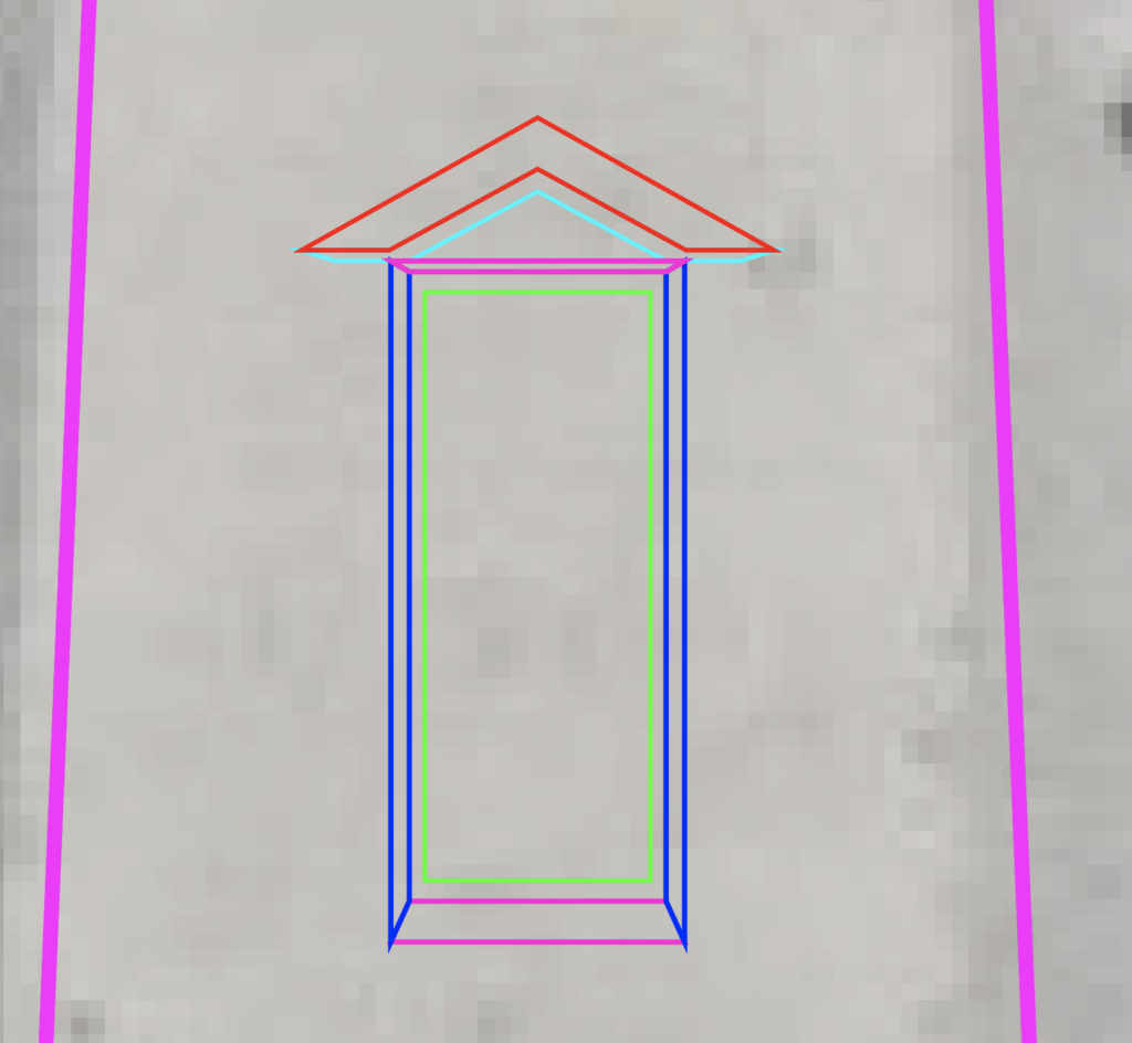
The last step on the window is to create the triangular overhang part above the window (Red). Again, this will need a perspective shape (teal) behind it in order to give it the illusion of being three dimensional. Next, select the objects that are part of your window and group them with CTRL/CMD + G, hit CTRL/CMD + C, then CTRL/CMD + F to paste a copy in place and drag the window upwards. Do it one more time to place the bottom window. Group your middle section and the windows together using CTRL/CMD + G.
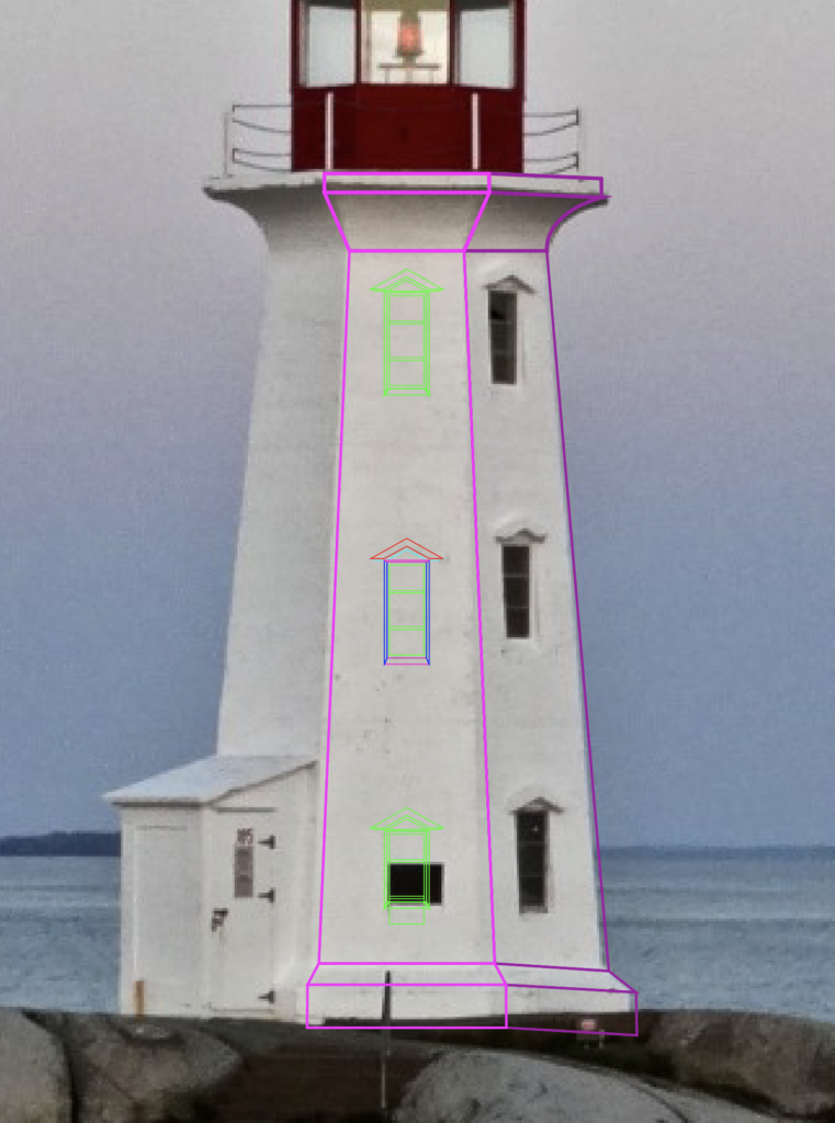
Since this method creates a symmetrical lighthouse, we only need to worry about making one of the side sections. I started with the side with the right. Use the middle section to help you align everything and try to match the body of the lighthouse. Don’t forget to curve the line to match the shape of the lighthouse. You can quickly access the Anchor Point Tool to manipulate the curvature of lines with Shift + C. Once you’re happy with how it looks, group it together and duplicated it.
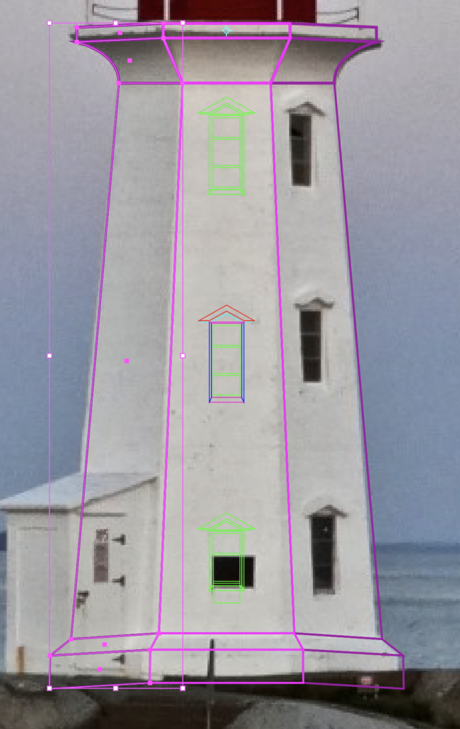
You can either right click, transform, reflect and then drag the group to the opposite side, or you can press O on the keyboard to open up the reflect tool. Left click to place your reflection point in the middle of the middle body section and then just left click and drag your mouse to spin the side area around. Either way works.
Top Section
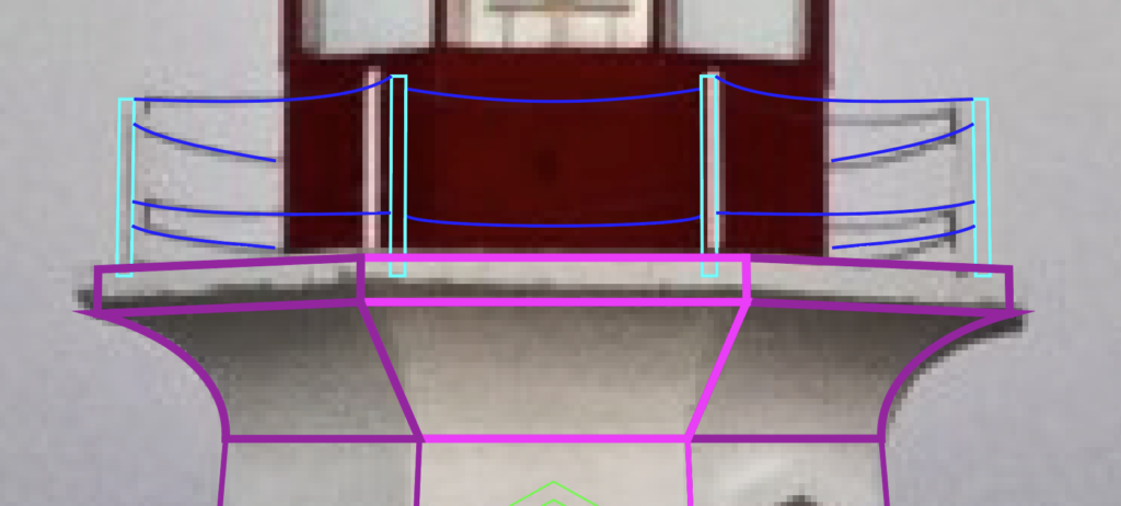
Now that the base of the lighthouse is complete, it’s time to move up to the upper section. Mark the four spots where there are posts around the perimeter of the top section. Make sure the chains stop at the bounds of the red structure, otherwise it will look like your chains don’t go around. You’ll notice that this picture isn’t perfectly symmetrical, but for the purposes of this tutorial, we can pretend that it is. Again, you only need to make one side of this area first. Once you’ve done that, group and duplicate and use the same techniques I mentioned in the above section to create the entire rail area. Keep in mind that when you order the layers, you’ll want to place this in front of the next section we create, but after the body section below.
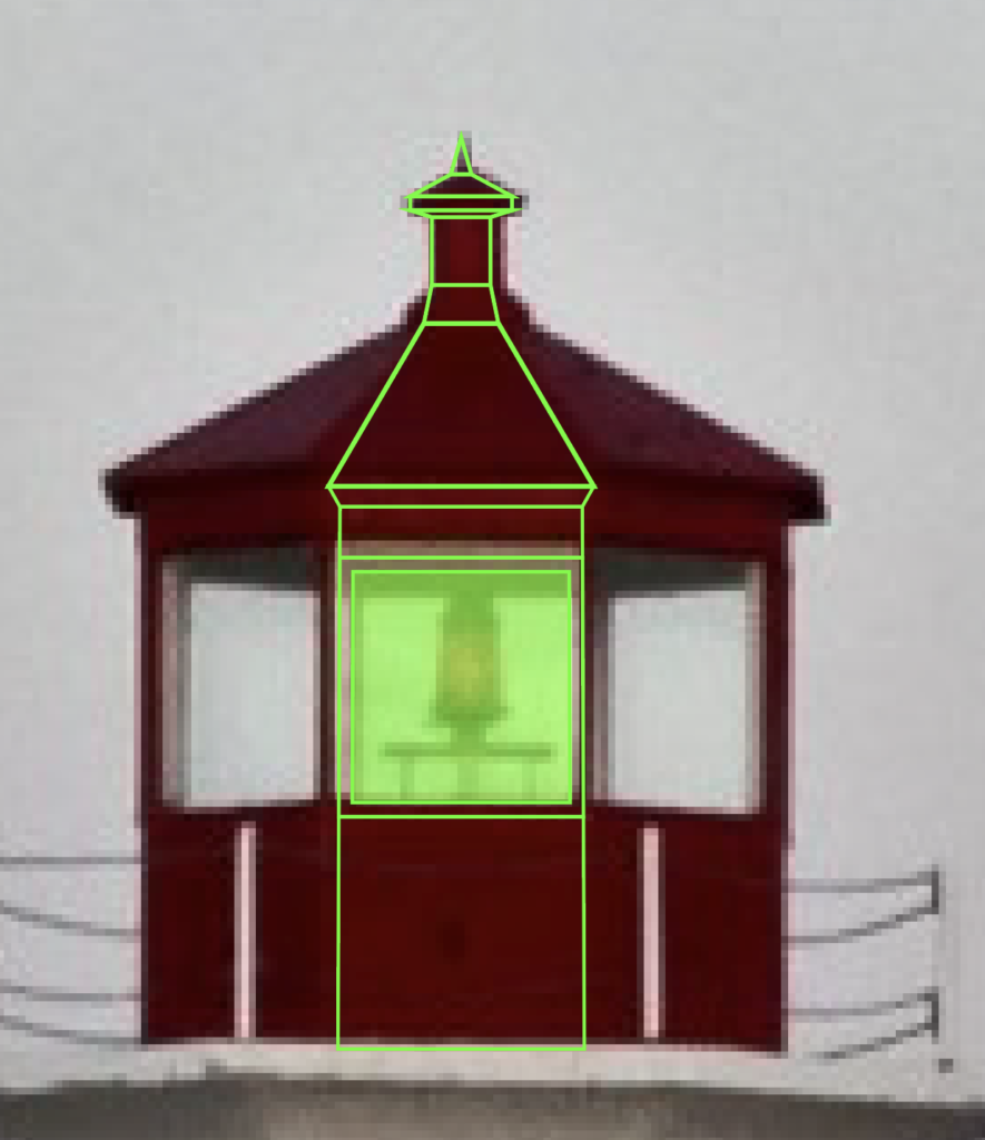
Alright, so the next section is going to be the Red area that houses the light and makes up the roof. Start with a square-like rectangle for the base. Then make another one for the area that houses the window. Duplicate that rectangle with CTRL/CMD + C then CTRL/CMD + F to paste it in place. Now shrink it to match the size of the glass. Select both of those rectangles, make sure the smaller one is on top in the layers panel, navigate to the Pathfinder panel and choose Minus Front. This creates a complex path that basically hollows out the square.
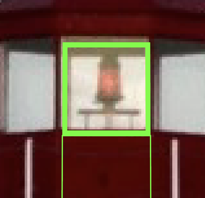
This way, you can create the frame of the window. Remember, you’re going to want to see through in order to see the light. You can fill in that area with another rectangle and adjust the transparency in order to create a glass effect.
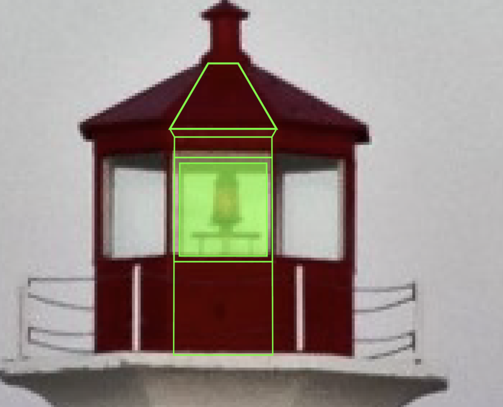
Next, add the sliver that’s above the window and create the roof that goes up to the top detail. Don’t forget to leave some space so you can add some perspective to make it look like the roof hangs over the window. The topmost part of this section will attach to the top detail.
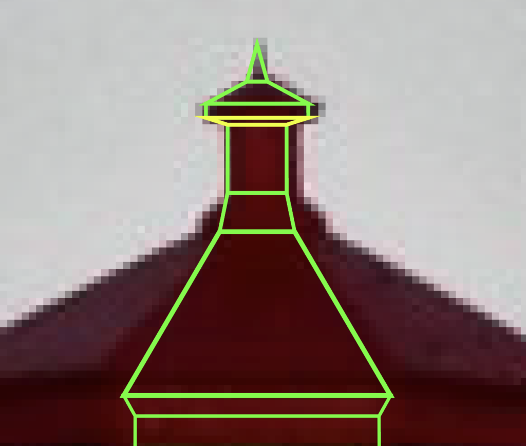
This section is basically a small version of the main red area. Make a bottom section, the middle, the “roof” and the perspective (in yellow) where it attaches to the middle part and the top pointy thing. The picture makes the outlines look disconnected from each other, but that’s just because of the sharp angles and the difference in line thickness.
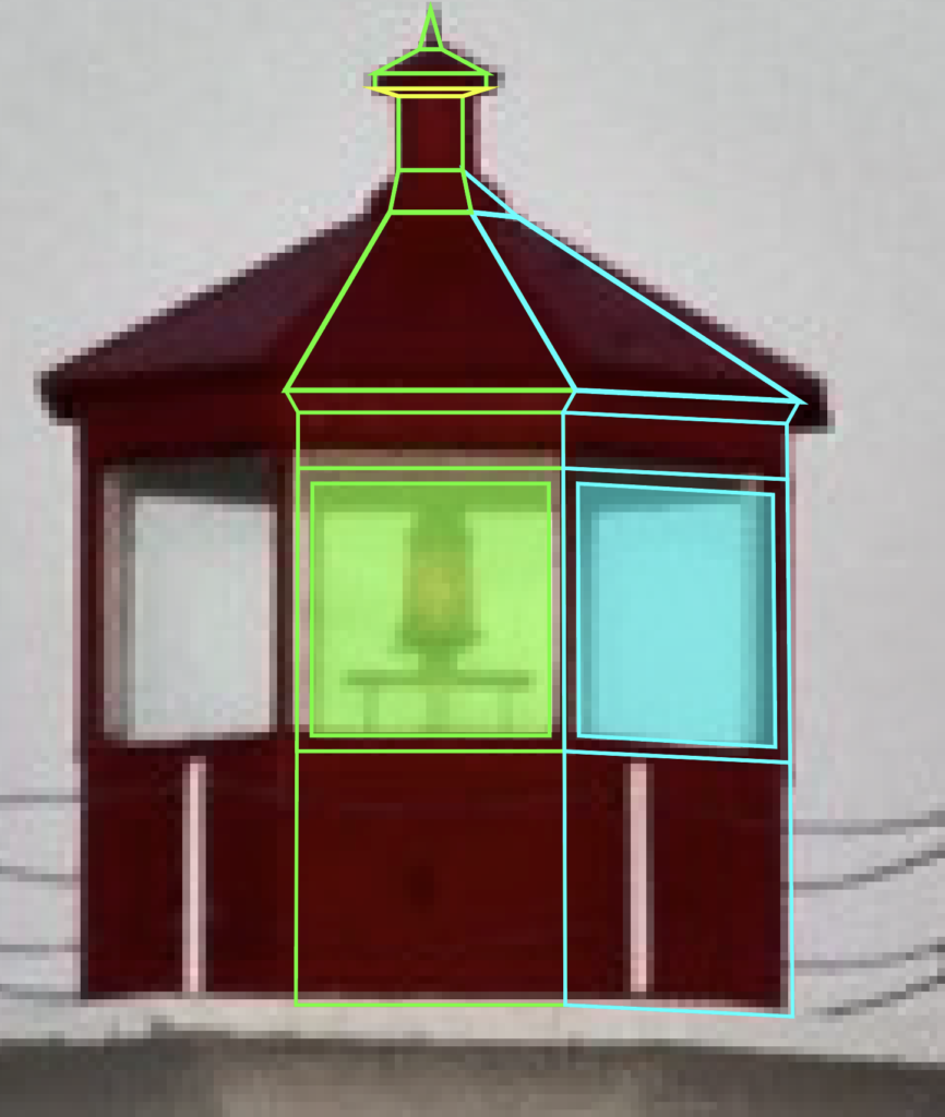
Next, we move onto the side next to the middle of the red area. Duplicate the middle area, move it over to the right, align your anchor points and then adjust the perspective to match. If you wanted to, you could build this side from scratch, but I find it easier to duplicate the middle and then adjust it to match what I need from there.
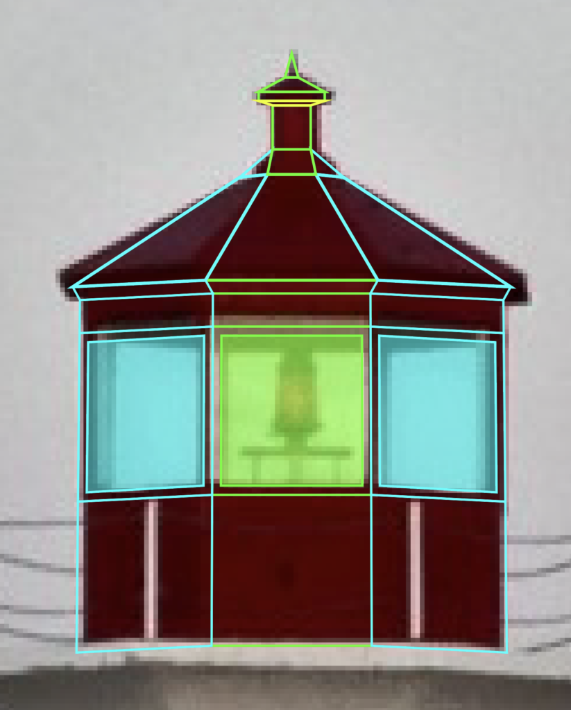
Using the duplication and reflection techniques I previously mentioned, create the left side. There, you’ve just recreated the entire top area. All that’s left is to make the light.
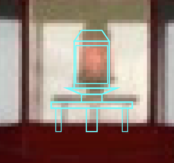
Next, we have to draw the actual light fixture. There’s a main body, the light itself, a top area and a base structure on which it sits. Make sure to place it behind the Red Structural pieces in the layers panel.
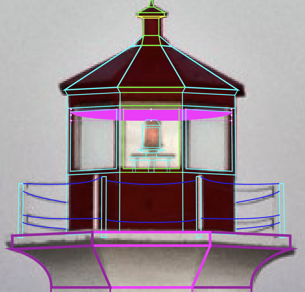
Another thing to remember on this top section is the perspective on the ceiling and the back of the structure that is visible through the glass. This section is filled in with magenta.
Side Entrance
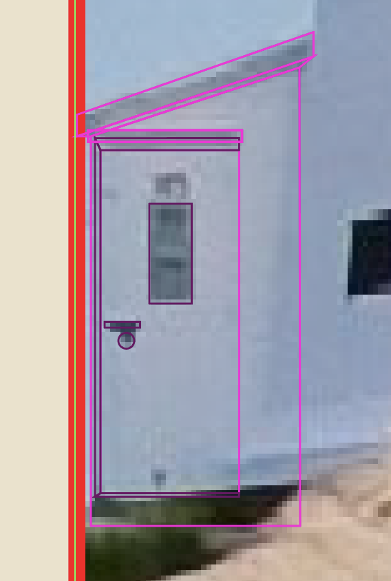
The last part we need to draw is the entrance on the side of the lighthouse. For this, I went back to the original image, because I wanted to get the perspective right. Go ahead and switch back to the original image if you haven’t yet. Select and group all the objects that make up your lighthouse. Then move the group over top of the lighthouse from the original image, shrink it and try to line it up as best as you can.
To draw the side entrance, start by drawing the roof, roof perspective (dark area), then the body of the structure, then the door and the doorknob and door perspectives to give it some semblance of depth. Now, I tend to maybe overdo it on the details of my buildings. The truth is that you could probably do without the perspectives and your structure would be perfectly fine.
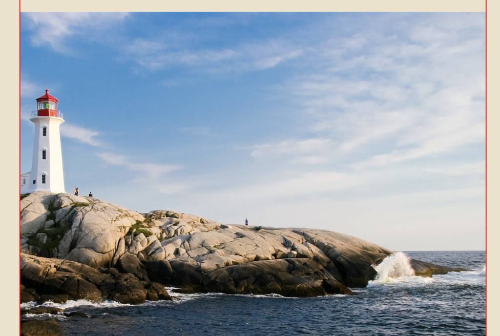
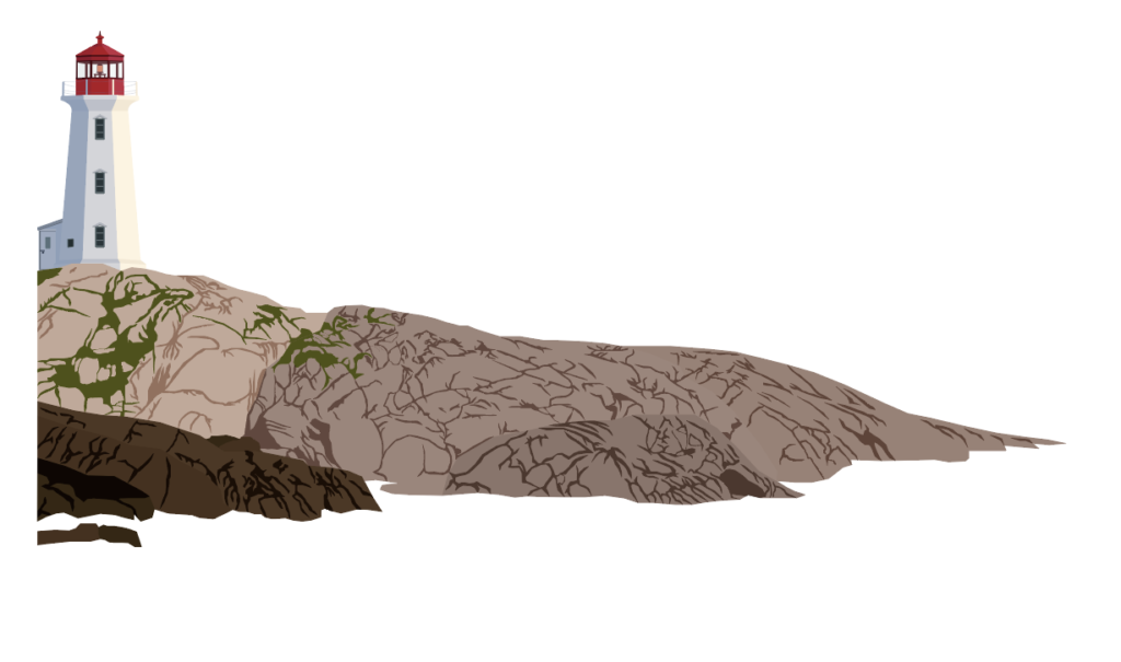
Then, just start adding your color to the shapes you made. I like to use the eye dropper tool and pull from the actual image. So, once you put it all together it might look something like mine.
Sky and Water
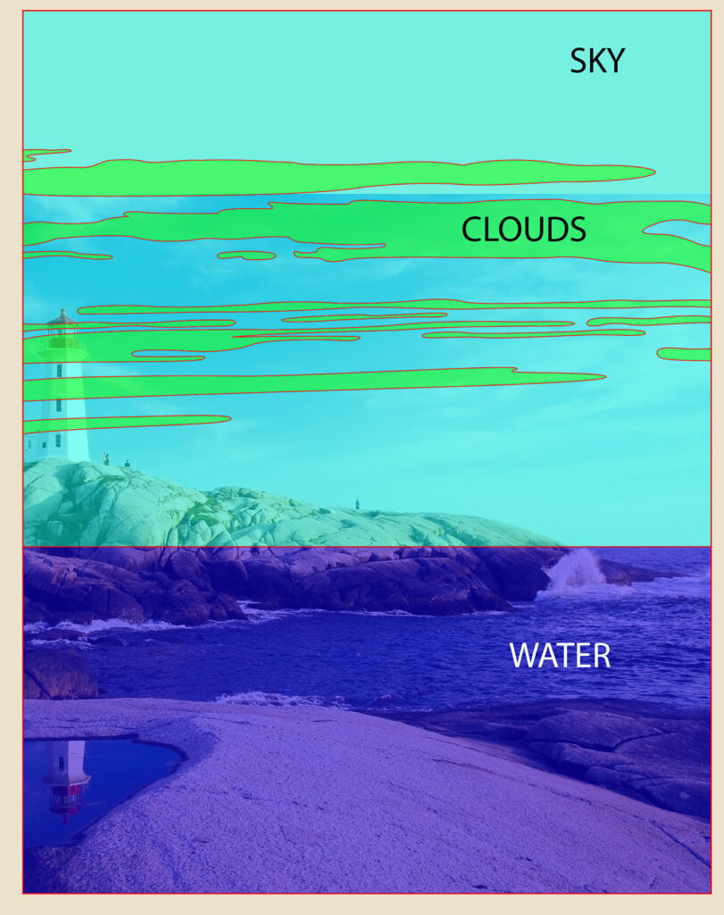
Sky
I always do these sections last since they are at the back of the image. Just draw a rectangle that covers the area where they sky is. Then match up a second rectangle and draw it downwards to create the water area. The sky is pretty simple, because you can just use the eye dropper tool to match the blue from the image.
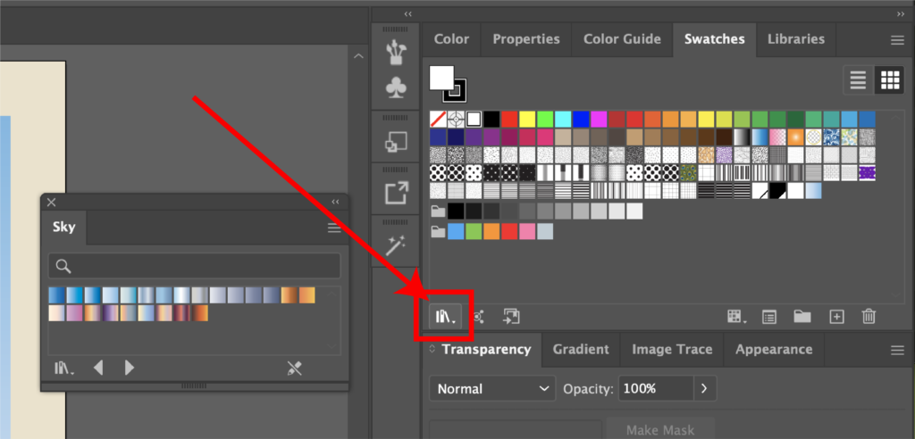
Another option is to open up the Swatches Menu by going to Window, then Swatches. In the bottom left corner, there is an icon that resembles several books. Click that, then gradients, then sky. This will bring up several pre-made sky gradients.
There are lots of options that range from daytime to overcast and beautiful sunsets. Once you find one you like, just click on it and make sure the angle is correct in the “gradient” window. For some reason, mine always defaults to a zero-degree angle, so I have to change it to ninety degrees. The nice part too is you can always edit the colors to make it your own.
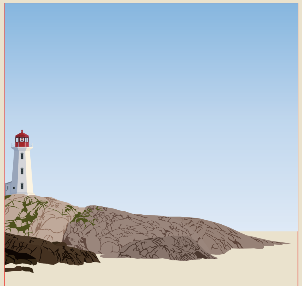
But for this poster I just used a pre-set, daytime gradient that I felt matched the picture. The last step to complete the sky is to add in the clouds. I often find that clouds are difficult to draw. Which is why I almost always simplify them.
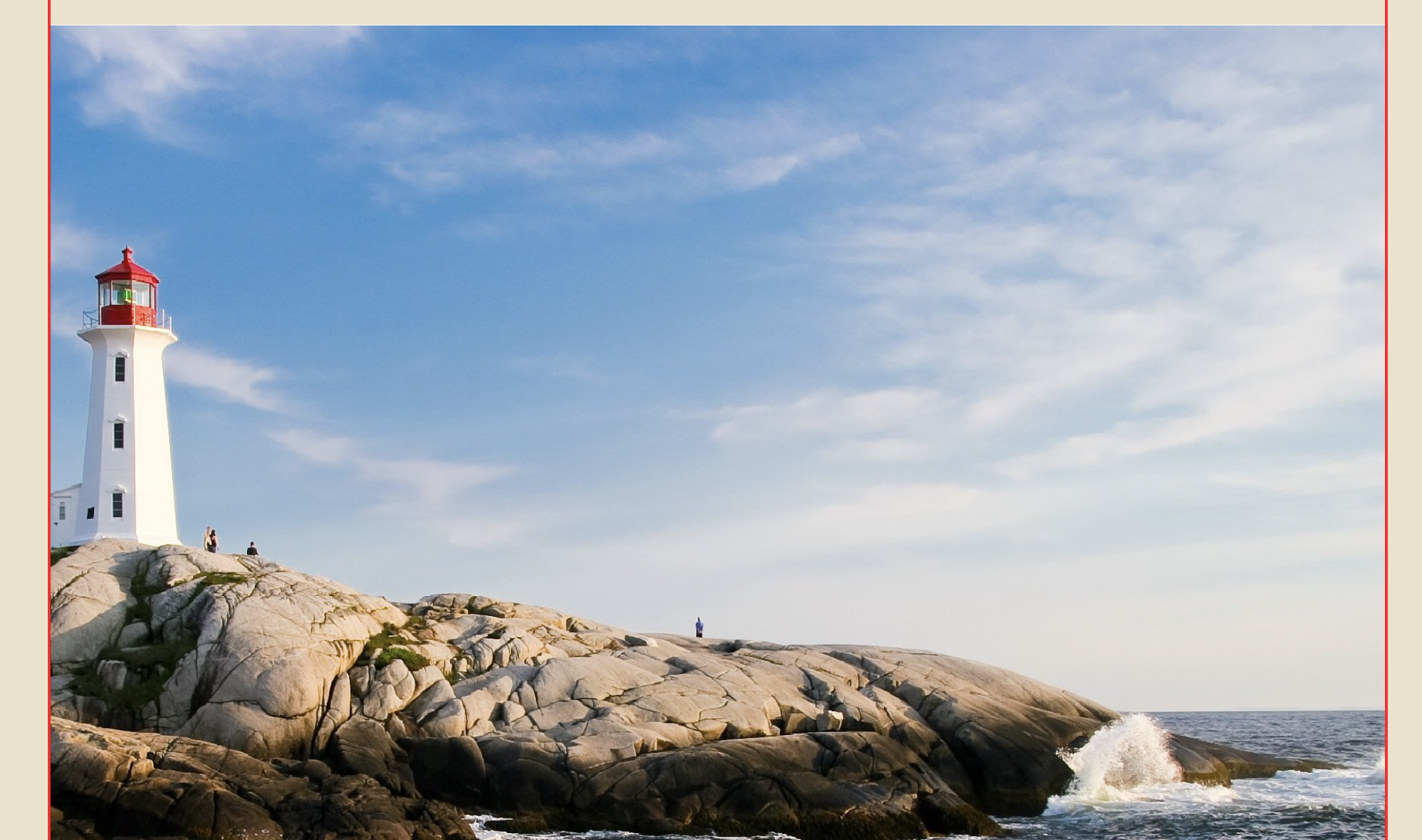
As you can see, in the original image, they are quite wispy and drawing these would be pretty difficult.
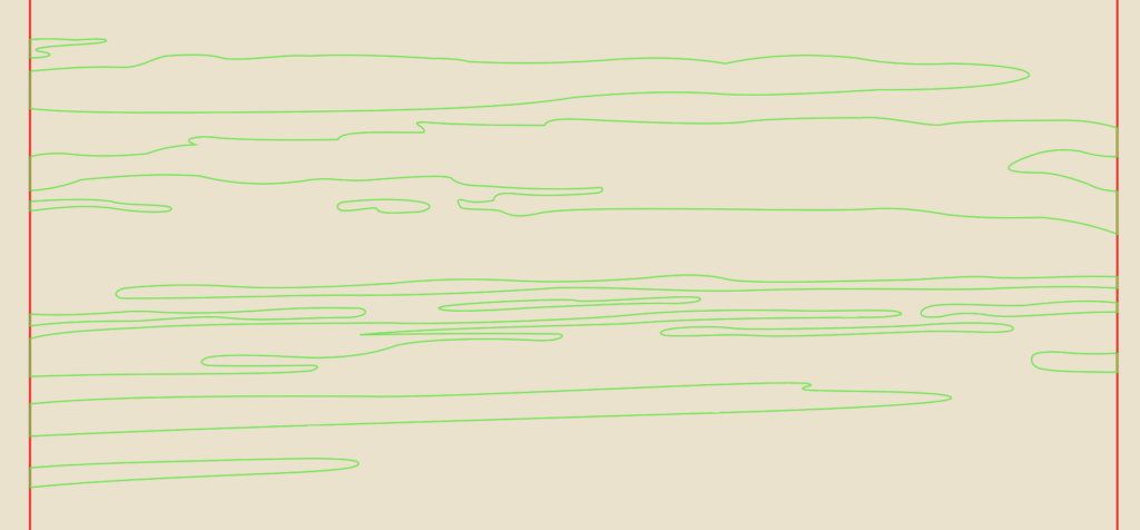
So, to make this easier, try to draw long, skinny clouds that look pretty wispy. Use the pen tool and the Anchor Point tools to draw the shapes and eliminate any jagged edges by rounding them.
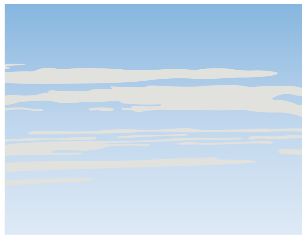
Then, instead of leaving them as outlines, select them all and use the eye dropper tool to pull the color from the clouds on the image. As you can see in the image above, it still doesn’t look right. The color is too harsh and they don’t look like real clouds.
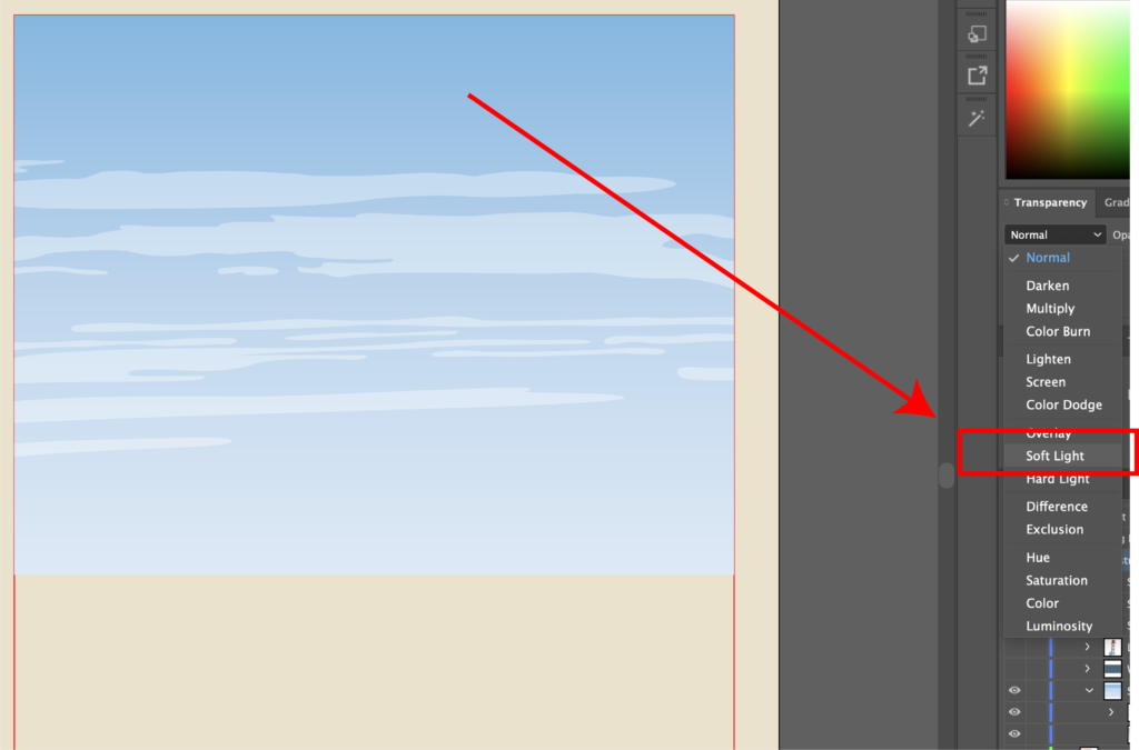
There’s a pretty cool tool that might get overlooked by a lot of people. In the Transparency menu, you can use the dropdown next to where it says “normal.” This is the blend mode drop down. What you’re going to want to do is select all of them, then find the blend mode menu and select soft light. As you can see in the picture, it adds some transparency to them. Since they are on top of the sky, which has a gradient, they pick up that color change and look more like real clouds. If you want to add your own flair, you can add some birds or a boat in the distance (not pictured here).
Water
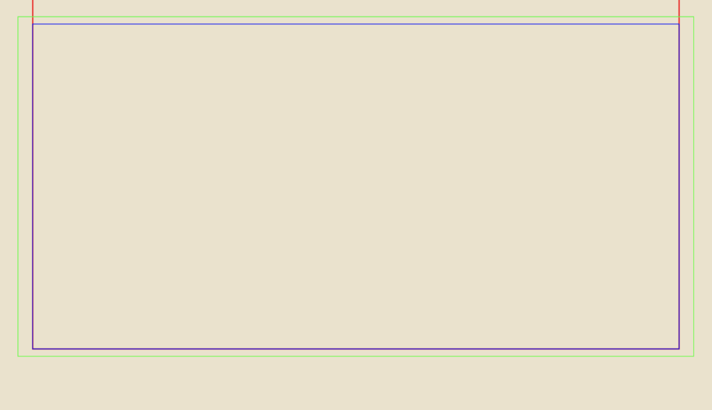
Next, we move onto the water. Water can also be very difficult to capture. However, I’ve discovered a technique that I’ll share with you. If you’d like to find the tutorial where I originally found it, you can click here. So what you’re going to do is select the rectangle you created for the water earlier, hit CTRL/CMD + C, then CTRL/CMD + F to paste it in place. Next, select the copy and expand it so that it is larger than the original one.
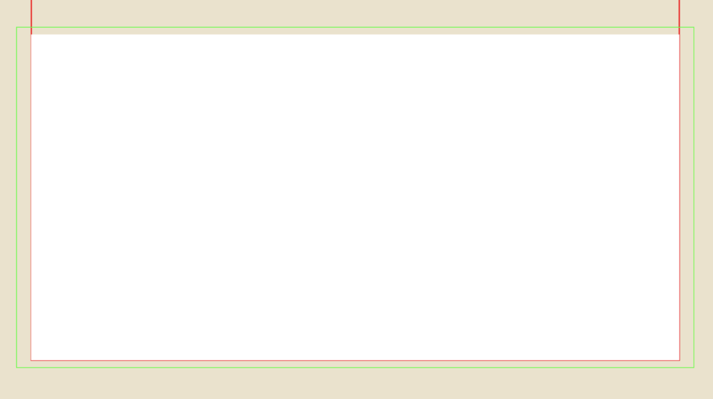
I like to call the original layer, “water base” because when we apply the effect to the top layer, this will serve as the detail for the waves. I also typically make the “water base” layer white. You’ll see why in a little bit.
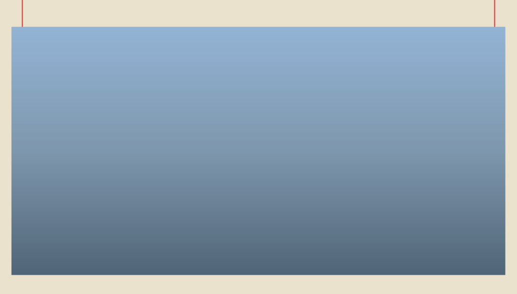
Next, let’s focus on the layer you duplicated and scaled up. Let’s call this “water top.” Just like the sky, I like to try and give my water a gradient. You can use the same method as the sky, or simply use the eye drop tool on the sky layer and then adjust the colors manually. If you hit “G” on your keyboard, you’ll get the gradient tool. You can click and drag to create it along the layer and select individual nodes to find a different color. I like to use the eye dropper tool and try to match the original image as much as possible.
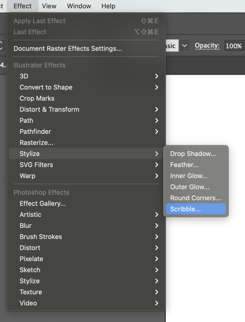
Here’s where the fun starts. Select “water top” and go to Effect, Stylize, and Scribble.
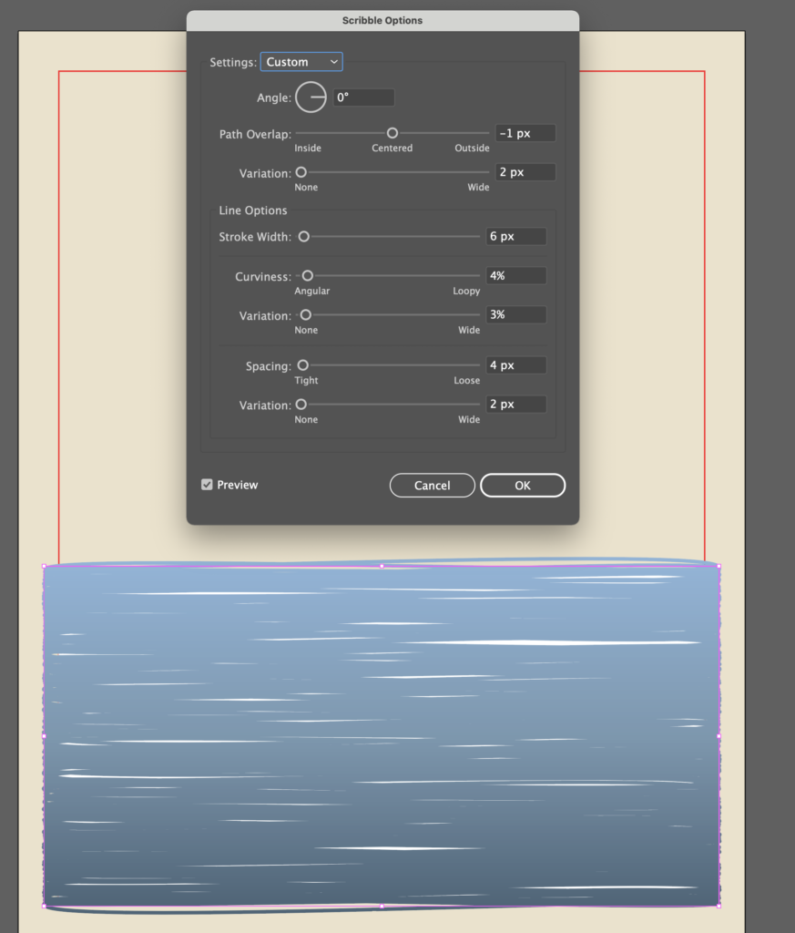
Then try to match similar values to what I did in the image. This creates gaps in the shape and it exposes the “water base” layer, which creates the illusion of waves. Feel free to mess with the values in the scribble menu as much as you want.

Now, we need to capture only the area that is going to appear on our final illustration. To do this, select the “water top” layer, go to Object, Expand Appearance. This turns the scribbles into an editable object.
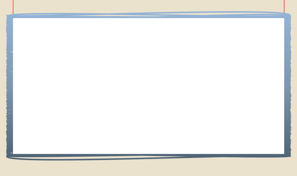
Duplicate the “water base” layer, rename it “crop area” and move it over the expanded “water top” layer in the layer side bar. It should look like the image above.
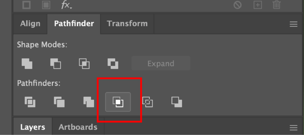
Select both the “crop area” and “water base” layers and find the Crop option in the Pathfinder menu.
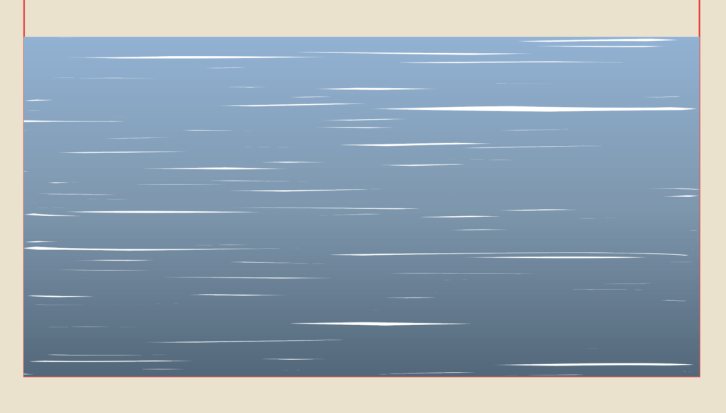
What you’re left with is a rectangle that resembles water.
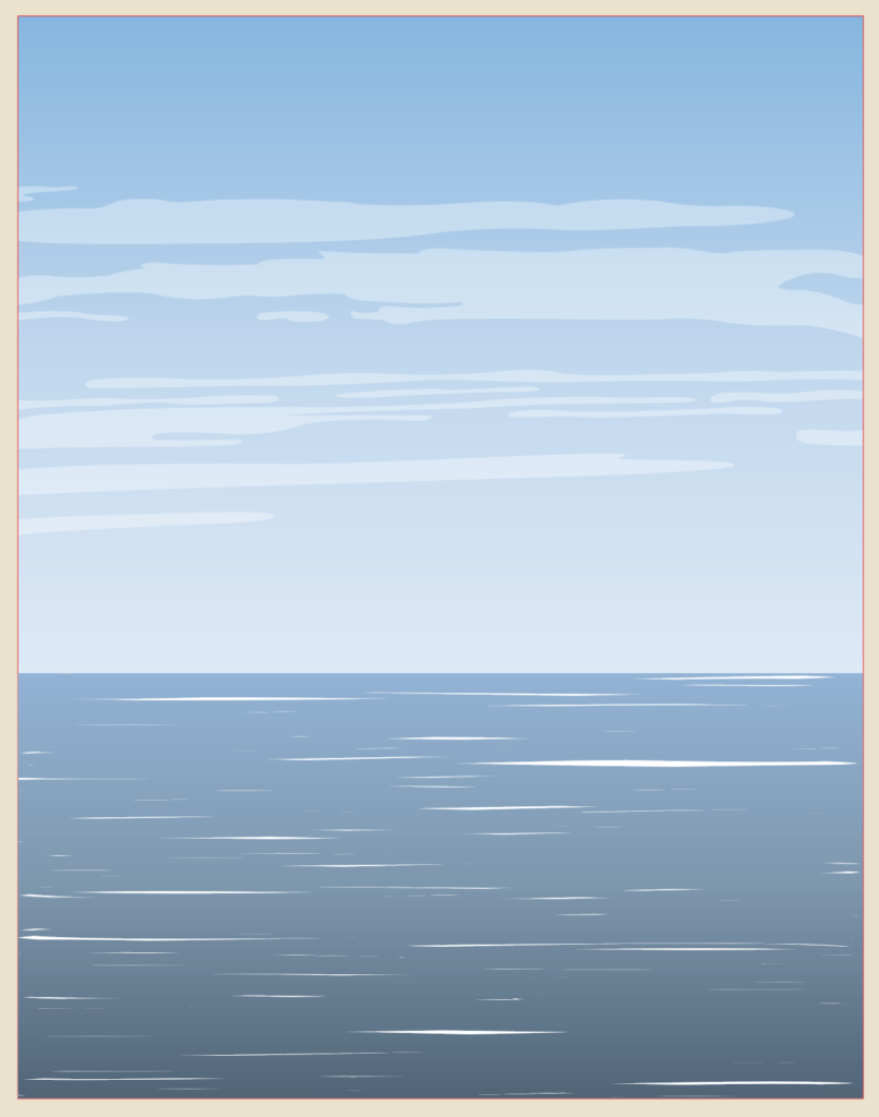
Here is how both my sky and water ended up turning out. If you wanted to, you could manipulate the water areas so that it looked more like it was going around the shoreline and the rocks or draw your own shapes, but I’m pretty happy with how it turned out.
Finishing Touches and Text
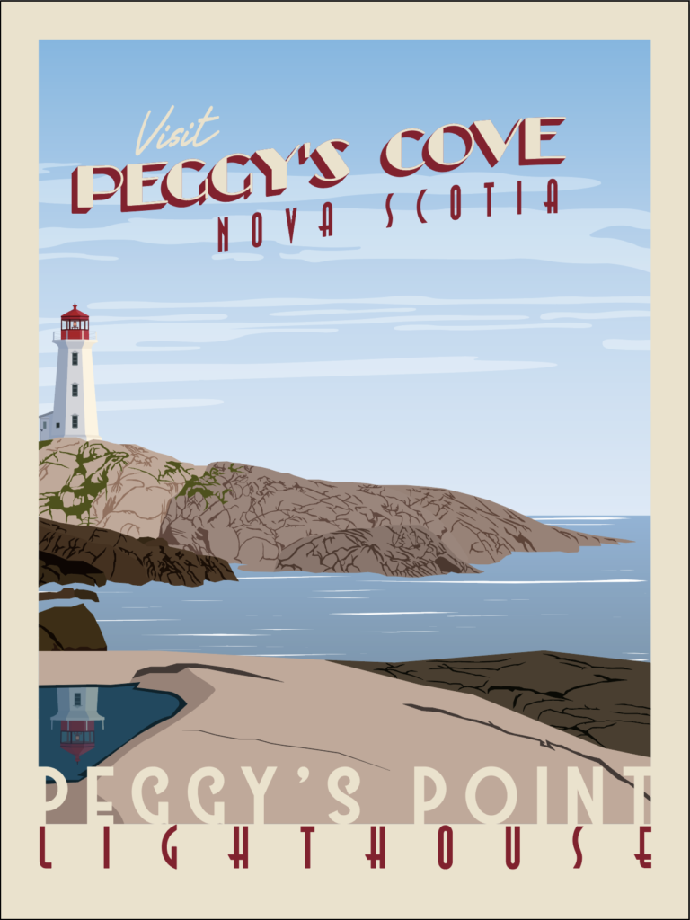
It is time to put on the finishing touches. In the original image, there is a reflection of the lighthouse in the puddle on the nearest rocks.
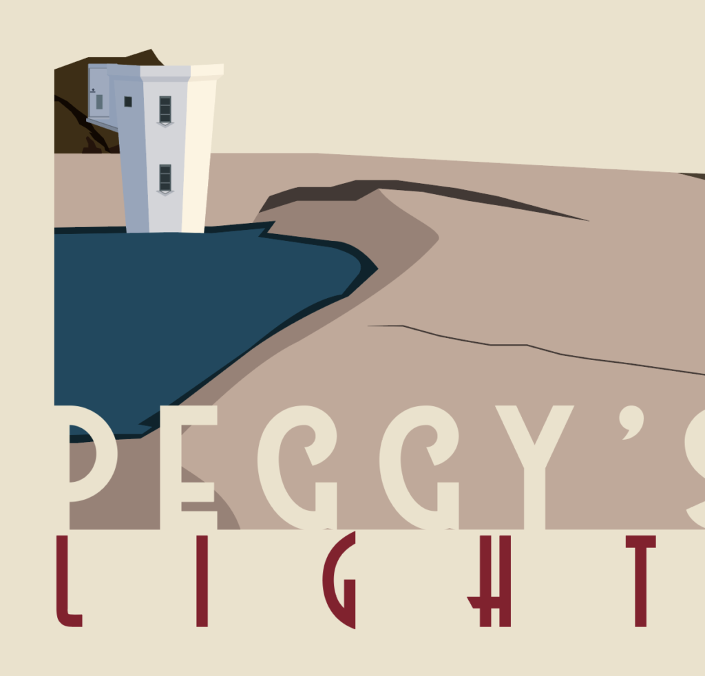
So what you’re going to want to do is duplicate the lighthouse from earlier, reflect it so that it is upside down and move it over top of the puddle. Then duplicate the puddle layer, move it on top of the lighthouse in the layers panel so that it looks like the image above.
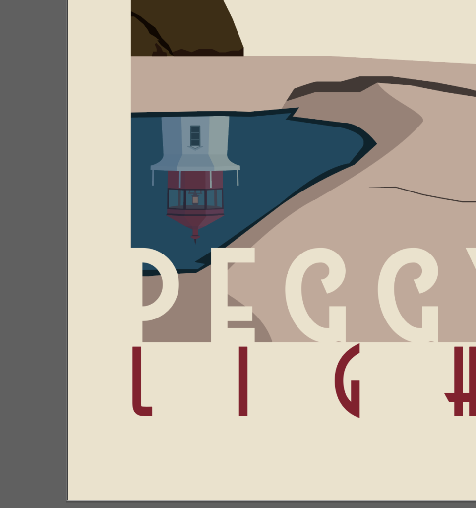
Next, select both layers and use the crop option in the pathfinder menu, like you did with the water earlier. Either mess with a blend layer or drop the transparency, or both and it’ll look like a reflection.

Now when it comes to the text layers, there are 2 main sections. The top and the bottom. I’m going to start with the top. You’re free to do whatever you think looks best, but I’m going to show you what I did so you have an example to reference. All these fonts are free and are available for commercial use.
In the top section, I always try to write something like, “Visit” then “City/Town, State/Country.” Let’s start by writing the word “VISIT.” I used the High Summit Font, but you could use any handwritten font you like. Next, write “PEGGY’S COVE” in the Better Book Font, or whatever you choose. Then, write “Nova Scotia” in Astrud Font below that.
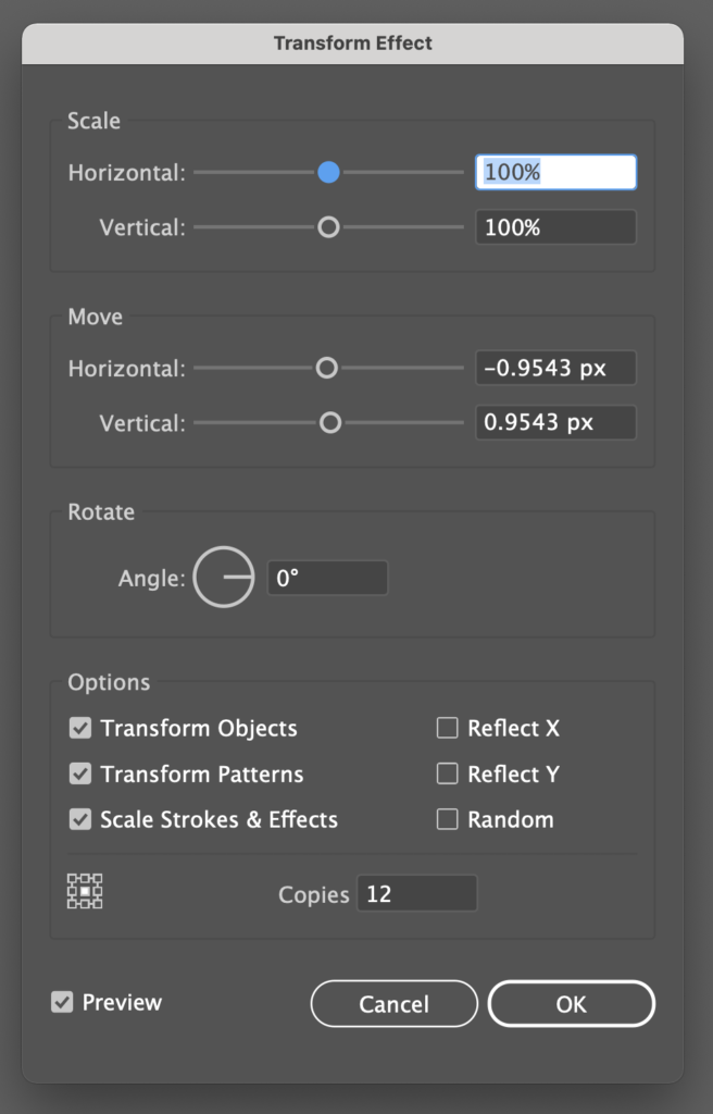
In order to get the shadow look on Peggy’s Cove, duplicate it in place, go to Effect, Distort & Transform, Transform and use the values I entered in the image and place it below the original Peggy’s Cove layer.
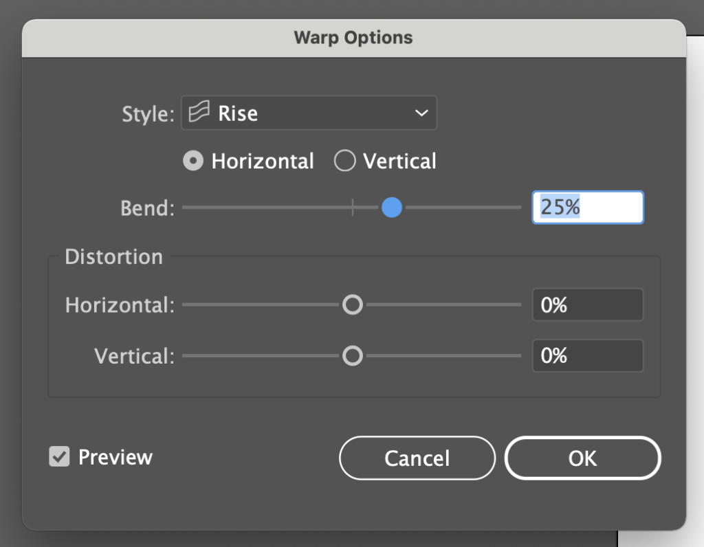
Next, group Peggy’s Cove, the shadow and Nova Scotia together. Then go to Effect, Warp, Rise and use the values from the image.
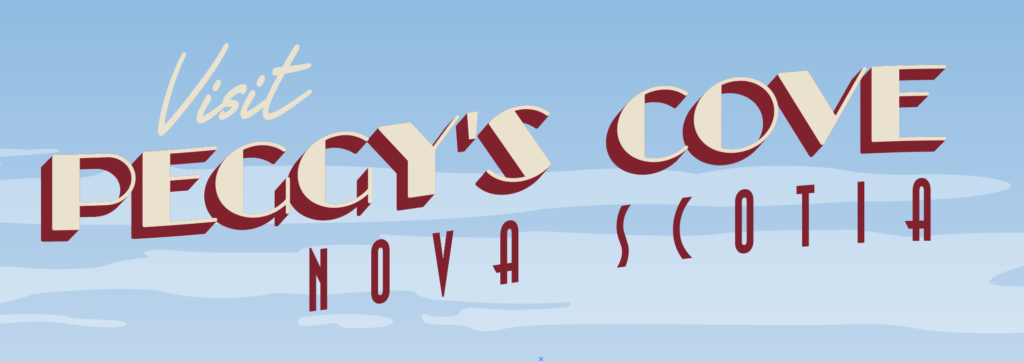
Finally, make Visit and the Original Peggy’s Cove text layers the same color as the tan background. For the shadow and the Nova Scotia text layers, I used the red from the lighthouse roof. I always try to find an accent color that looks good and sticks out from the illustration. And that’s it for the top section.

For the bottom section I typically write the name of the specific thing that was created in the illustration, rather than just the place. In this case, the town is called “Peggy’s Cove,” but the scene we drew is called, “Peggy’s Point Lighthouse.”
To get started, write “PEGGY’S POINT” in the Westmeath Font, or whatever you want. Try to make it line up with the bottom of the red outline and just spill over on the left and right side. You want it to blend in seamlessly on each side with the poster background. Then, underneath, write “LIGHTHOUSE.” I reused the Astrud font from earlier. Try to make this one line up at the top with the bottom of the red outline and stretch across widthwise without spilling over the side. Make the top text the same as the background (tan) and make the bottom text the same as the red text above.
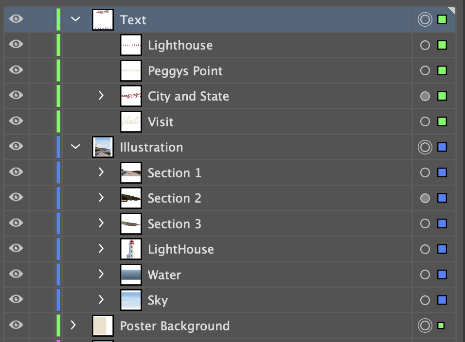
Make sure that you’ve got all your layers in the correct order. It’ll be pretty obvious if things aren’t in their proper positions. You might have named your layers differently, but it should resemble mine.

Now if you put it all together, you get a pretty nice-looking poster. But we aren’t done yet. It might look nice, but it is missing that gritty-ness and roughness that makes it look vintage. So open up Photoshop and create a new project that is 18 inches wide by 24 inches tall, since that’s the size of the illustrator artboard.
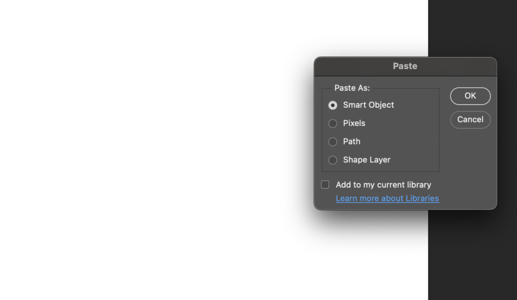
Go back to Illustrator, select all the layers (Poster background, Illustration and Text), then hit CTRL/CMD + C and move over to your Photoshop canvas and press CTRL/CMD + V to paste it as a smart object. What’s nice about this is if you notice something is off on illustration, you can double click the image part on the Vector Smart Object layer and it’ll re-open in Illustrator so you can make any changes. When you save the illustrator file, it’ll update in Photoshop.
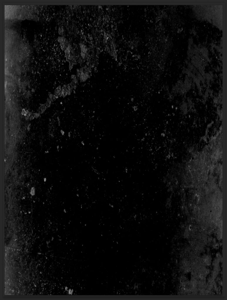
Next, I would recommend downloading some grunge or dirt brushes and adding them to your photoshop. I don’t recall where I got mine, but you can find a bunch of free brushes here. Create a new layer above your illustration and using the grunge or dirt brush, start painting on that layer using either white or a very light color. In the image above, I added a black background behind my grunge layer so you could see how I did it.
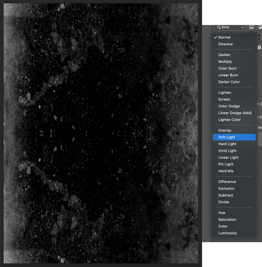
Then, I like to duplicate it and reflect it so it adds even more texture. Make sure you use the Blend Mode drop down (similar to the Illustrator one I mentioned previously) and select “soft light.”
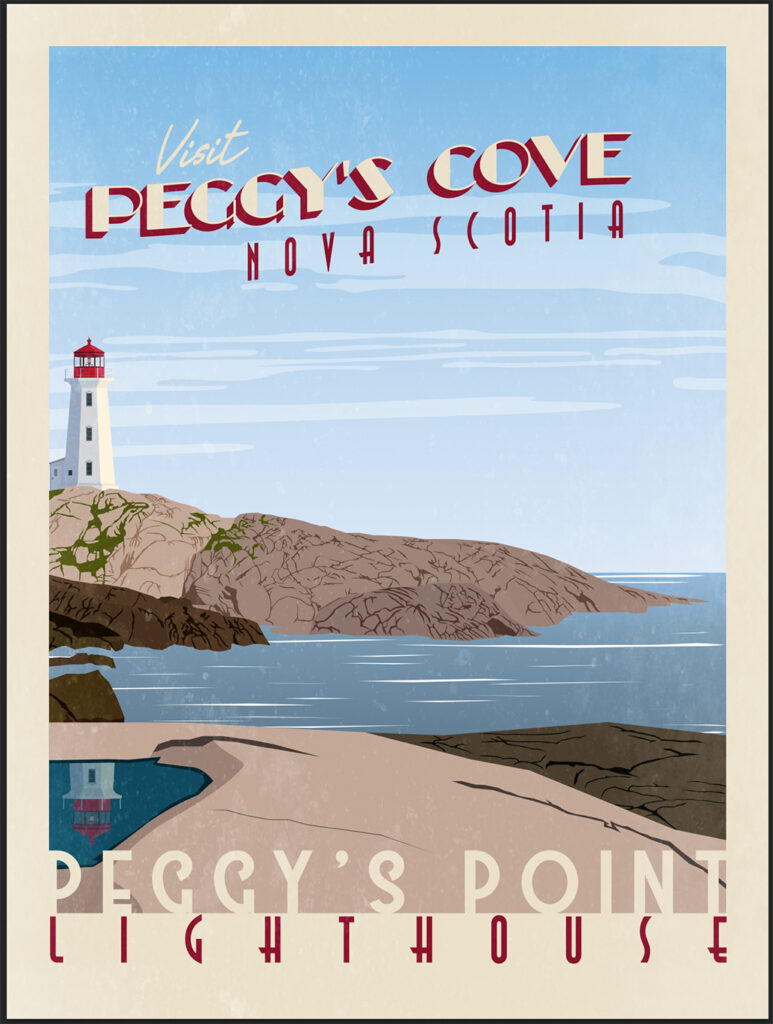
What you end up with is some texture that creates a more “vintage” look. There are plenty of other ways you can mess with Photoshop effects to create your own unique Vintage look, but I have just one more step that I like to take.
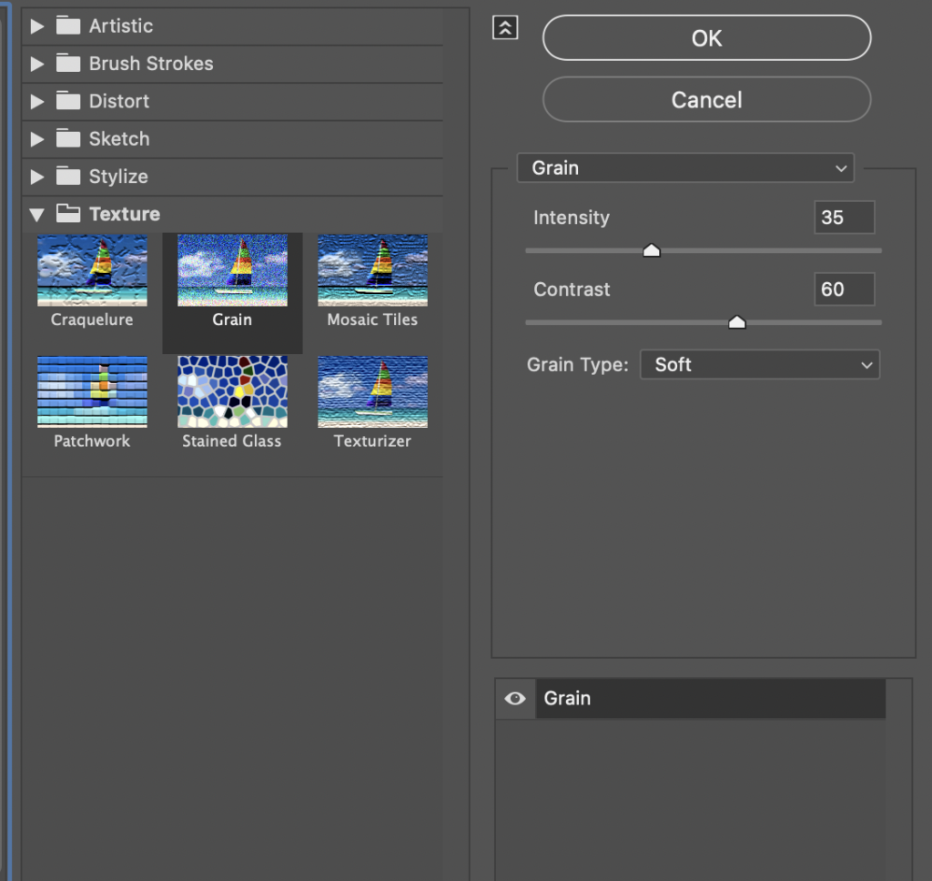
Go to Filter, Filter Gallery and under Texture, select to Grain. I try not to make it too intense, but I do like the way it looks. Choose soft grain type, make the intensity about 35 and the contrast anywhere from 45 to 60, depending on how dark your scene is. Since this one is daytime, I chose 60. When you’re done, click “OK” to apply it.
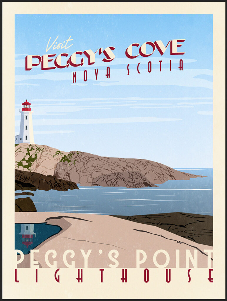
Here is how mine turned out. The grain didn’t change much, but it did make it brighter and older looking. Anyways, I know that was very long, but you just created your very own Vintage Travel Poster. Let me know what you think of my tutorial or my process. I’d love to hear some feedback. If you’ve got any tips and tricks for me, I’d love to hear them also. You can use my contact form and I’ll make sure to respond.
