I’m very excited to announce that I will be participating in two different art shows/events this month.
First Friday
On July 2nd, CASA of Sedgwick County will be hosting a First Friday event. So if you’re looking for something fun to do downtown, or if you want to support local artists and CASA, you should definitely check out this event. It is located on the 5th floor of the Orpheum building in Downtown Wichita, KS. Admission is free and doors open at 7pm.
Great Plains Nature Center
Starting on July 1st, my posters will be featured in the Owl’s Nest Gift Shop at the Great Plains Nature Center. They will be available for purchase all month long. Whether you’re going to the GPNC for a walk or to scope out the local wildlife, you won’t want to skip out on visiting the gift shop. Even if you don’t buy my artwork, there are plenty of cool things available for purchase. If you don’t see a poster there that you want, there are plenty of others available in my store.
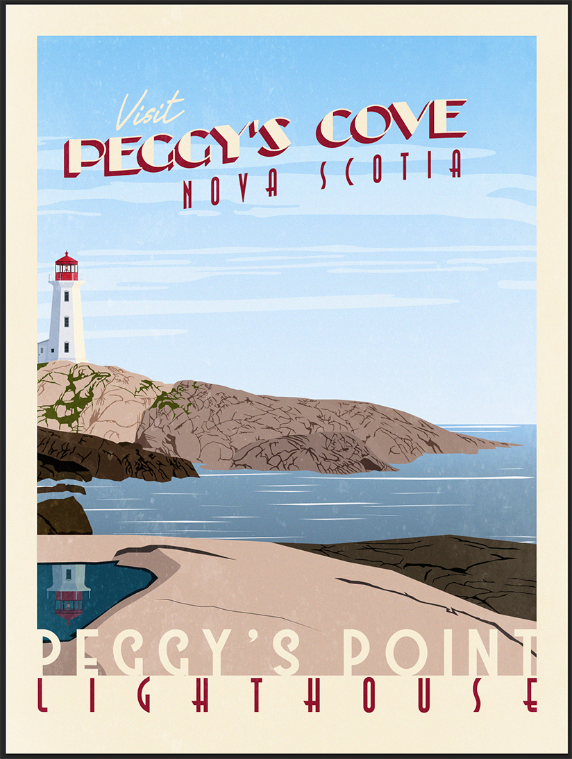
Welcome to my Vintage Travel Poster Illustrator Tutorial. I wanted to make this to teach and inspire others how I make my Vintage Travel Posters, which you can check out here. Art should be shared and celebrated, not hoarded and kept a secret. If you asked me, I wouldn’t say that I’m an expert at Illustrator and this tutorial should work for someone with a decent understanding of the program. I developed my skills and abilities over many years and slowly created this process. If you want to learn more about my “why,” click here. Basically, what I do is trace real images in Illustrator in order to create my posters.
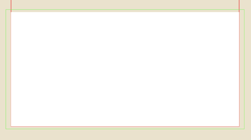
Alright, that’s enough about my story. Let’s dive right in. In order to help you follow along and get started, I’ve included the original image and an SVG File Template that you can download. I like to have the original image open at all times so I can reference it. If you don’t feel comfortable, then you can create your own illustrator template and try to match it to my specifications.
If you don’t feel comfortable, then you can create your own illustrator template and try to match it to my specifications. Keep in mind that you’ll have to try and match the photo up with mine for the rest of the tutorial to work.
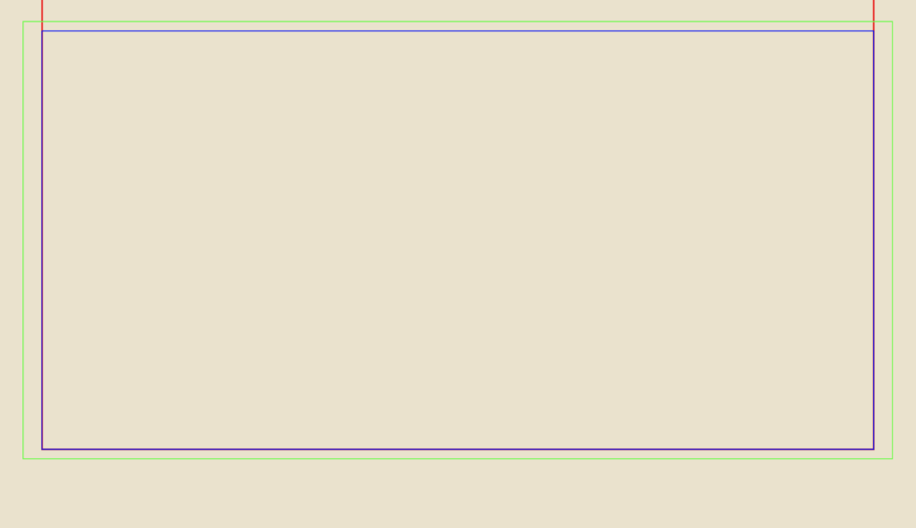
Artboard Width: 1296px
Artboard Height: 1728px
Border Width: 1152px
Border Height: 1476px
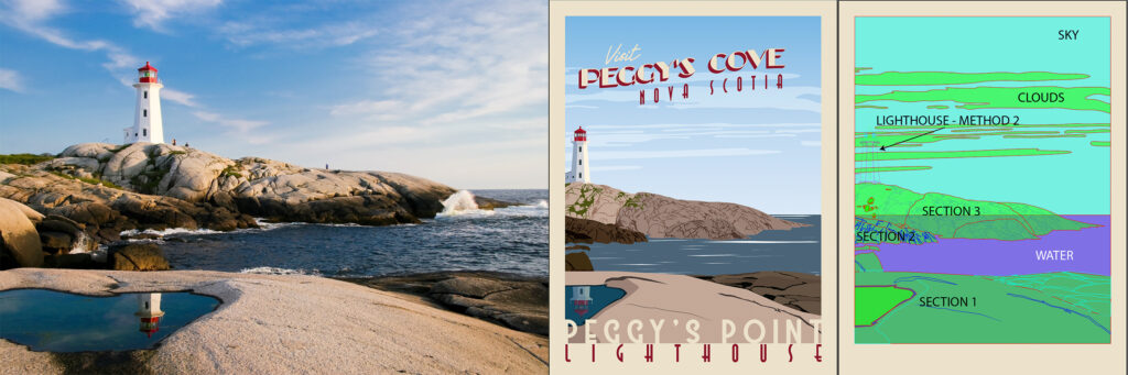
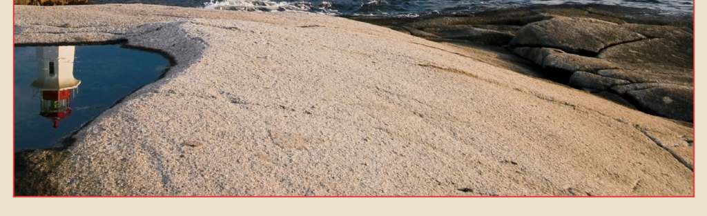
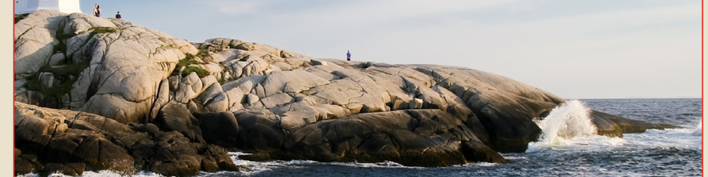
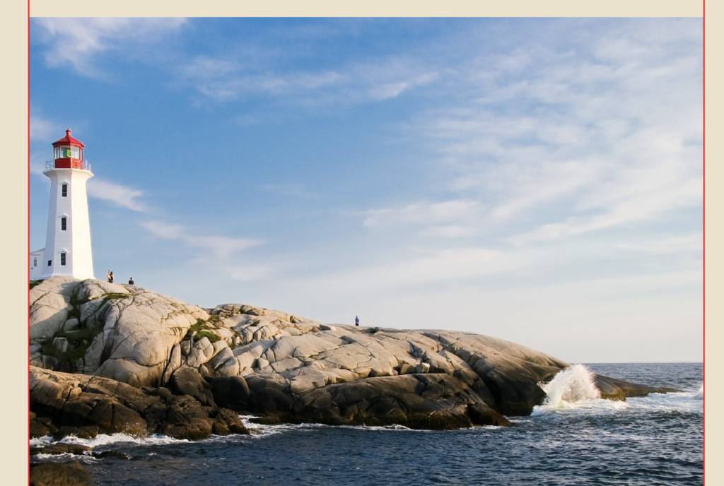
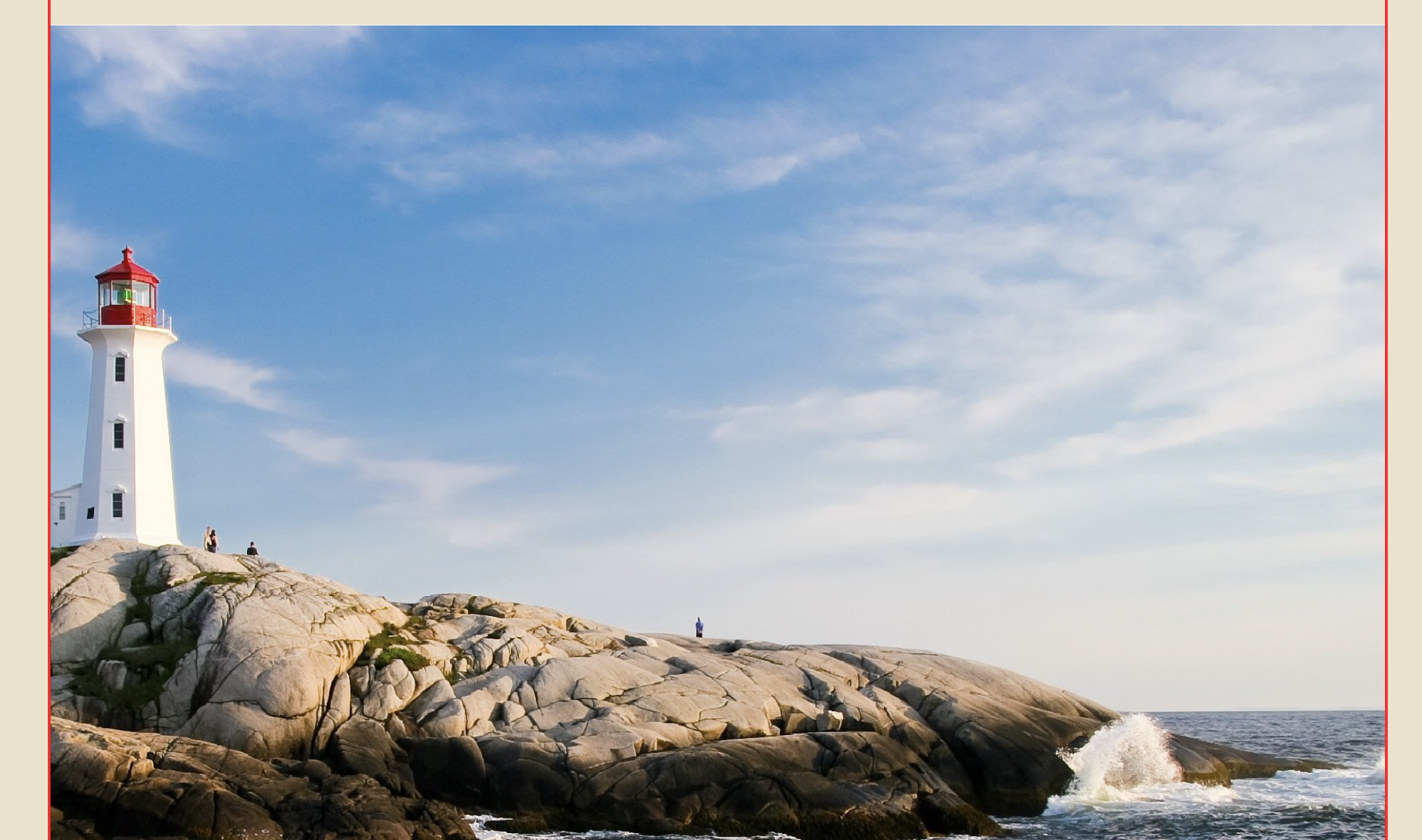
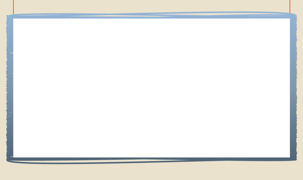
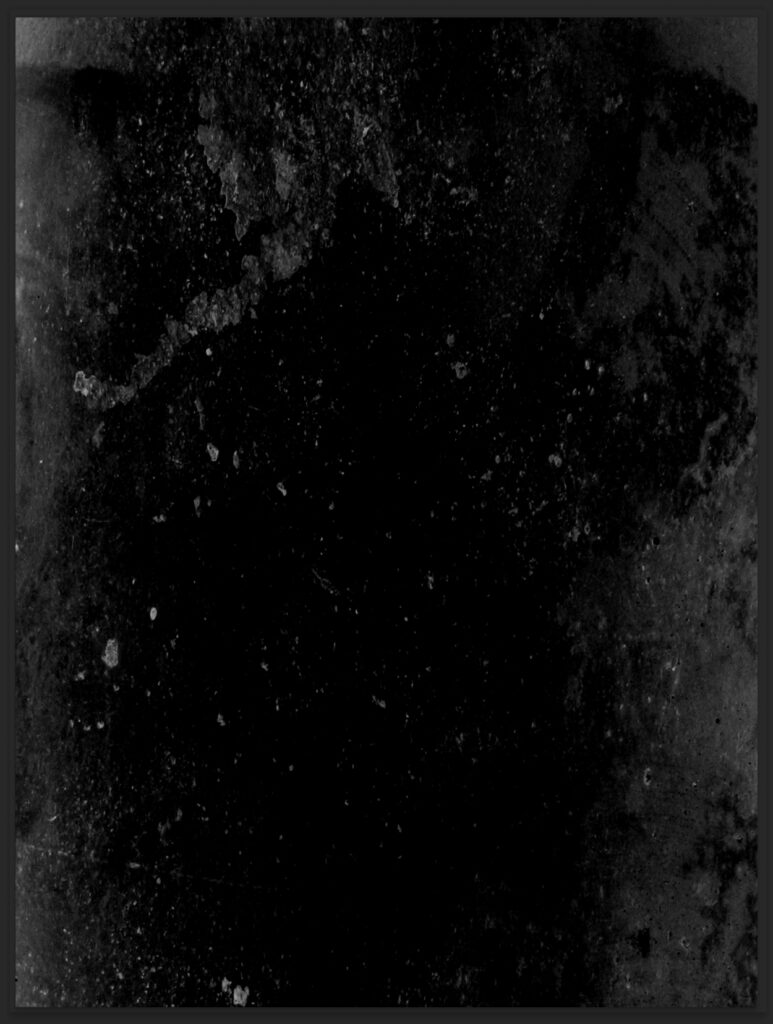
If you open the Poster Background Layer, you’ll see that I’ve already included the image I used as my model. You can find the original image here. I like to use images I’ve taken myself, whenever I can; however, there are so many places in the world and traveling can be difficult and expensive, so I rely on images I find on the internet. Pixabay is a great website for finding free images and vectors.
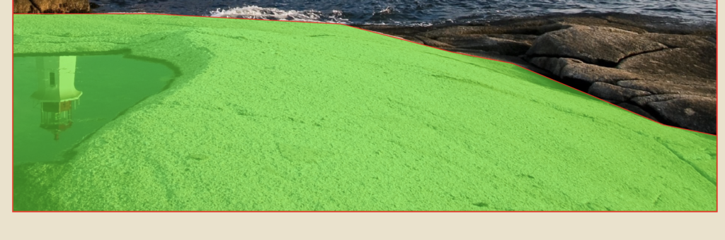
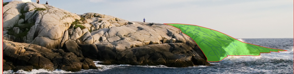
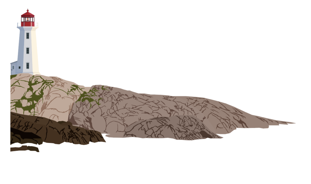
Original Image, Final Poster and Each section broken down
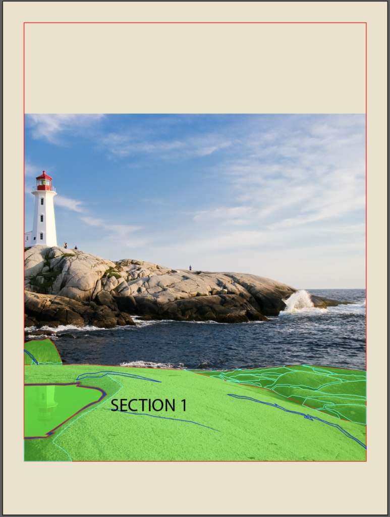
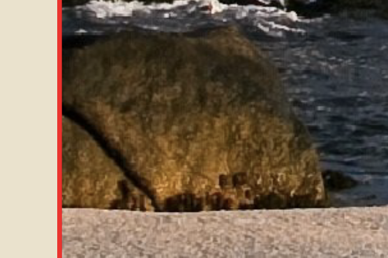
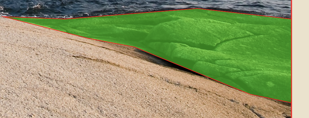
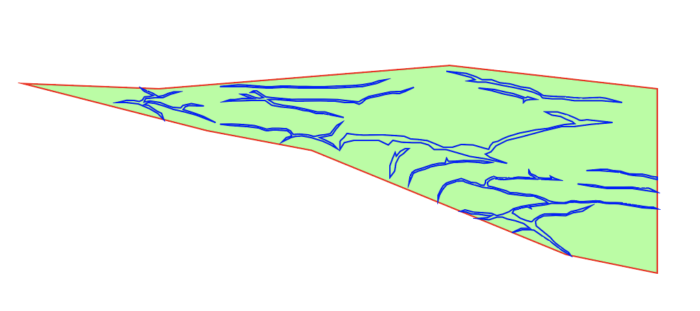
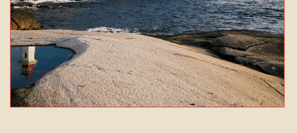
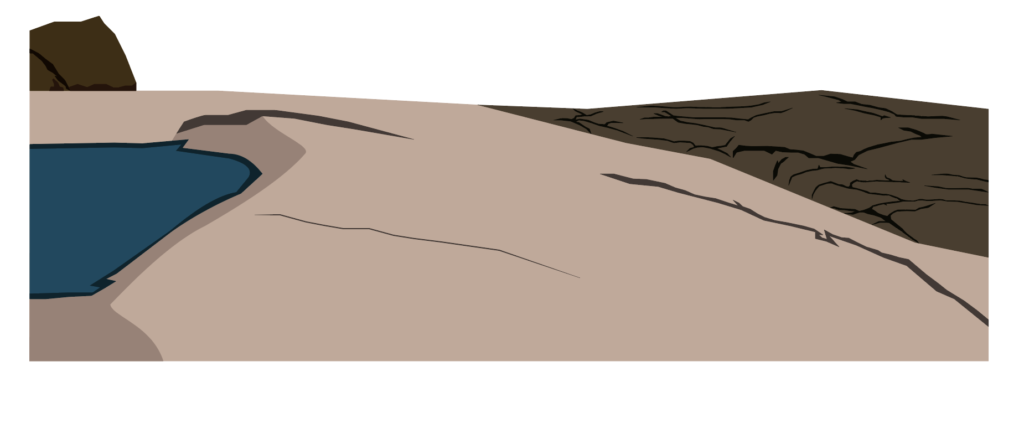
The way I start my posters is by breaking it down into smaller sections. It is much easier to tackle a smaller section. Typically, I also start at the front and work my way back. So, in this image, the best place to start is with the rocks directly in front of us.
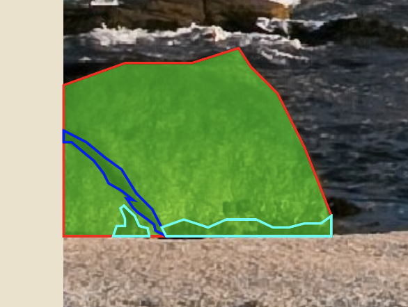
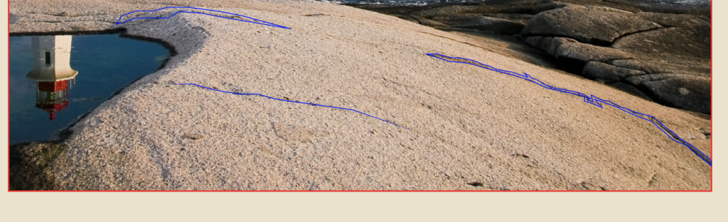
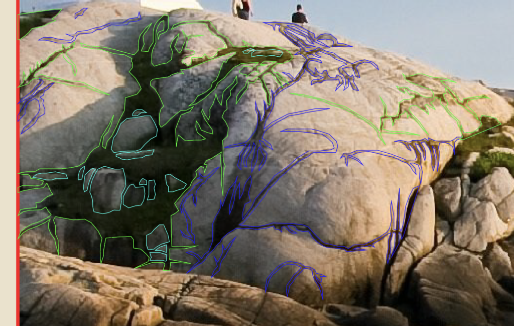
Outlines of each subsection of section 1
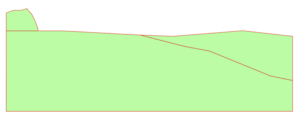
I’ve broken this up into 3 smaller sections as well. The area on the right, the large section in the middle and the small rocks on the left. Start with making an outline of the area using the Pen tool. Then connect anchor points all around to make the shapes. From there, just add some detail.
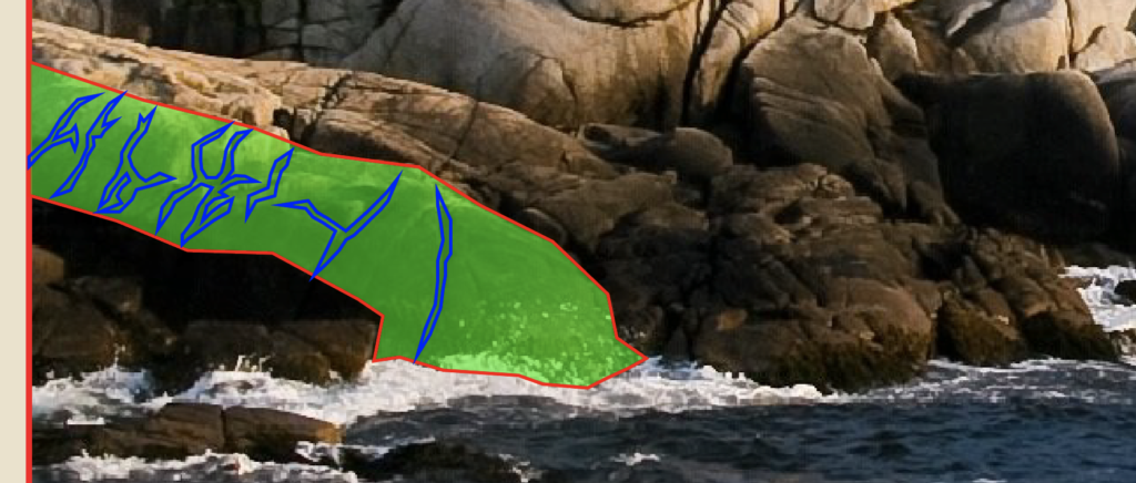
Subsection 1
So as we can see on the left rock, there is a crack and some dark spots near the bottom.
So, using the pen tool again, begin drawing the detail. For the purpose of this tutorial, I used different outlines to designate the different elements. The teal outline is the dark spots and the blue outline is the crack in the rock. Keep everything in outlines until you’re absolutely finished drawing or editing. Next, let’s move onto the main section in the middle.
Subsection 2
With the image behind it
Without the image behind it
Again, just connect the anchor points and follow along with the general shape of it. There’s no right or wrong way to do this. Just connect points until you’re happy with the shape. Then start adding some details. Notice that this area has a puddle and some small cracks in the rock.
The first area of section 1
Starting with the cracks, start making a bunch of anchor points and kind of following with the actual crack. It is okay to freestyle a bit, because that’s what makes it unique. These posters don’t have to be perfect replicas of the scene. They just need to capture the essence.
Cracks on the rock
As you can see, my cracks are larger than the real ones. The bottom crack was pretty small though, so I just drew a simple path and adjusted my stroke size to match the real one.
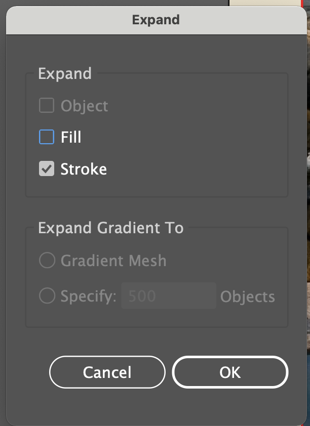
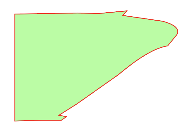
Expand Appearance Menu
The problem with this is that you can’t get the pointy ends that many of these cracks have, so you’ll want to go to Object, Expand, expand the “Stroke,” then add some anchor points on each end and drag them outwards to make it pointy.
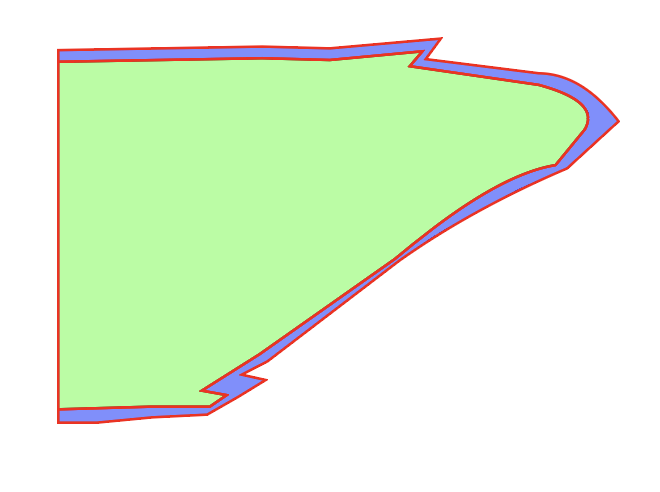
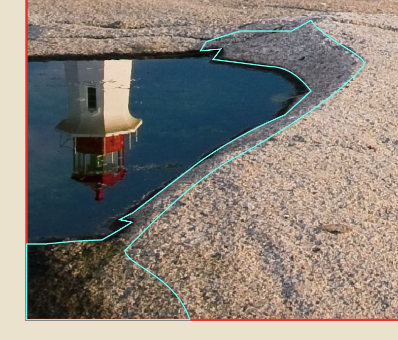
Next, is the puddle. This is made up of 2 parts, the dark ring and the water itself. Starting with the water, use the border of the poster as your edge and connect anchor points around the water to create a similar shape.
Next, to add the dark ring, trace the edge of the puddle and take your cursor slightly outwards and go back around and follow along. This ensures you don’t have any space showing underneath.
Shadow part of the rock face
The final thing is to trace the shadow of where the indention in the rock begins. Again, retrace the lines you already made for the dark part of the puddle, move your cursor outwards and then follow the image.
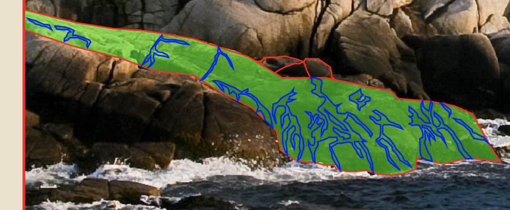
Subsection 3
Final subsection
The last subsection is very similar. Draw by drawing the outline of the rocky area.
Final subsection with details
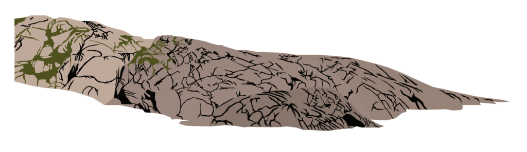
Then draw the detail, which in this case is really only the cracks. It simplifies the detail, but it still looks great when you’re done. If you wanted to go into more detail, you could try to draw each rock individually and line them up and create the cracks that way. I chose to take the simpler route, because I wanted to keep it looking more uniform for the rest of the poster.
Actual Picture
My Version
So, when you decide you’re ready, you can begin adding color from the rocks. An easy way to do this is to select the object or path you want and use the eyedropper tool to match the color from the image. Here’s how mine turned out.
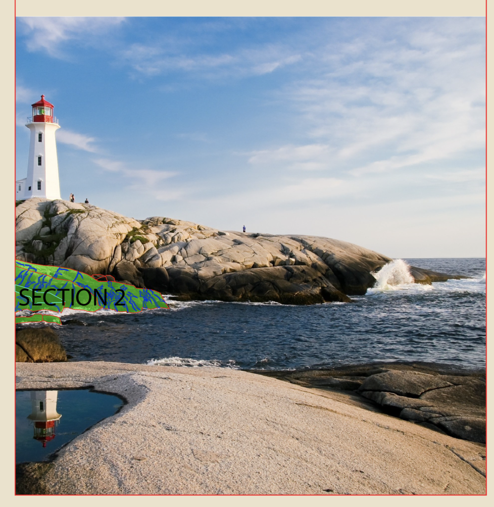
Section 2
Entire Poster with Section 2 and details outlined
I’m going to quickly go over these next two sections, since the process is basically the same as the first one. So the second section is what I marked in the image above. I broke it down into four smaller ones.
Subsection 1
Subsection 2
Subsection 3
Subsection 4
Divide the rocks into smaller groups, outline them and then add the color to the rocks and the cracks. The closer rocks are slightly darker and the further rocks are slightly lighter in color. Here’s how mine turned out.
Actual Picture
My version
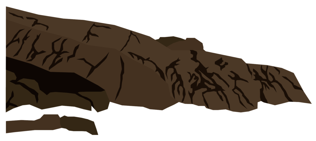
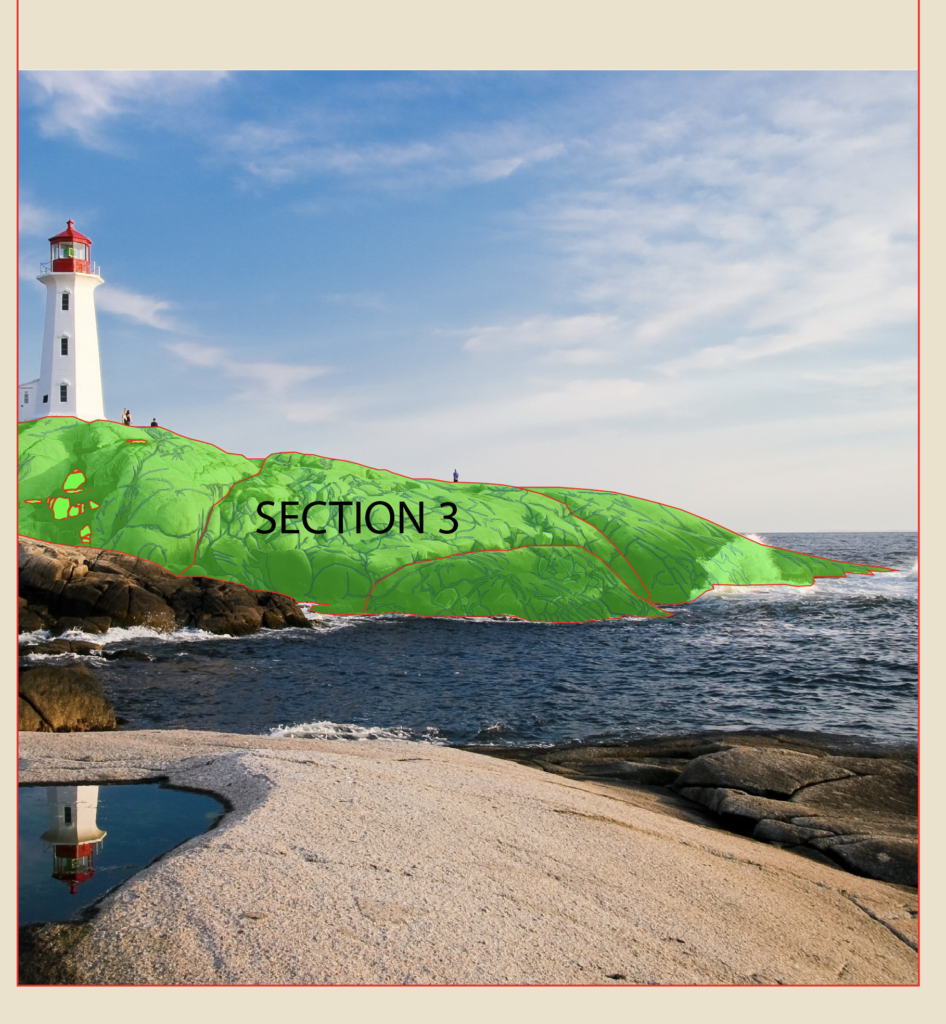
Section 3
Entire Poster with Section 2 and details outlined
Again, this section is pretty much identical to the previous two.
Subsection 1
Subsection 2
Subsection 3
Subsection 4
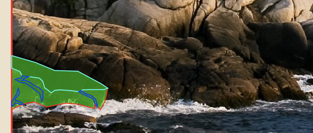
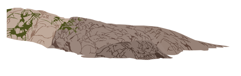
Divide this large rock structure into smaller groups and then trace the shapes and add detail. This one does have a twist though. Instead of only having cracks, there is some moss and grass on part of the rock. There’s no wrong way to go about this. Just do your best and use the same technique you used to make the cracks.
Details on the rock
If we zoom in on the image, you can see that there were some rather large areas of detail in the picture. Blue lines mean it is a crack, green means grass and the teal means it is a rock I had to draw back in. I ended up doing this for all sub-sections, but I just wanted to highlight it here.
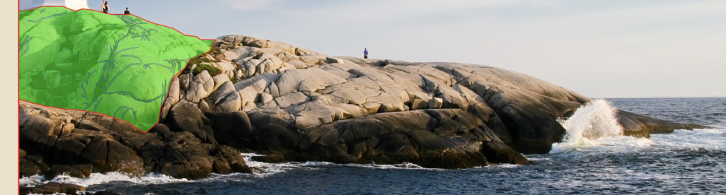
Actual photo
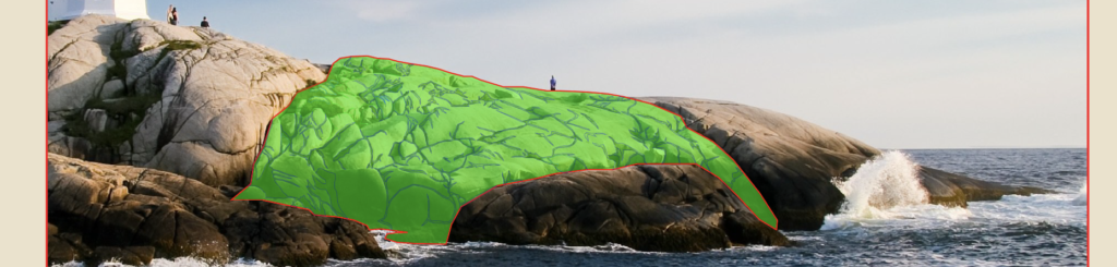
My version
Either way, here is how mine turned out after I finished outlining and adding color to the rocks.
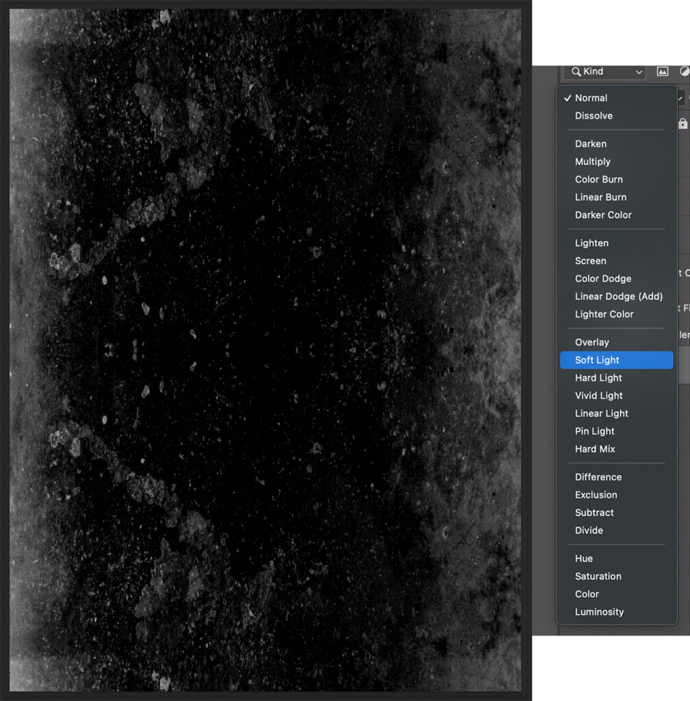
Soft Light blend mode applied to cracks
Optional Step: I initially chose a darker color for all the cracks, but wanted to soften it up a bit, so I messed with the blending mode. You can find all sorts of options in the Transparency menu. For mine, I chose “Soft Light” and I applied it to all the cracks I drew in the picture.
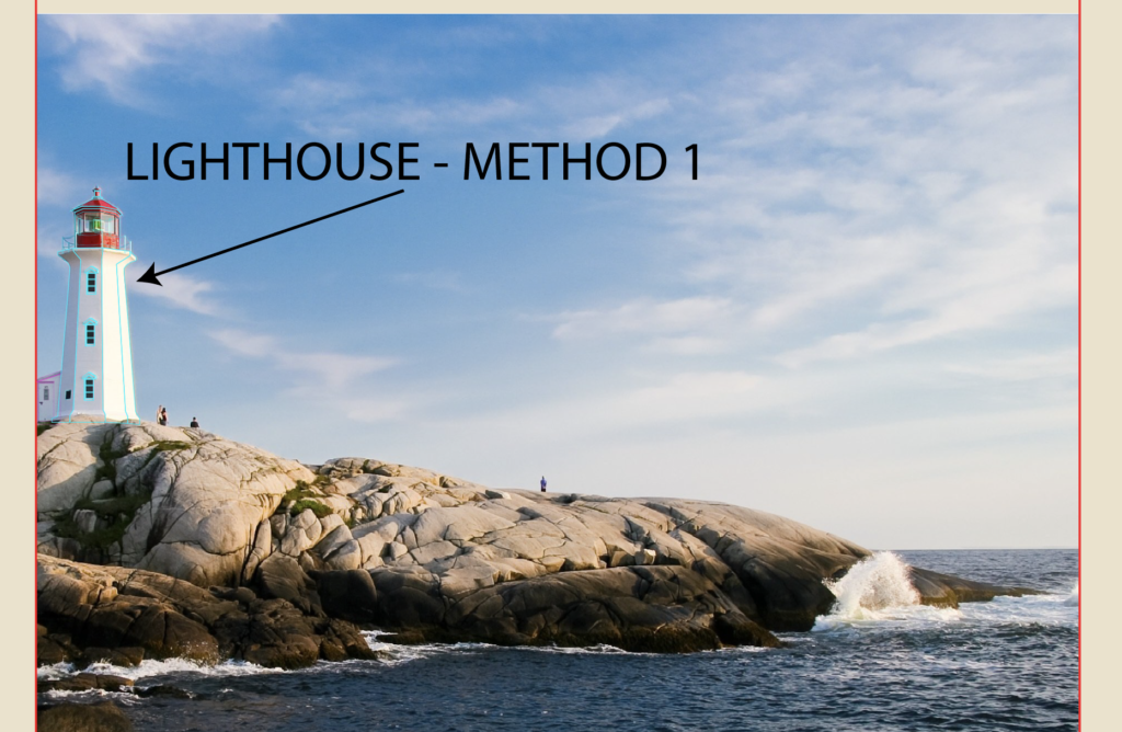
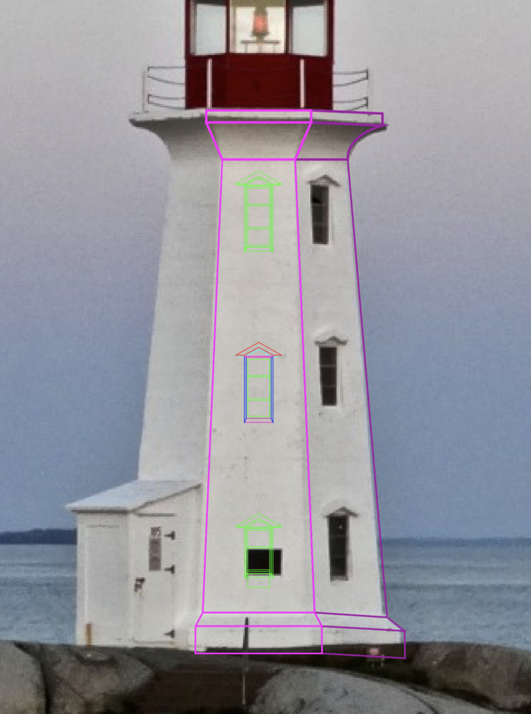
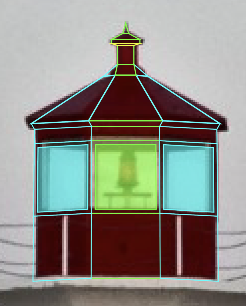
Lighthouse Method 1
Lighthouse drawn by tracing image exactly as it appears
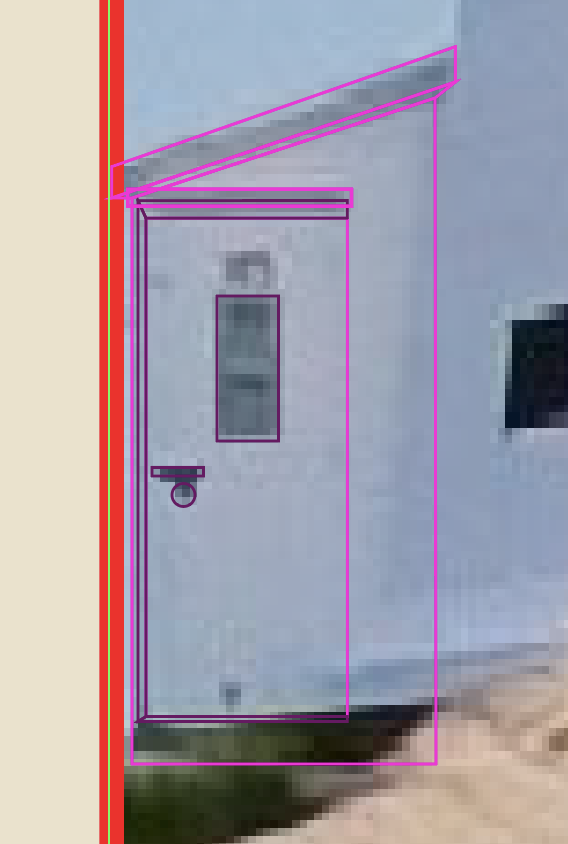
Now, the part we’ve all been waiting for, the lighthouse. I will outline two methods you can use. I ended up going with the second method, but I wanted to demonstrate both so that you could choose how you want to handle situations like this in the future. The reason I have two methods is because the details can be pretty fuzzy when examining the original image in Illustrator, especially when you zoom in really close to trace the lighthouse. While this first method is more true to the picture, it is also more difficult to get to look right in my opinion. If you want to simplify things, then I would recommend that you click here to skip ahead to Method two, otherwise just keep going.
Side Entrance
Side entrance
This first way is to simply trace the lighthouse as is and try to get the perspectives right. Start with the side entrance, draw the roof, the roof perspective (dark area), then the body of the structure, then the door and the doorknob and door perspectives to give it some semblance of depth. Now, I tend to maybe overdo it on the details of my buildings. The truth is that you could probably do without the perspectives and your structure would look perfectly fine.
Main Body
Main body and windows
Let’s move onto the center of the lighthouse. Trace the body and the curves.
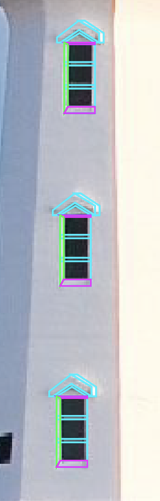
Window
Then make the first of the three windows. Outline the glass and where the perspective around the window are. Because it is slightly at an angle, you’ll have to skew the larger rectangle.
Window bars
Then, add the cross sections across the window.
Window perspectives
Next, fill in the gap between the window and the larger rectangle by connecting anchor points to make three shapes. A top and bottom part (which I like to make the same color when finalizing the shape’s color) and a side part (which will be slightly different colored than the top and bottoms).
Triangle roof detail
Lastly, make the triangle roof detail that sits above the window. Because it is at an angle, there needs to be a side perspective and a bottom one as well. Start with the main part, then add the side perspective and finally the bottom one. If you really wanted to get technical, you could follow this process two more times and tweak the perspectives slightly to match the angles of the windows perfectly, but I promise it doesn’t really matter that much.
Duplicate the windows to make 3 of them
Next, select all the window shapes together and group with CTRL/CMD + G, then hit CTRL/CMD + C, then CTRL/CMD + F to paste a copy of the first window in place and use the mouse to drag it upwards. Do it one more time for the last window.
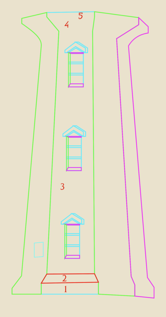
Create the perspectives of the lighthouse
Next, use the pen tool to trace the left side of the lighthouse, then the right side. If you look closely, you’ll see that there are actually two areas to the right of the section with windows (in green and purple). Each section basically has five parts (numbered 1-5 in red), designated by where you placed anchor points. From bottom to top, there’s a bottom lip, an angled part, the large body, another angled part and a final lip. So the way I handled this was to start with my outline like above, then use the pen tool to make each of the five parts by tracing over them and closing them off (like the red shape on number two). I did that for all five parts on all four sides of the lighthouse. Don’t forget the little window on the left section.
Top Section
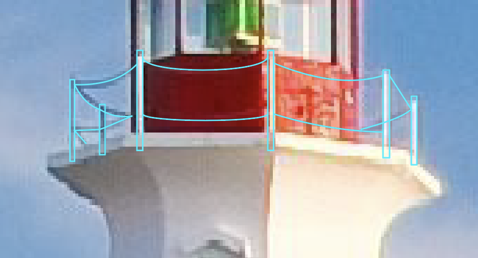
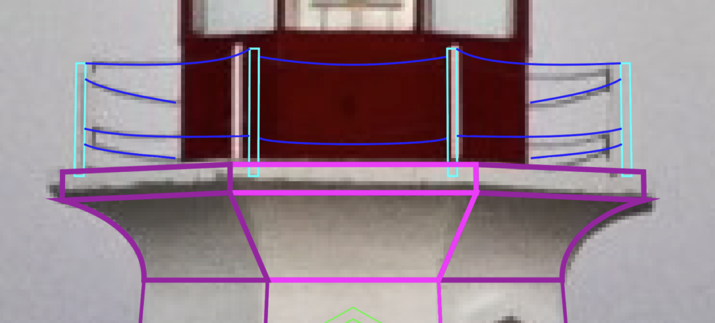
Posts on railing
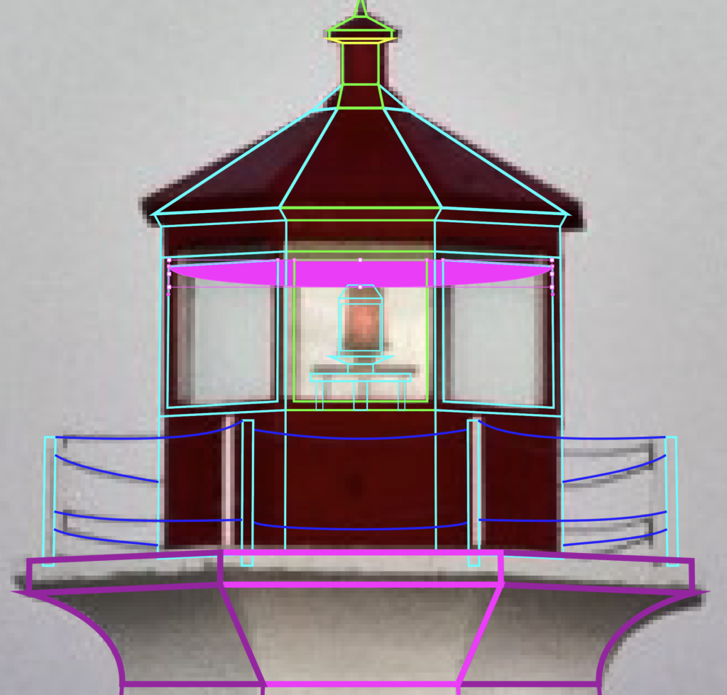
Moving upwards, mark the six spots where there are posts and add the chains. Make sure the chains stop at the bounds of the red structure, otherwise it will look like your chains don’t go around.
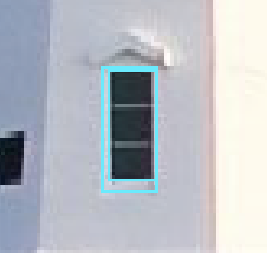
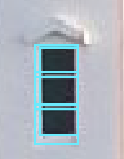
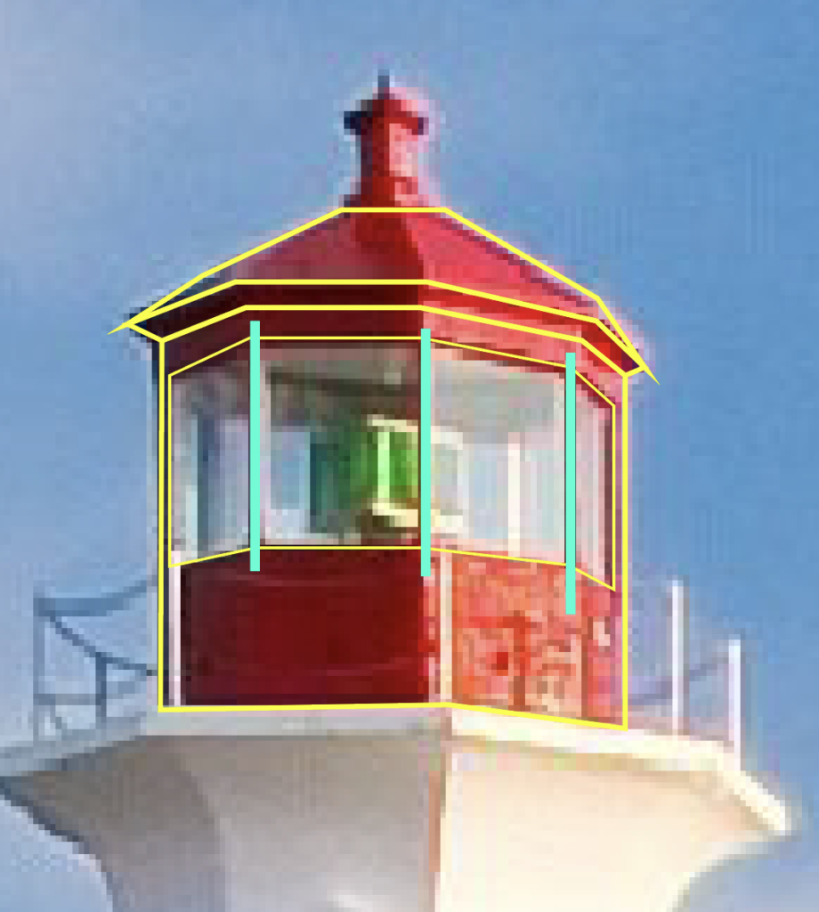
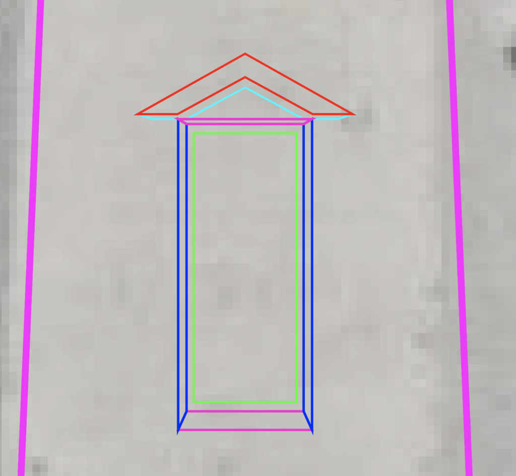
Window outline
Similar to the body of the tall area below, you’re going to want to outline the entire red structure. Make sure you mark the roof perspective and outline the roof and the window frame. Then, just like before, section off each of the parts using each anchor point as a boundary, since they each represent a different angle of the red structure. Remember to keep some space in between the windows since they have individual frames. Those places are designated by a teal line.
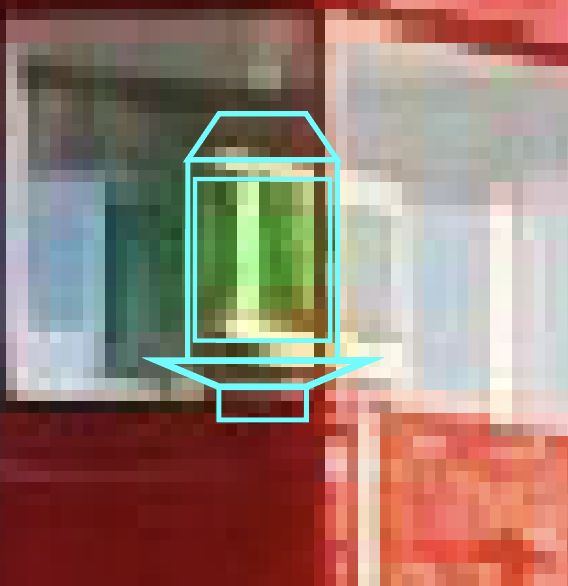
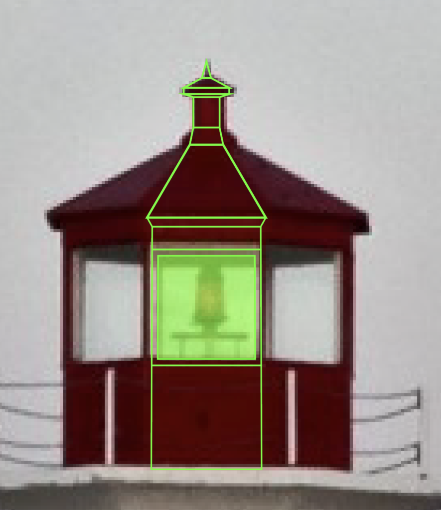
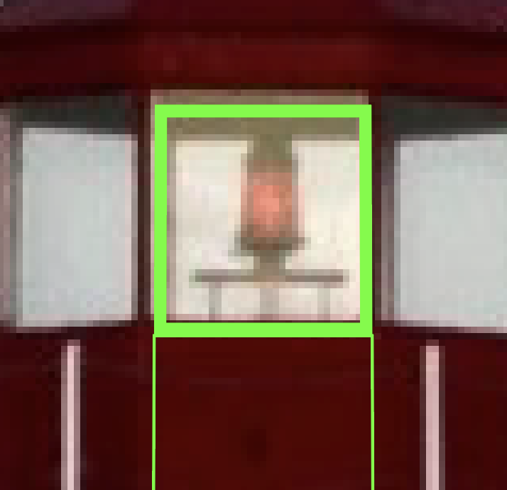
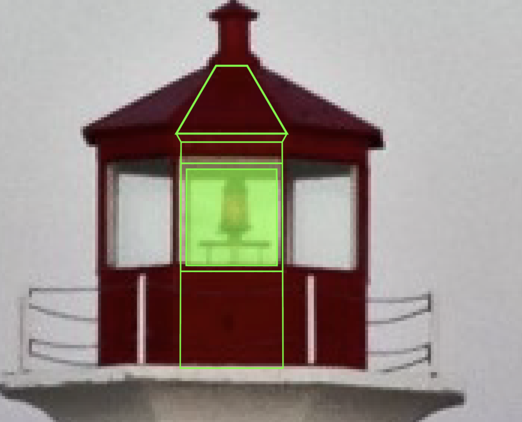
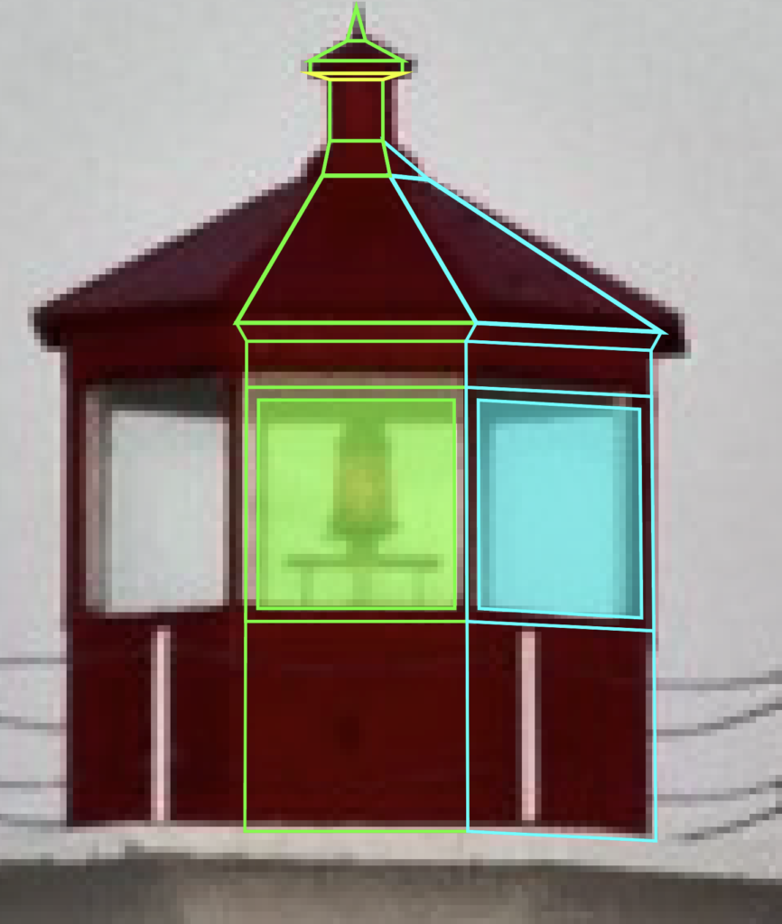
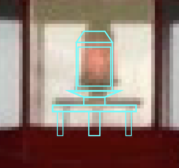
Light Fixture
Next, we have to draw the actual light fixture. Don’t worry about lining it up exactly with the frame of the structure. This will sit behind the window outline and the actual red structure pieces. Again, this image’s quality is pretty heavily reduced when you zoom in, so I looked for another picture of this lighthouse on Google and modeled it after that. There’s a main body, the light itself, a top area and a base structure on which it sits.
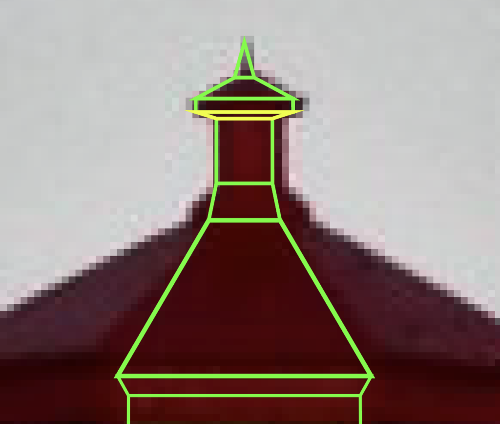
Top of lighthouse
Don’t forget the top section on the roof. this one is basically a small version of the main red section, I went ahead and made it “flat,” meaning I didn’t include the perspectives and alternative angles. It was hard to match the picture because the quality is so reduced. So I would start by making bottom section, the middle, the “roof” and the perspective (in yellow) where it attaches to the middle part and the top pointy thing in that order.
Perspective ceiling and back window posts
The final thing to remember is the perspective on the ceiling and the back of the structure that is visible through the glass. This is outlined in purple.
Actual Photo
My Version
Then, just start adding your color to the shapes you made. I like to use the eye dropper tool and pull from the actual image. So, once you put it all together it might look something like mine.
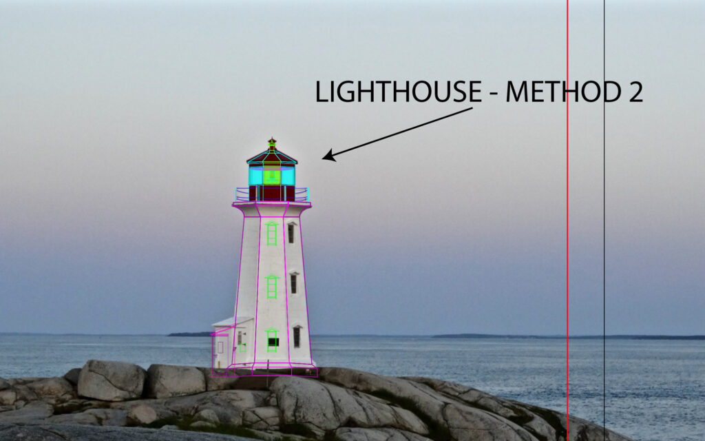
Lighthouse Method 2
Lighthouse drawn by tracing a different image that shows lighthouse from another angle
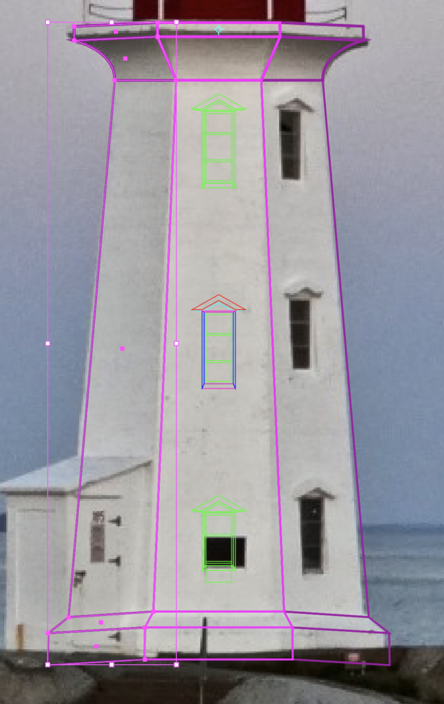
Out of the two methods I’m covering, this is the one that I used. I felt like it was easier and that the accuracy of the exact positioning of the lighthouse didn’t matter that much. At first this might seem just as complex, but what you’ll find with Method one is that getting the perspective to look right can be difficult and frustrating.
For this method, I found a different, closer up picture of the lighthouse; which can be found here. Basically, I got a higher resolution photo of the lighthouse so that I could see more detail and trace it more easily. Another difference is that this picture is taken from such an angle that you only see 3 sides and it is more symmetrical than the original picture, which again simplifies the process greatly. However, keep in mind that we want to keep the side facing us from the other picture, so we are going to trace this angle, but keep the features from the other one.
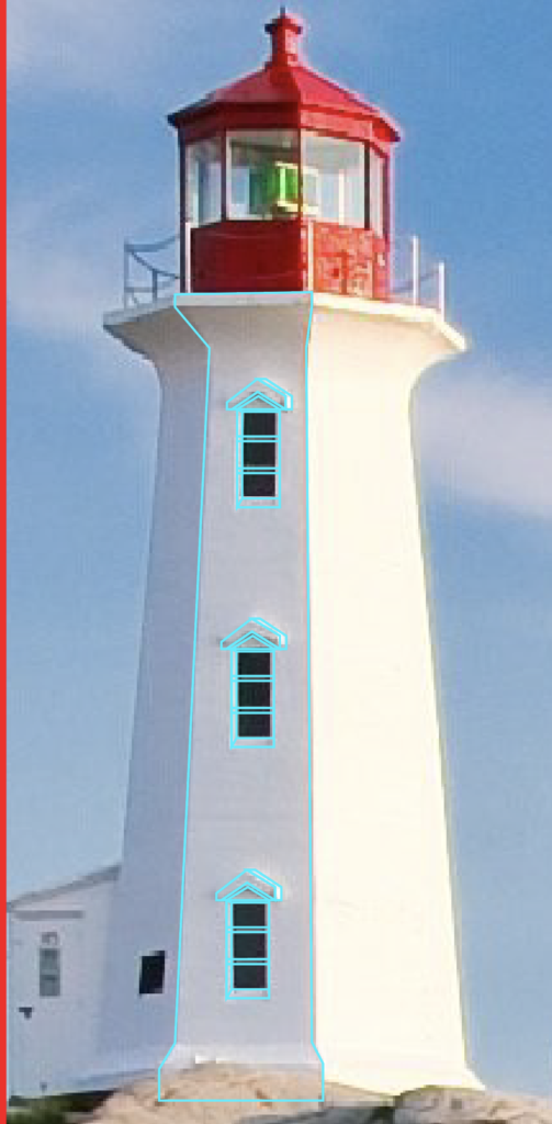
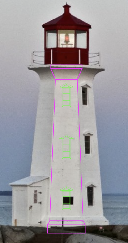
Main Body
Main body and windows
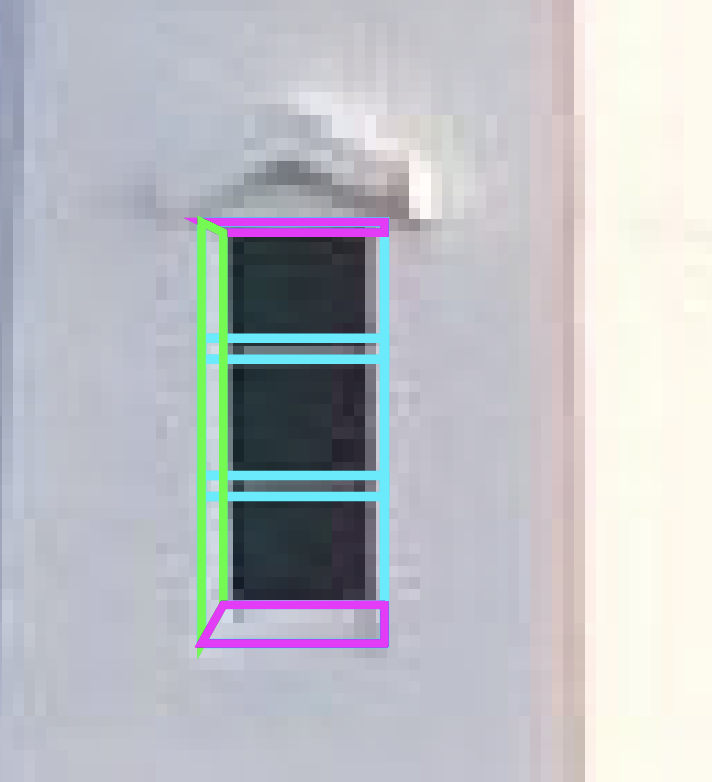
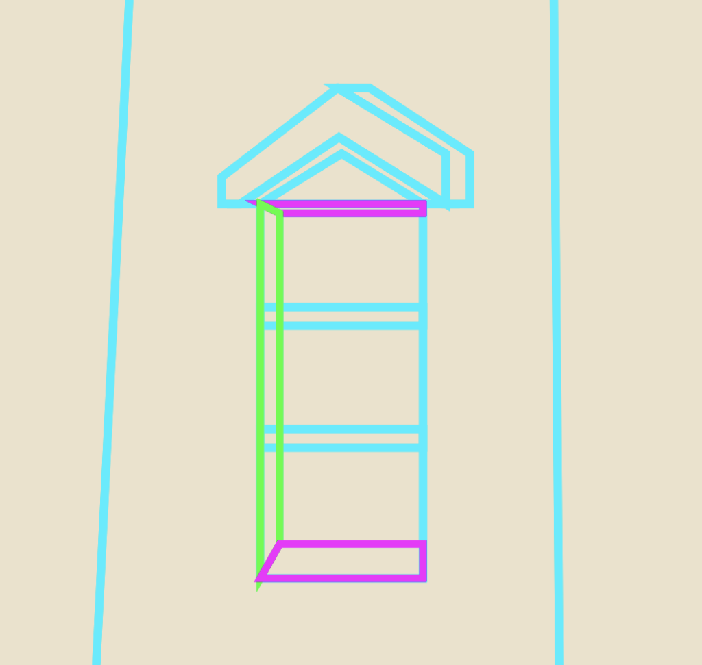
What I mean by that is begin by tracing the middle body section of the lighthouse, but then add the three windows to this section, like the other photo of the lighthouse has. So although this version of the photo is from a different angle, you’re going to use it to match the generic structure while keeping the details from the original photo. Start off by dividing this middle section into five parts: the base, the angle, the main body, the upper angle and the top lip.
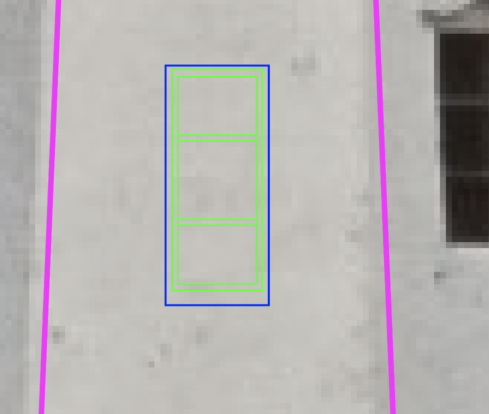
Window with perspective guide
Next, move onto creating the window. Because this angle is straight on, it is easier to get the glass and window perspectives right. Build a rectangle for the glass and then duplicated it and make it larger to create the window’s frame. Repeat this process another time to line up where the window’s frame perspective lines up (blue outline), since the window is technically inset in the building.
Lastly, add the horizontal cross sections on the window. Do this by making a small rectangle across the inner-most rectangle, put it in the center of the object and duplicated it. Then move each one upwards and downwards the same distance. An easy way to move shapes and objects is to use Shift + Arrows. This moves it greater distances than just the arrows. It also makes it easier to keep track of how far you move objects by counting how any Arrow presses you do.
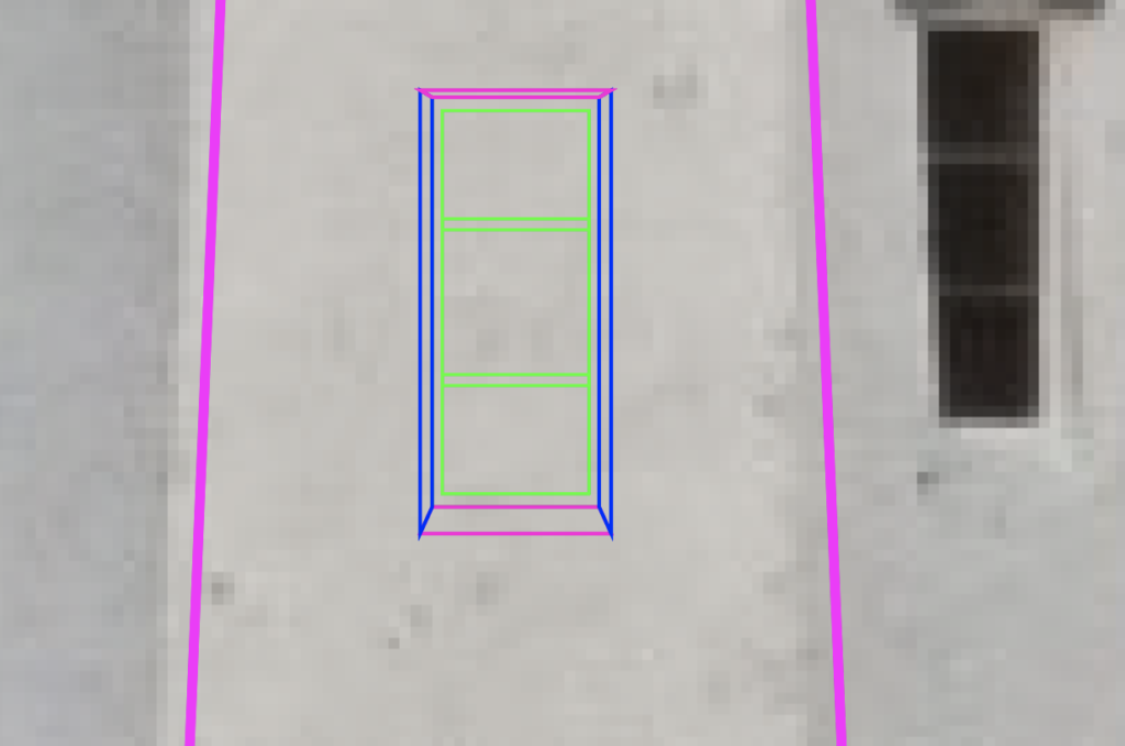
Window with perspectives
The next step is to use the pen tool and fill in the gaps between the second and third rectangles on the window. As seen in blue and magenta outlines, create a left and right perspective followed by a top and bottom one. These are to help give the window the illusion of being inset in the building.
Window with triangle overhang
The last step on the window is to create the triangular overhang part above the window (Red). Again, this will need a perspective shape (teal) behind it in order to give it the illusion of being three dimensional. Next, select the objects that are part of your window and group them with CTRL/CMD + G, hit CTRL/CMD + C, then CTRL/CMD + F to paste a copy in place and drag the window upwards. Do it one more time to place the bottom window. Group your middle section and the windows together using CTRL/CMD + G.
Lighthouse middle and right sides
Since this method creates a symmetrical lighthouse, we only need to worry about making one of the side sections. I started with the side with the right. Use the middle section to help you align everything and try to match the body of the lighthouse. Don’t forget to curve the line to match the shape of the lighthouse. You can quickly access the Anchor Point Tool to manipulate the curvature of lines with Shift + C. Once you’re happy with how it looks, group it together and duplicated it.
Lighthouse body with all 3 sides
You can either right click, transform, reflect and then drag the group to the opposite side, or you can press O on the keyboard to open up the reflect tool. Left click to place your reflection point in the middle of the middle body section and then just left click and drag your mouse to spin the side area around. Either way works.
Top Section
Lighthouse railings
Now that the base of the lighthouse is complete, it’s time to move up to the upper section. Mark the four spots where there are posts around the perimeter of the top section. Make sure the chains stop at the bounds of the red structure, otherwise it will look like your chains don’t go around. You’ll notice that this picture isn’t perfectly symmetrical, but for the purposes of this tutorial, we can pretend that it is. Again, you only need to make one side of this area first. Once you’ve done that, group and duplicate and use the same techniques I mentioned in the above section to create the entire rail area. Keep in mind that when you order the layers, you’ll want to place this in front of the next section we create, but after the body section below.
Middle side of the top of the lighthouse
Alright, so the next section is going to be the Red area that houses the light and makes up the roof. Start with a square-like rectangle for the base. Then make another one for the area that houses the window. Duplicate that rectangle with CTRL/CMD + C then CTRL/CMD + F to paste it in place. Now shrink it to match the size of the glass. Select both of those rectangles, make sure the smaller one is on top in the layers panel, navigate to the Pathfinder panel and choose Minus Front. This creates a complex path that basically hollows out the square.
Middle window frame
This way, you can create the frame of the window. Remember, you’re going to want to see through in order to see the light. You can fill in that area with another rectangle and adjust the transparency in order to create a glass effect.
Middle window glass and roof
Next, add the sliver that’s above the window and create the roof that goes up to the top detail. Don’t forget to leave some space so you can add some perspective to make it look like the roof hangs over the window. The topmost part of this section will attach to the top detail.
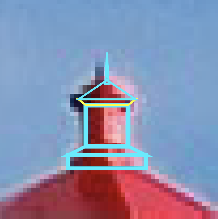
Top of roof
This section is basically a small version of the main red area. Make a bottom section, the middle, the “roof” and the perspective (in yellow) where it attaches to the middle part and the top pointy thing. The picture makes the outlines look disconnected from each other, but that’s just because of the sharp angles and the difference in line thickness.
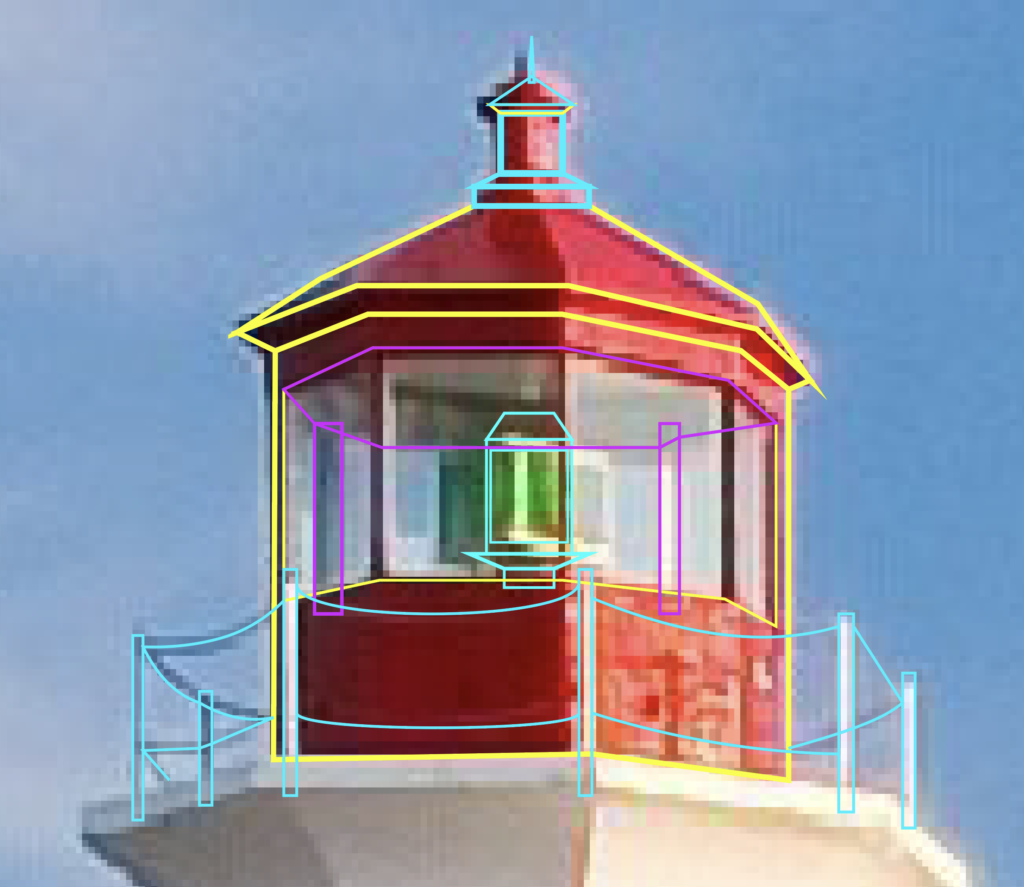
Lighthouse top with middle and right sides
Next, we move onto the side next to the middle of the red area. Duplicate the middle area, move it over to the right, align your anchor points and then adjust the perspective to match. If you wanted to, you could build this side from scratch, but I find it easier to duplicate the middle and then adjust it to match what I need from there.
Lighthouse top with all three sides
Using the duplication and reflection techniques I previously mentioned, create the left side. There, you’ve just recreated the entire top area. All that’s left is to make the light.
Light fixture
Next, we have to draw the actual light fixture. There’s a main body, the light itself, a top area and a base structure on which it sits. Make sure to place it behind the Red Structural pieces in the layers panel.
Perspective ceiling
Another thing to remember on this top section is the perspective on the ceiling and the back of the structure that is visible through the glass. This section is filled in with magenta.
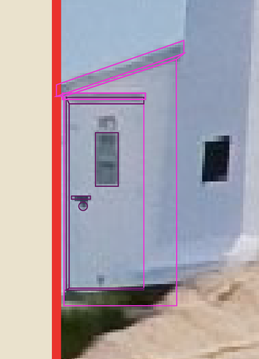
Side Entrance
Side entrance
The last part we need to draw is the entrance on the side of the lighthouse. For this, I went back to the original image, because I wanted to get the perspective right. Go ahead and switch back to the original image if you haven’t yet. Select and group all the objects that make up your lighthouse. Then move the group over top of the lighthouse from the original image, shrink it and try to line it up as best as you can.
To draw the side entrance, start by drawing the roof, roof perspective (dark area), then the body of the structure, then the door and the doorknob and door perspectives to give it some semblance of depth. Now, I tend to maybe overdo it on the details of my buildings. The truth is that you could probably do without the perspectives and your structure would be perfectly fine.
Actual Image
My Version
Then, just start adding your color to the shapes you made. I like to use the eye dropper tool and pull from the actual image. So, once you put it all together it might look something like mine.
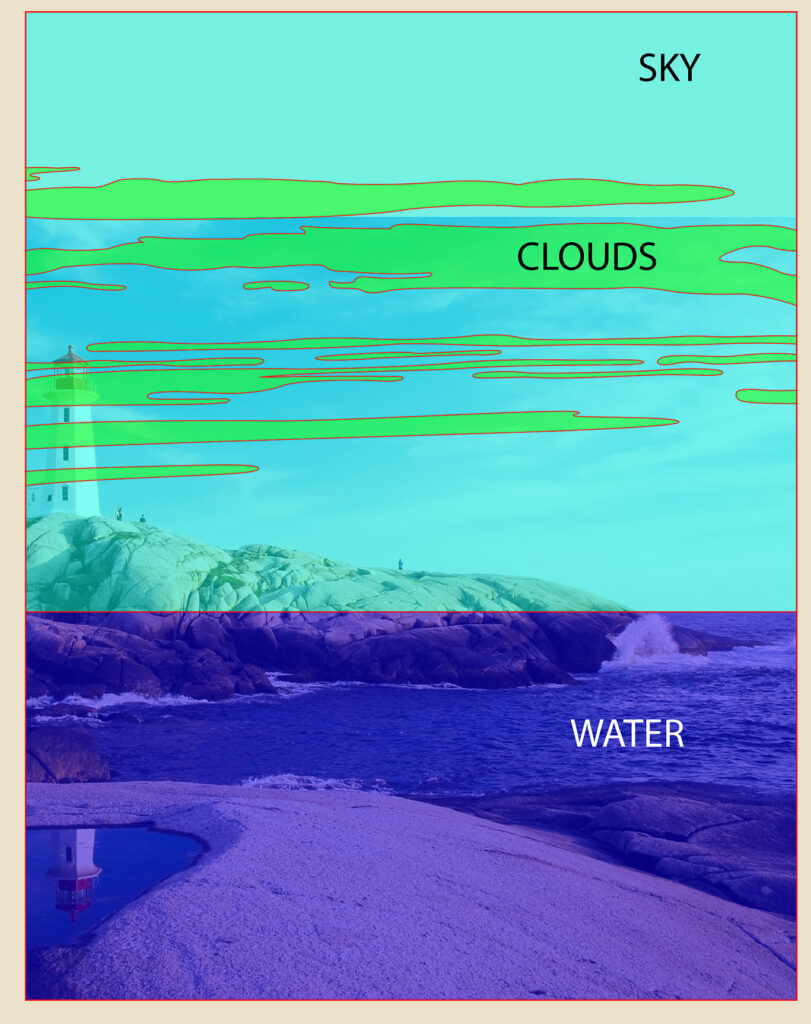
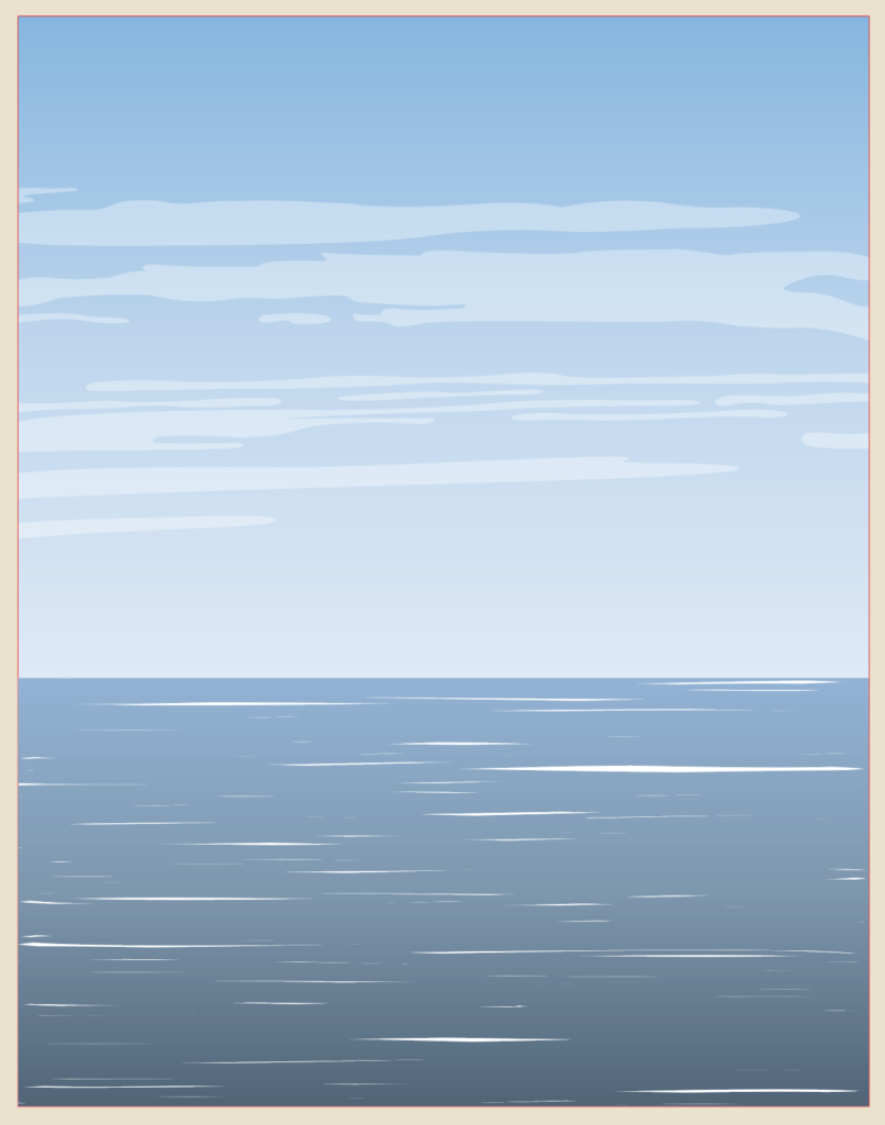
Sky and Water
Entire poster with Sky and Water sectioned off
Sky
I always do these sections last since they are at the back of the image. Just draw a rectangle that covers the area where they sky is. Then match up a second rectangle and draw it downwards to create the water area. The sky is pretty simple, because you can just use the eye dropper tool to match the blue from the image.
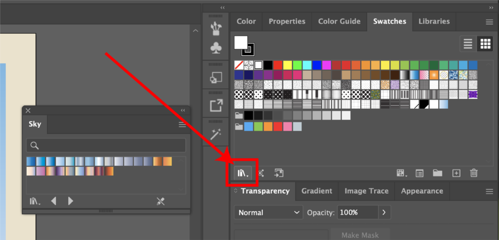
Swatches menu
Another option is to open up the Swatches Menu by going to Window, then Swatches. In the bottom left corner, there is an icon that resembles several books. Click that, then gradients, then sky. This will bring up several pre-made sky gradients.
There are lots of options that range from daytime to overcast and beautiful sunsets. Once you find one you like, just click on it and make sure the angle is correct in the “gradient” window. For some reason, mine always defaults to a zero-degree angle, so I have to change it to ninety degrees. The nice part too is you can always edit the colors to make it your own.
Simple day-time sky gradient
But for this poster I just used a pre-set, daytime gradient that I felt matched the picture. The last step to complete the sky is to add in the clouds. I often find that clouds are difficult to draw. Which is why I almost always simplify them.
As you can see, in the original image, they are quite wispy and drawing these would be pretty difficult.
So, to make this easier, try to draw long, skinny clouds that look pretty wispy. Use the pen tool and the Anchor Point tools to draw the shapes and eliminate any jagged edges by rounding them.
Clouds streaking across the sky
Then, instead of leaving them as outlines, select them all and use the eye dropper tool to pull the color from the clouds on the image. As you can see in the image above, it still doesn’t look right. The color is too harsh and they don’t look like real clouds.
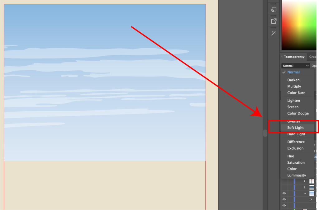
Blend Modes Menu
There’s a pretty cool tool that might get overlooked by a lot of people. In the Transparency menu, you can use the dropdown next to where it says “normal.” This is the blend mode drop down. What you’re going to want to do is select all of them, then find the blend mode menu and select soft light. As you can see in the picture, it adds some transparency to them. Since they are on top of the sky, which has a gradient, they pick up that color change and look more like real clouds. If you want to add your own flair, you can add some birds or a boat in the distance (not pictured here).
Water
Initial water layer and the scaled up layer
Next, we move onto the water. Water can also be very difficult to capture. However, I’ve discovered a technique that I’ll share with you. If you’d like to find the tutorial where I originally found it, you can click here. So what you’re going to do is select the rectangle you created for the water earlier, hit CTRL/CMD + C, then CTRL/CMD + F to paste it in place. Next, select the copy and expand it so that it is larger than the original one.
Water Base layer is white
I like to call the original layer, “water base” because when we apply the effect to the top layer, this will serve as the detail for the waves. I also typically make the “water base” layer white. You’ll see why in a little bit.
Apply gradient to Water Top Layer
Next, let’s focus on the layer you duplicated and scaled up. Let’s call this “water top.” Just like the sky, I like to try and give my water a gradient. You can use the same method as the sky, or simply use the eye drop tool on the sky layer and then adjust the colors manually. If you hit “G” on your keyboard, you’ll get the gradient tool. You can click and drag to create it along the layer and select individual nodes to find a different color. I like to use the eye dropper tool and try to match the original image as much as possible.
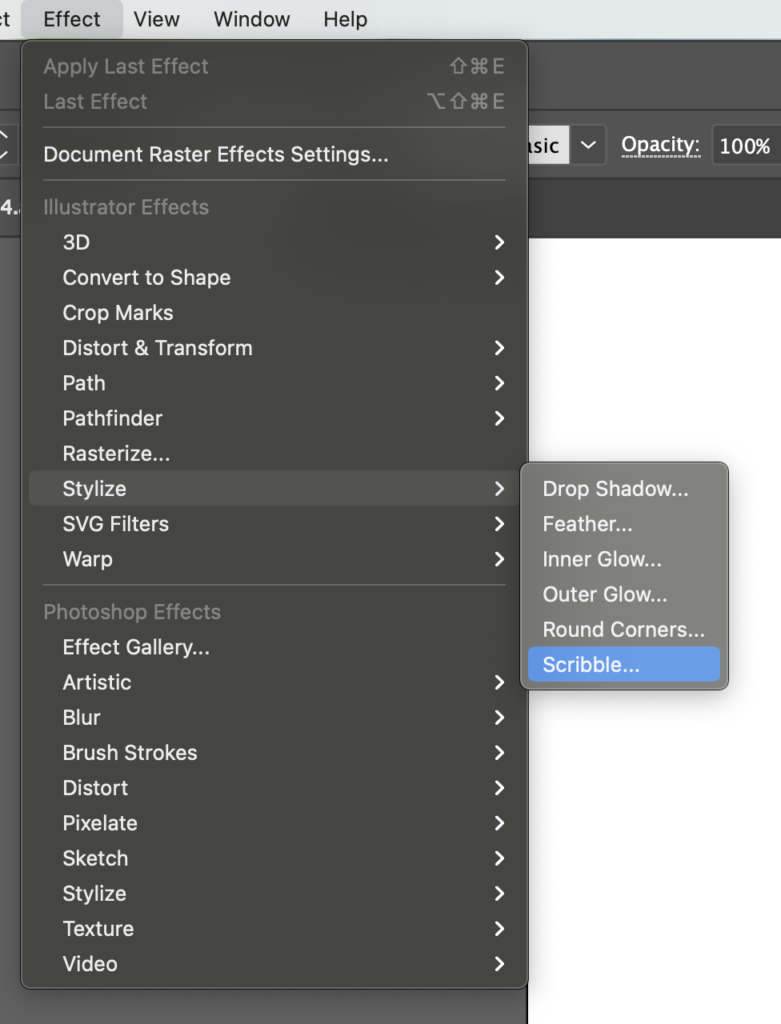
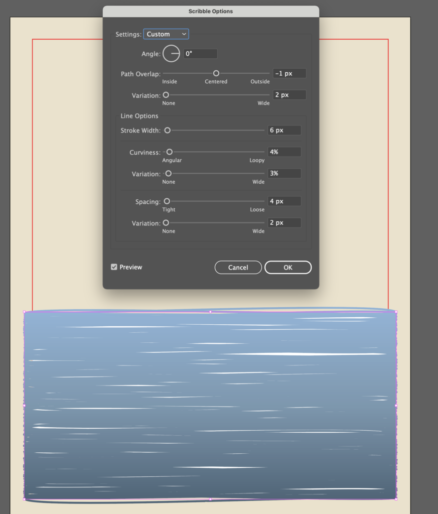
Here’s where the fun starts. Select “water top” and go to Effect, Stylize, and Scribble.
Then try to match similar values to what I did in the image. This creates gaps in the shape and it exposes the “water base” layer, which creates the illusion of waves. Feel free to mess with the values in the scribble menu as much as you want.
Now, we need to capture only the area that is going to appear on our final illustration. To do this, select the “water top” layer, go to Object, Expand Appearance. This turns the scribbles into an editable object.
Crop Area layer overtop the Water Top layer
Duplicate the “water base” layer, rename it “crop area” and move it over the expanded “water top” layer in the layer side bar. It should look like the image above.
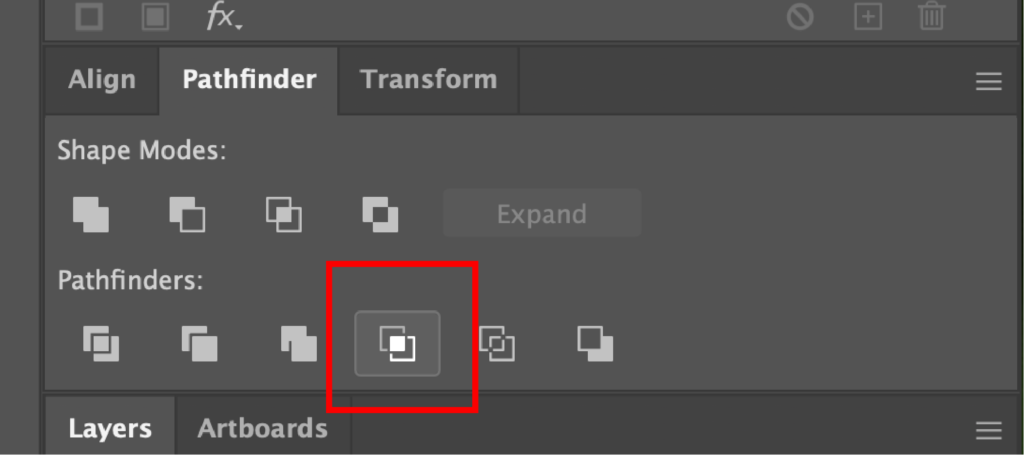
Pathfinder Menu
Select both the “crop area” and “water base” layers and find the Crop option in the Pathfinder menu.
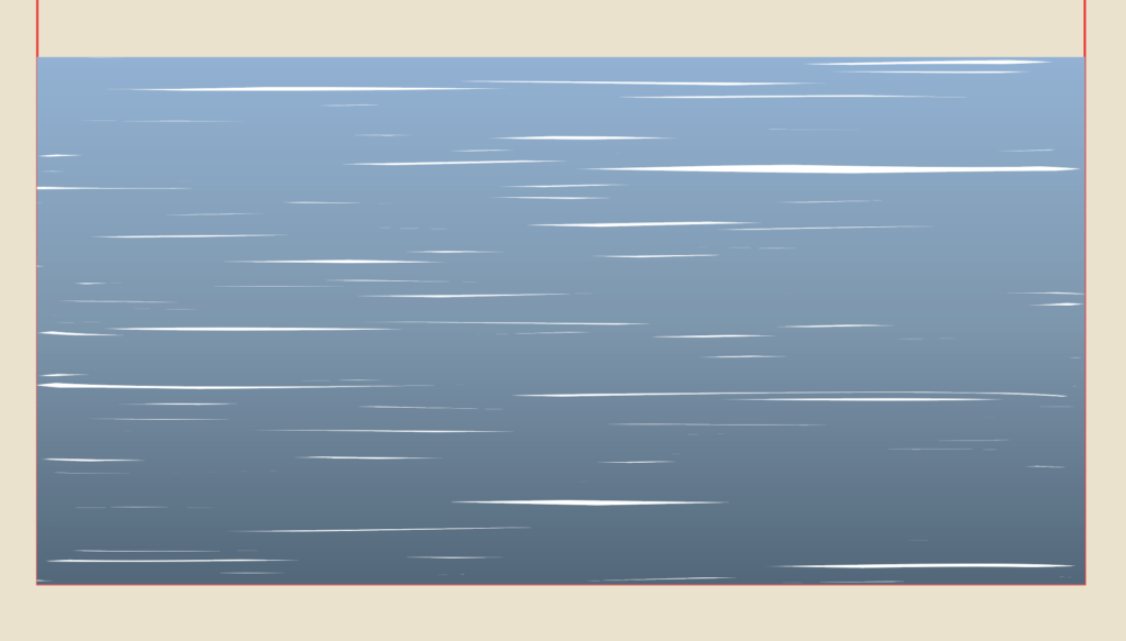
Water texture
What you’re left with is a rectangle that resembles water.
Sky and Water Illustration
Here is how both my sky and water ended up turning out. If you wanted to, you could manipulate the water areas so that it looked more like it was going around the shoreline and the rocks or draw your own shapes, but I’m pretty happy with how it turned out.
Finishing Touches and Text
Final Outcome
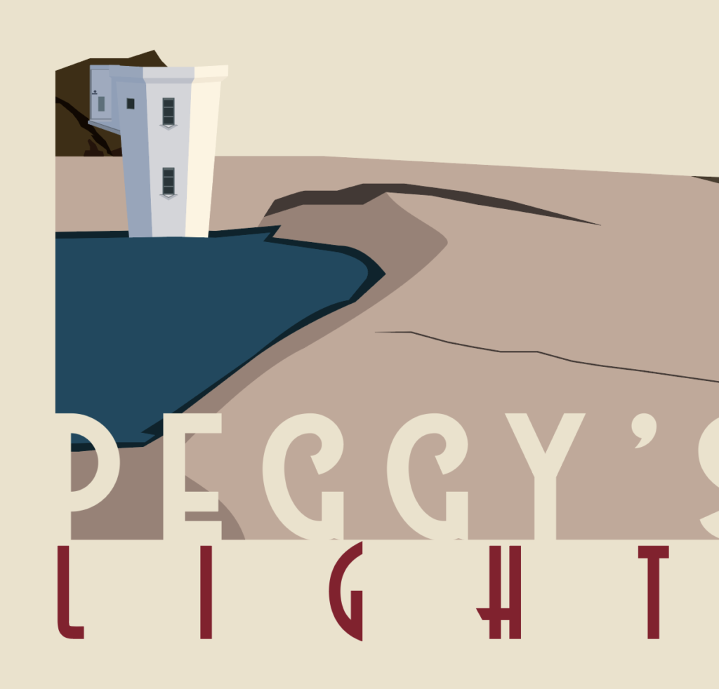
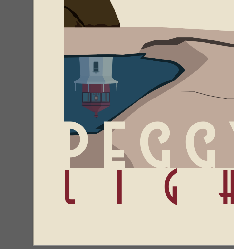
It is time to put on the finishing touches. In the original image, there is a reflection of the lighthouse in the puddle on the nearest rocks.
Puddle layer overtop of reflected lighthouse
So what you’re going to want to do is duplicate the lighthouse from earlier, reflect it so that it is upside down and move it over top of the puddle. Then duplicate the puddle layer, move it on top of the lighthouse in the layers panel so that it looks like the image above.
Lighthouse Reflection
Next, select both layers and use the crop option in the pathfinder menu, like you did with the water earlier. Either mess with a blend layer or drop the transparency, or both and it’ll look like a reflection.
Top text area
Now when it comes to the text layers, there are 2 main sections. The top and the bottom. I’m going to start with the top. You’re free to do whatever you think looks best, but I’m going to show you what I did so you have an example to reference. All these fonts are free and are available for commercial use.
In the top section, I always try to write something like, “Visit” then “City/Town, State/Country.” Let’s start by writing the word “VISIT.” I used the High Summit Font, but you could use any handwritten font you like. Next, write “PEGGY’S COVE” in the Better Book Font, or whatever you choose. Then, write “Nova Scotia” in Astrud Font below that.
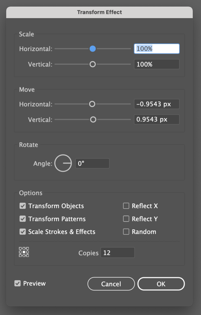
In order to get the shadow look on Peggy’s Cove, duplicate it in place, go to Effect, Distort & Transform, Transform and use the values I entered in the image and place it below the original Peggy’s Cove layer.
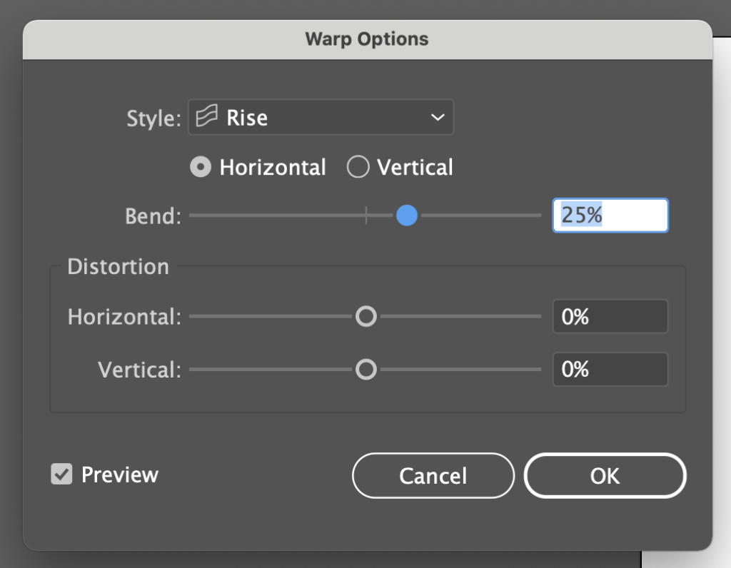
Next, group Peggy’s Cove, the shadow and Nova Scotia together. Then go to Effect, Warp, Rise and use the values from the image.
Top Text Area Finalized
Finally, make Visit and the Original Peggy’s Cove text layers the same color as the tan background. For the shadow and the Nova Scotia text layers, I used the red from the lighthouse roof. I always try to find an accent color that looks good and sticks out from the illustration. And that’s it for the top section.
Bottom Area Text
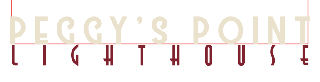
For the bottom section I typically write the name of the specific thing that was created in the illustration, rather than just the place. In this case, the town is called “Peggy’s Cove,” but the scene we drew is called, “Peggy’s Point Lighthouse.”
To get started, write “PEGGY’S POINT” in the Westmeath Font, or whatever you want. Try to make it line up with the bottom of the red outline and just spill over on the left and right side. You want it to blend in seamlessly on each side with the poster background. Then, underneath, write “LIGHTHOUSE.” I reused the Astrud font from earlier. Try to make this one line up at the top with the bottom of the red outline and stretch across widthwise without spilling over the side. Make the top text the same as the background (tan) and make the bottom text the same as the red text above.
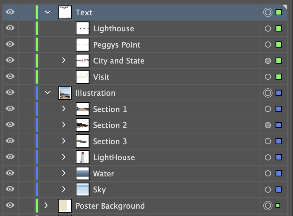
Layer Order
Make sure that you’ve got all your layers in the correct order. It’ll be pretty obvious if things aren’t in their proper positions. You might have named your layers differently, but it should resemble mine.
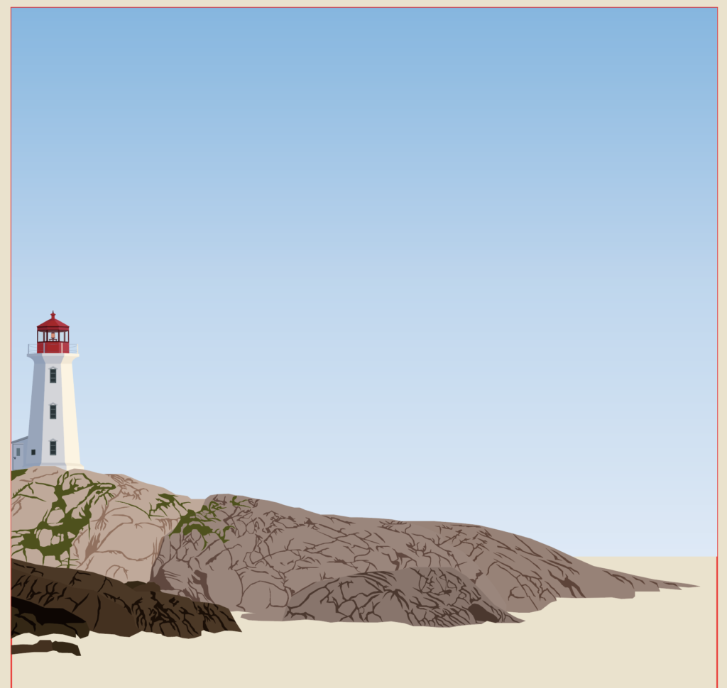
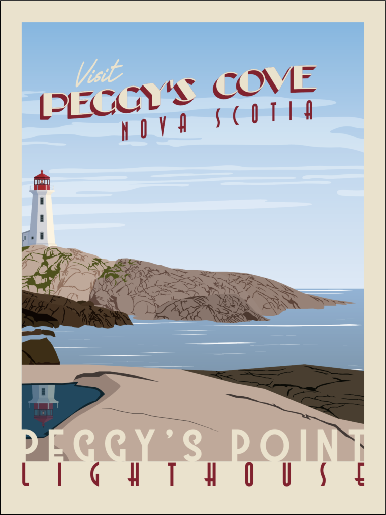
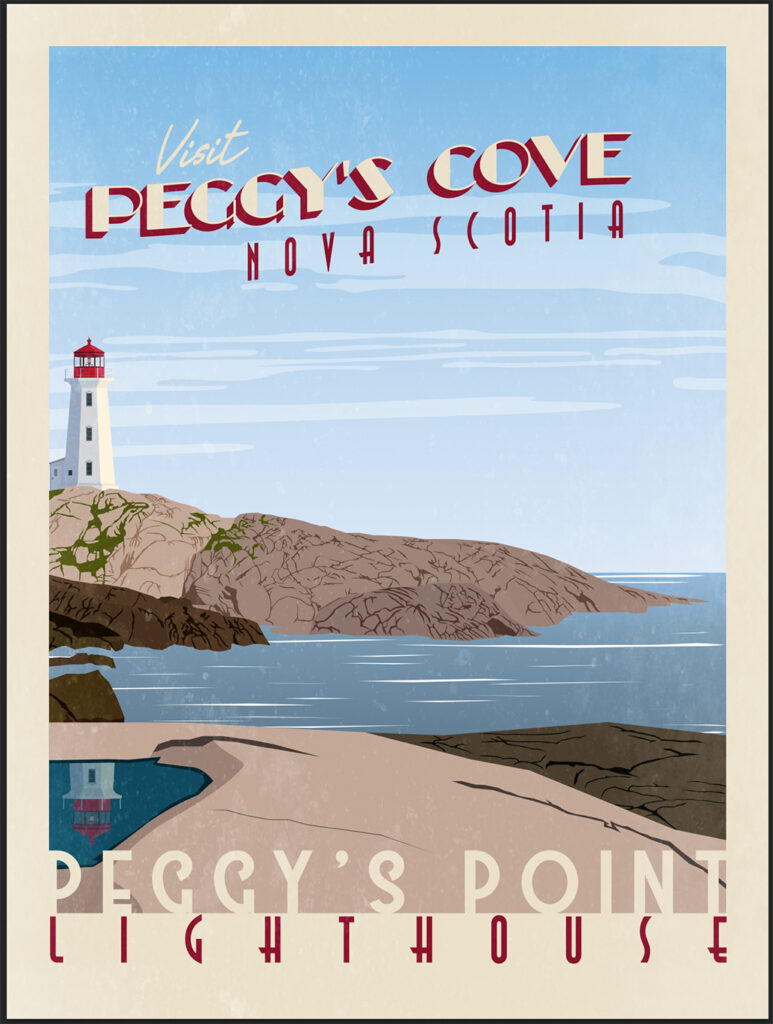
Finished Illustration
Now if you put it all together, you get a pretty nice-looking poster. But we aren’t done yet. It might look nice, but it is missing that gritty-ness and roughness that makes it look vintage. So open up Photoshop and create a new project that is 18 inches wide by 24 inches tall, since that’s the size of the illustrator artboard.
Paste Illustrator selection as as Smart Object
Go back to Illustrator, select all the layers (Poster background, Illustration and Text), then hit CTRL/CMD + C and move over to your Photoshop canvas and press CTRL/CMD + V to paste it as a smart object. What’s nice about this is if you notice something is off on illustration, you can double click the image part on the Vector Smart Object layer and it’ll re-open in Illustrator so you can make any changes. When you save the illustrator file, it’ll update in Photoshop.
Next, I would recommend downloading some grunge or dirt brushes and adding them to your photoshop. I don’t recall where I got mine, but you can find a bunch of free brushes here. Create a new layer above your illustration and using the grunge or dirt brush, start painting on that layer using either white or a very light color. In the image above, I added a black background behind my grunge layer so you could see how I did it.
Then, I like to duplicate it and reflect it so it adds even more texture. Make sure you use the Blend Mode drop down (similar to the Illustrator one I mentioned previously) and select “soft light.”
Poster with Grunge
What you end up with is some texture that creates a more “vintage” look. There are plenty of other ways you can mess with Photoshop effects to create your own unique Vintage look, but I have just one more step that I like to take.
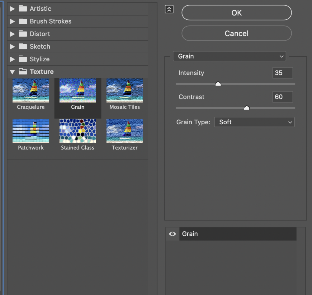
Filter Gallery Menu in Photoshop
Go to Filter, Filter Gallery and under Texture, select to Grain. I try not to make it too intense, but I do like the way it looks. Choose soft grain type, make the intensity about 35 and the contrast anywhere from 45 to 60, depending on how dark your scene is. Since this one is daytime, I chose 60. When you’re done, click “OK” to apply it.
Finished Product
Here is how mine turned out. The grain didn’t change much, but it did make it brighter and older looking. Anyways, I know that was very long, but you just created your very own Vintage Travel Poster. Let me know what you think of my tutorial or my process. I’d love to hear some feedback. If you’ve got any tips and tricks for me, I’d love to hear them also. You can use my contact form and I’ll make sure to respond.
If you haven’t heard about this event, you really should check it out. To celebrate their 85th anniversary, the Wichita Art Museum opened some space to promote and display local artists. Their goal is to strengthen the Wichita Art community by inviting artists to share a work of art to get their “foot in the door.” Furthermore on the event’s webpage, they wrote, “economic studies attest that a vibrant art scene is a leading ingredient in any prospering city.” And Wichita’s art community is certainly growing and becoming vibrant.
Event Details
The event was open to anyone who identified as an artist, regardless of skill level. The event officially opened on Saturday, October 10th, 2020 and will remain open through Sunday, April 18th, 2021. You can view all the local pieces in the Paul Ross Gallery and the Scott and Carol Ritchie Gallery.
If you aren’t familiar with the Wichita Art Museum’ location, you can click here. Also, I’ve included their hours below:
My wife got wind of this event because she saw a post on social media and immediately signed up. After explaining what it was, she helped me sign up for it also. Both of us appreciate and support the “Local” movement that is taking Wichita by storm. A large part of this is the local art movement. We felt this event would bolster the larger community and get new local artists involved in the art scene. So, as soon as we received confirmation that we were accepted, we each got to work creating a piece for submission.
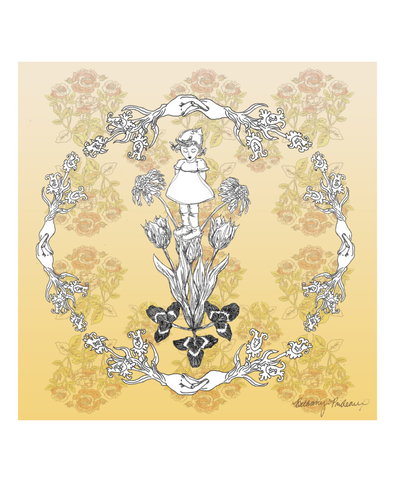
Local Artist, Bethany Prideaux (AKA My Wife)
Garden Girl, by Bethany Prideaux
Above, you will see an image of what my wife submitted. She used a combination of hand drawings and Photoshop to create this piece. She started out by drawing all of the assets in this print by hand. Next, she scanned them individually and put it all together using Photoshop. You can see more of her drawings here.
In order to understand how she came to create this unique piece, it is important to understand where she draws inspiration from. Please check out her website to learn more about her.
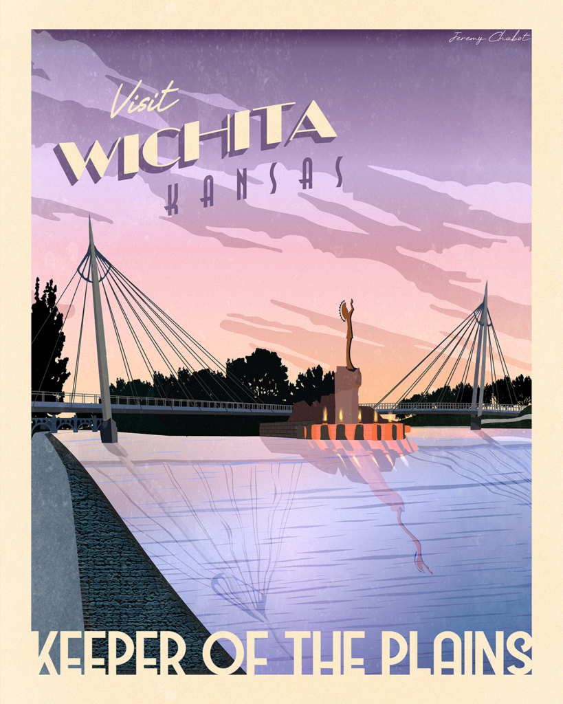
Local Artist, Jeremy Chabot (AKA Bethany’s Husband)
The Keeper, by Jeremy Chabot
The image above is the print I submitted to the “Foot in the Door” event. To start with, I googled “Keeper of the Plains” and used several of the photographs that popped up as my inspiration. I primarily worked in Illustrator to create each of the shapes, objects and text that makes up over a dozen different layers. I mainly used the pen tool, but I also utilized the perspective grid, textures and gradients tools. You can see more of my prints on my home page.
For more information on how I got into making Vintage Travel Posters, please visit my blog post.
In Closing
Please support your local artist. If you’re looking for something fun or different to do in Wichita that is inexpensive, this event might be what you’re looking for. WAM members and children get in free. Adults only pay $10, Seniors pay $5 and College students with ID and youths ages 5-17 pay $3.
List of All Participating Artists
Click on this link and scroll down to view a list of all artists who are participating in the event. So use that Ctrl (or CMD) + F to search for someone you know!
Disclaimer: I have no training and I don’t have much prior experience with art. But that’s perfectly okay. A major theme of this website is to inspire others to try their best at whatever they want.
Imagination and Childhood
Which brings me to my artwork. As a kid, I would go visit my grandparents and spend about a month in Baie Comeau, Quebec. This unique experience of full immersion in the French language allowed me to become bilingual. It also pushed me to explore and use my imagination in order to keep myself entertained. This was before the days of the internet and my grandparents didn’t have cable. Additionally, there weren’t many children my age around.
One way I occupied my time was to play with the Legos I brought along. I was limited in how many I could bring, so I had to choose very carefully. This constraint led to some interesting space ships and narratives that I probably wouldn’t have come up with had I been at home with my full stash of Legos.
Appreciation for Nature and Landscapes
Another way I learned to entertain myself was by appreciating nature and landscapes. The sheer amount of beauty and (mostly) untouched wilderness in that part of the world is insane! My grandpa and my uncle really fostered that appreciation in me. My grandparents had a cabin on a cliff above the northern shore of the St. Lawrence river, which we would spend the majority of our vacation at.
If you don’t know, the St. Lawrence river is about 60 miles wide at this point, thus rendering it susceptible to the tides. During high tide, my grandpa and I would walk for miles until we caught up with the water. We would have to hurry up and turn around so we could beat the advancing water. Along the way I encountered several varieties of sea birds, red crabs, fish, clams and sometimes a few muskrats.
I’m not sure how to even explain it, but I felt small. But in a good way. Like I was part of something so much larger than myself. That feeling of seeing huge swaths of the earth that were untouched by human activity gave me hope. I promise this will tie in later.
These are both posters of some of my favorite scenes of the St. Lawrence River. Pictured Left is Pointe Aux Outardes and Pictured Right is the ferry crossing at Tadoussac.
This is something that I had in common with my grandma, who loved to paint scenery and landscapes. She may not have been a professional, but that hardly matters. Personally, I always appreciated her ability to capture such beauty in her paintings. Although I didn’t know it at the time, this became a huge inspiration for me and my artwork.
Finding a Creative Outlet
Unfortunately, I never learned how express myself artistically. And as I grew older, I stopped playing with Legos as much and never picked up a new creative outlet. I did take a Computer Desktop Publishing course in high school, which I enjoyed. I would even say that I got pretty good at a few of the Adobe programs. However, I never felt good enough to pursue a degree in graphic design. Eventually, I convinced myself that I just wasn’t the creative type and I focused my energy elsewhere.
That was until I met my wife. She was studying ceramics at Wichita State when I met her. I was immediately amazed at what she could create with her hands. She is super artistically talented and very creative. I think that she is super good at all forms of artistic expression (drawing, painting, sewing and ceramics, obviously). After we met, we hung out like every day and just couldn’t get enough of each other. Not long after, she introduced me to Minecraft, which is basically just video game Legos. We played an embarrassing amount of creative mode and built whatever we could conceive in our minds. She had reignited my creative spark.
Career and Skill Development
The last thing that fell into place for me was landing my career with LightSpeed VT Midwest. A big portion of my job and one that I enjoy very much is designing e-Learning platforms for various clients. I quickly picked up on how to use Photoshop, Illustrator and even After Effects. It was a slow start and I’ve still got tons to learn; but I’ve gotten to a point where I’m comfortable enough creating art.
After a big update to the system, my coworker and I decided to practice our design skills. Our goal was to create something aesthetically pleasing and unique, while pushing the system’s limits. We brainstormed and settled on an Art Deco poster theme. To find inspiration, he introduced me to National Park Posters and I discovered Vintage Travel Posters. Feeling inspired from the cool system theme we created, I began creating my own posters of Wichita. More recently, I’ve expanded to posters outside of Wichita. I’ve drawn inspiration from vacations, old childhood photos and random photos I occasionally stumble across on the internet. If you’d like to learn how to design your own, here’s a cool tutorial.
A collage of various posters I’ve made. Some based on photos I took and others from random images on the internet.
There you have it. My story as to why I started dabbling in Art and eventually began making digital art. Hopefully I didn’t bore you. Long story short, I developed a love of landscapes at an early age. My wife pushed me to find a creative outlet. And through my job, I developed the skills I needed in order to design Vintage Travel Posters. Thanks for coming to my TED talk.